Inspired by what you see?

Need A Design Like This In Your Life?

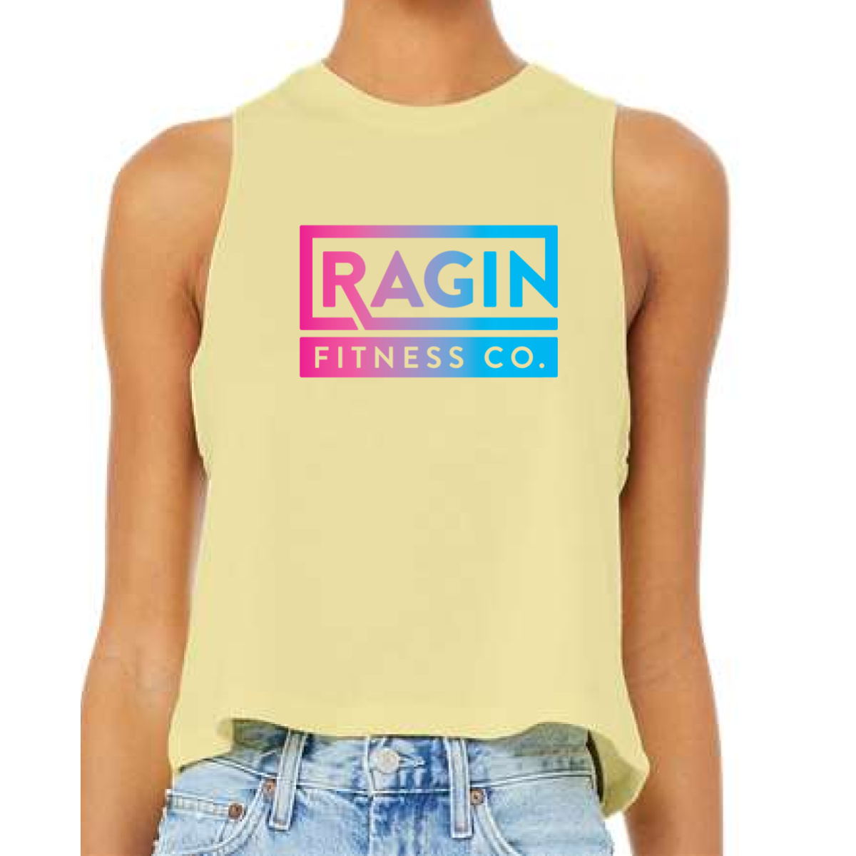
Ragin Fitness Co Yellow Crop Tank

This version pushed the design into a brighter and more energetic space. It gave the brand a strong summer look that felt bold and fun.

Overview

We used a light yellow cropped tank to bring in a warm weather feel that stands out right away. The Ragin Fitness Co logo stayed consistent but shifted into a vibrant pink to blue gradient for added energy. The clean boxed layout kept the design structured while the color made it feel alive. The cropped fit kept the piece modern and easy to wear.

Results

The final product felt bright and highly visible in any setting. Members could wear it for training or casual use without it feeling heavy. The color combination helped the brand pop in group settings and photos. It became a strong piece for summer releases.

Love What You See? Make This Layout Yours!

Tell us what to swap, and our team will send you a digital proof and quote ASAP!*


*Some of the artwork presented in our portfolio is our client’s actual logos. While you are free to use anything you see as inspiration, out of respect for that client we’d obviously revise any artwork and make it more individual to your specific group or event.