Inspired by what you see?

Need A Design Like This In Your Life?

Railway CrossFit: Iron Decade

Ten years is a long time to keep showing up. Railway CrossFit marked the milestone with a shirt that feels as solid as the community that built it.

Overview

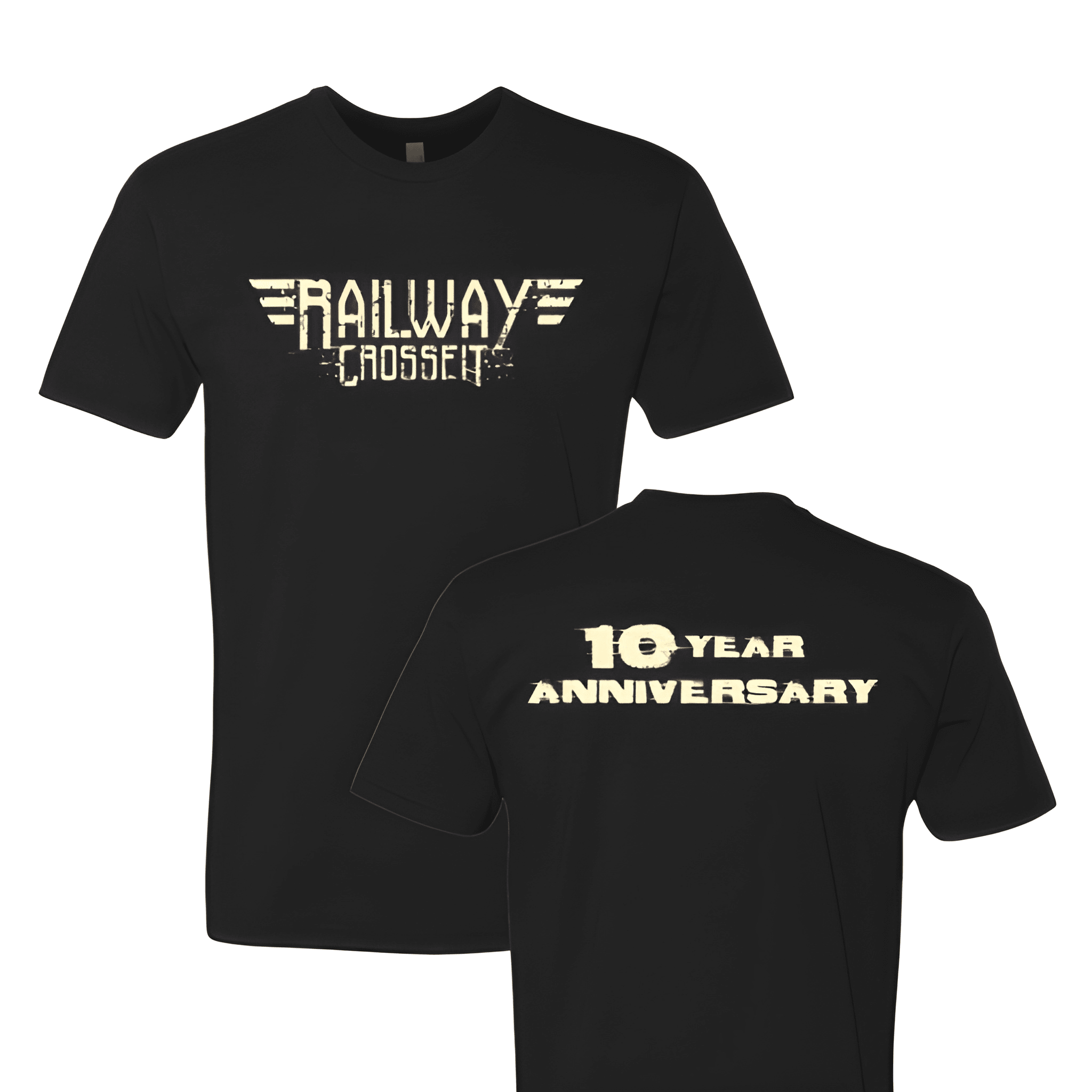
Printed in warm cream ink on a black tee, the design pulls from late 70s rock and American iron culture. The winged wordmark on the front is bold and ornate with a distressed texture that gives it real age and weight. The back calls out the 10 Year Anniversary in the same heavy type, keeping the message simple and impossible to miss. Front center and full back placement make this a two sided statement piece.

Results

A 10 year anniversary shirt like this is meant to feel like something worth keeping. The vintage treatment gives it staying power well beyond the celebration itself. Members wearing these gym shirts are carrying a piece of the gym's story with them long after the party is over.

View More Work:

Love What You See? Make This Layout Yours!

Tell us what to swap, and our team will send you a digital proof and quote ASAP!*


*Some of the artwork presented in our portfolio is our client’s actual logos. While you are free to use anything you see as inspiration, out of respect for that client we’d obviously revise any artwork and make it more individual to your specific group or event.