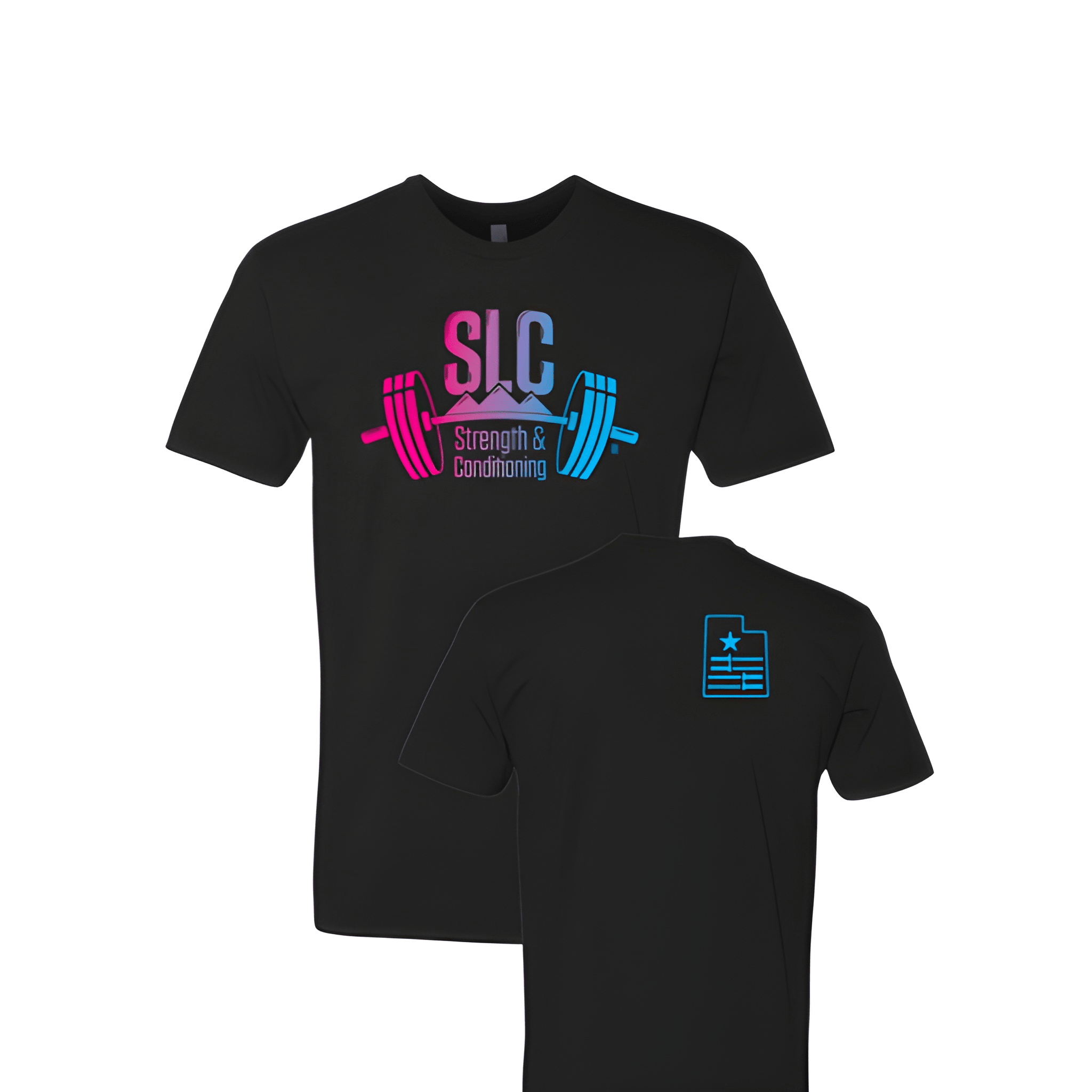
SLC Strength & Conditioning: Fall Tee
SLC on top. Strength & below. Conditioning at the bottom. The acronym leads, then the full name follows.
Overview
We printed a three line stack on the center chest of a classic tee. The white lettering reads "SLC" on top, "Strength &" in the middle, and "Conditioning" at the bottom. The black tee gives it a bold fall feel. The full name builds underneath the acronym.
Results
The final tee puts SLC STRENGTH & CONDITIONING front and center where everyone sees it. Members rep the full name loud and clear. SLC adds a cool insider touch. It is bold, clean, and built for fall.