Inspired by what you see?

Need A Design Like This In Your Life?

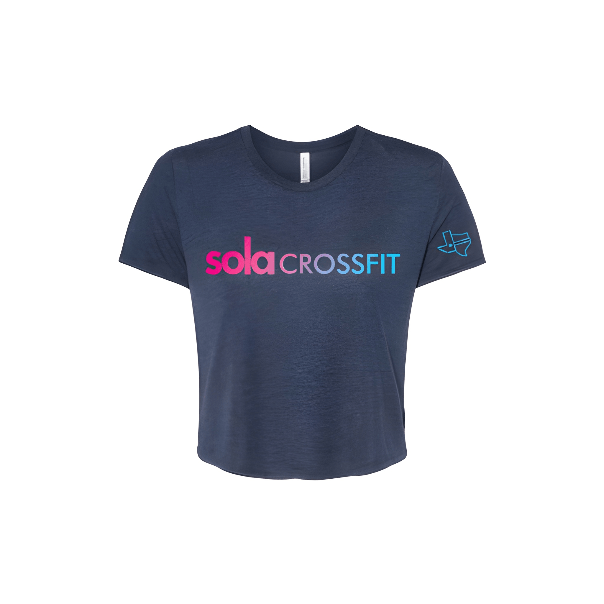
SOLA CrossFit: Comp Tee

Clean bold and unmistakable. This gym let their name run the show with a competition look that needed nothing extra.

Overview

We placed the SOLA CrossFit mark bold across the chest in a clean simple competition layout. The tee was chosen for its comfortable fit and strong identity energy. Centered chest placement lets the name do all the talking.

Results

The bold mark gives the shirt a confident feel. Athletes get a piece that says SOLA in big letters and lets everyone know exactly who they compete for.

Love What You See? Make This Layout Yours!

Tell us what to swap, and our team will send you a digital proof and quote ASAP!*


*Some of the artwork presented in our portfolio is our client’s actual logos. While you are free to use anything you see as inspiration, out of respect for that client we’d obviously revise any artwork and make it more individual to your specific group or event.