

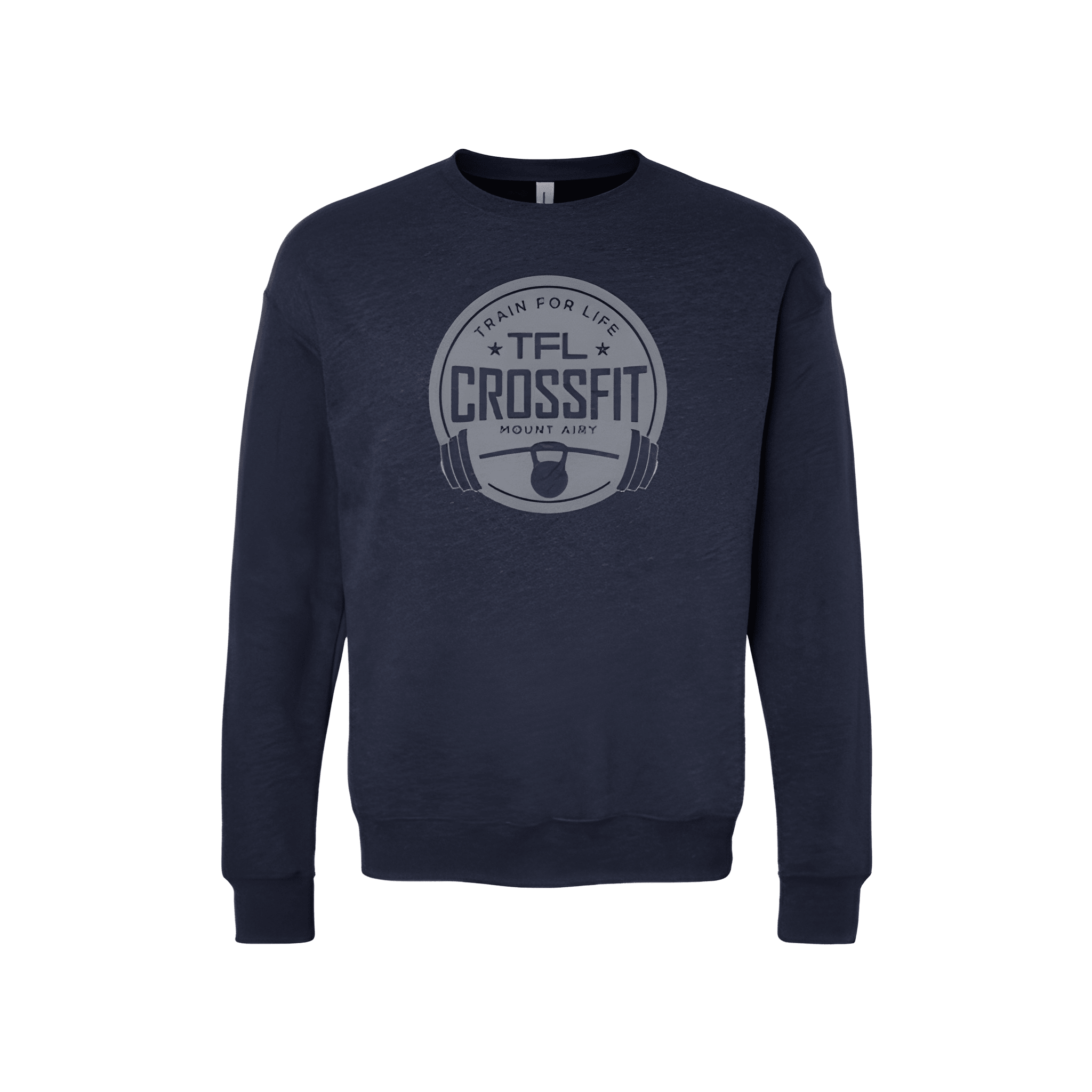
TFL Crossfit: Fall Shirt
TRAIN FOR LIFE leads the way. TFL stays close below. CROSSFIT follows next. MOUNT AIRY anchors the bottom. The mantra starts it, the acronym and brand build it, the location finishes it.
Overview
We stacked "TRAIN FOR LIFE" above "TFL" above "CROSSFIT" above "MOUNT AIRY" on the center chest of a fall shirt. The white lettering pops against the black fabric. The mantra, acronym, brand, and location build together for a complete, meaningful look.
Results
This shirt puts TFL CROSSFIT on display from top to bottom. Members get a design that feels complete and rooted. TRAIN FOR LIFE adds purpose. MOUNT AIRY adds local pride. It is layered, meaningful, and ready for fall.
