Inspired by what you see?

Need A Design Like This In Your Life?

The Crate Performance Utility Hoodie

This design mixed clean branding with a bold back graphic built for gym culture.

Overview

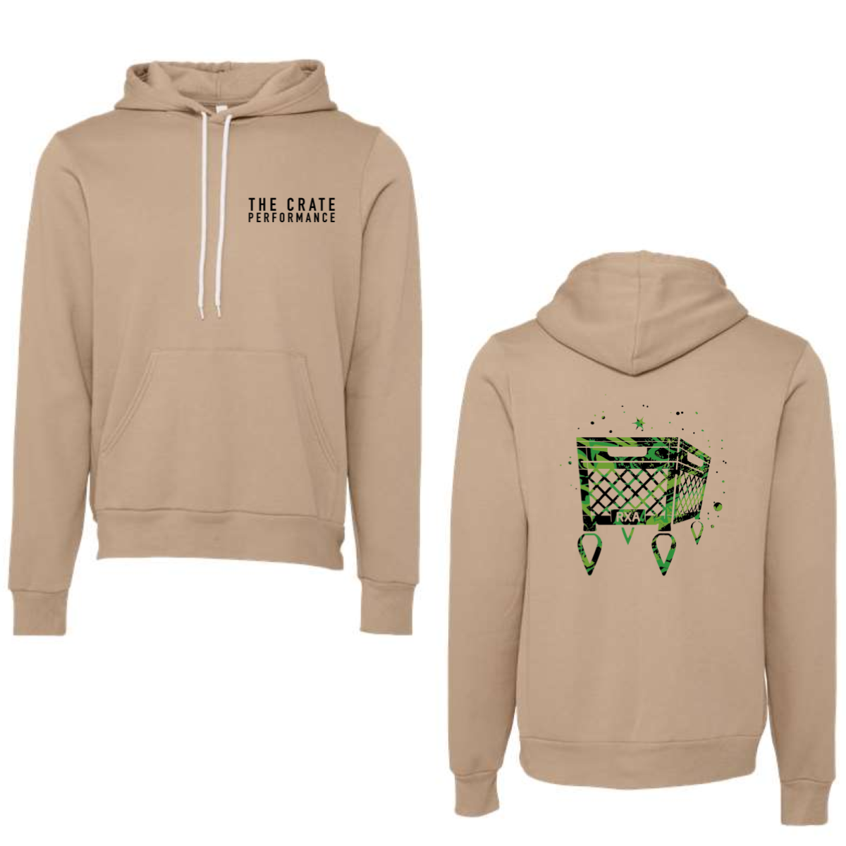
We used a sand color hoodie to give a neutral base that works year round. The front kept it simple with a small chest logo for everyday wear. The back featured a large crate graphic with a gritty texture and bright green accents. The design pulled from gym equipment and performance energy. The placement gave it strong visibility without feeling crowded.

Results

The front stayed clean while the back drove attention. The green ink popped hard against the neutral fabric. Members got a hoodie that felt both wearable and bold. It worked well for layering and everyday gym use.

Love What You See? Make This Layout Yours!

Tell us what to swap, and our team will send you a digital proof and quote ASAP!*


*Some of the artwork presented in our portfolio is our client’s actual logos. While you are free to use anything you see as inspiration, out of respect for that client we’d obviously revise any artwork and make it more individual to your specific group or event.