Timberwolf CrossFit Bright Contrast Tee
This version used bold color contrast to grab attention fast.
Overview
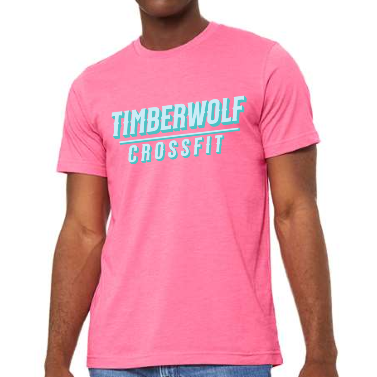
We used a bright pink tee to create a high energy spring look. The design kept the same strong stacked type but switched to a teal ink for contrast. The angled layout added motion without extra graphics. A full front print kept the message clear and easy to read. The style stayed clean but eye catching.
Results
The color combo stood out right away in the gym. Members liked the fun and bold feel. The simple layout made it easy to wear every day. It became a strong option for seasonal drops and events.