Inspired by what you see?

Need A Design Like This In Your Life?

CrossFit Flagstaff: Urban Camo Tee

Gray camo fill on a black tee. CrossFit Flagstaff went tactical and it looks exactly right.

Overview

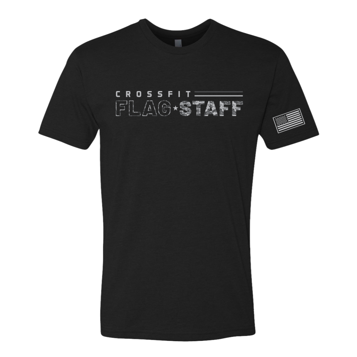
Gray urban camo and white ink on a black tee. "Crossfit" runs in clean spaced caps above "Flag·Staff" in bold type filled with a digital camo texture. Double rule lines accent the layout and a small American flag sits on the left sleeve. Front center and sleeve placement.

Results

Filling bold type with a camo texture is a technique that adds visual depth without complicating the overall design — from a distance it reads as a clean two-color shirt, up close the detail rewards the look. The digital camo keeps it modern rather than throwback. The sleeve flag ties it to place and purpose without being over the top about it. These are the crossfit shirts that look like they were made for a gym that takes things seriously.

View More Work:

Love What You See? Make This Layout Yours!

Tell us what to swap, and our team will send you a digital proof and quote ASAP!*


*Some of the artwork presented in our portfolio is our client’s actual logos. While you are free to use anything you see as inspiration, out of respect for that client we’d obviously revise any artwork and make it more individual to your specific group or event.