Inspired by what you see?

Need A Design Like This In Your Life?

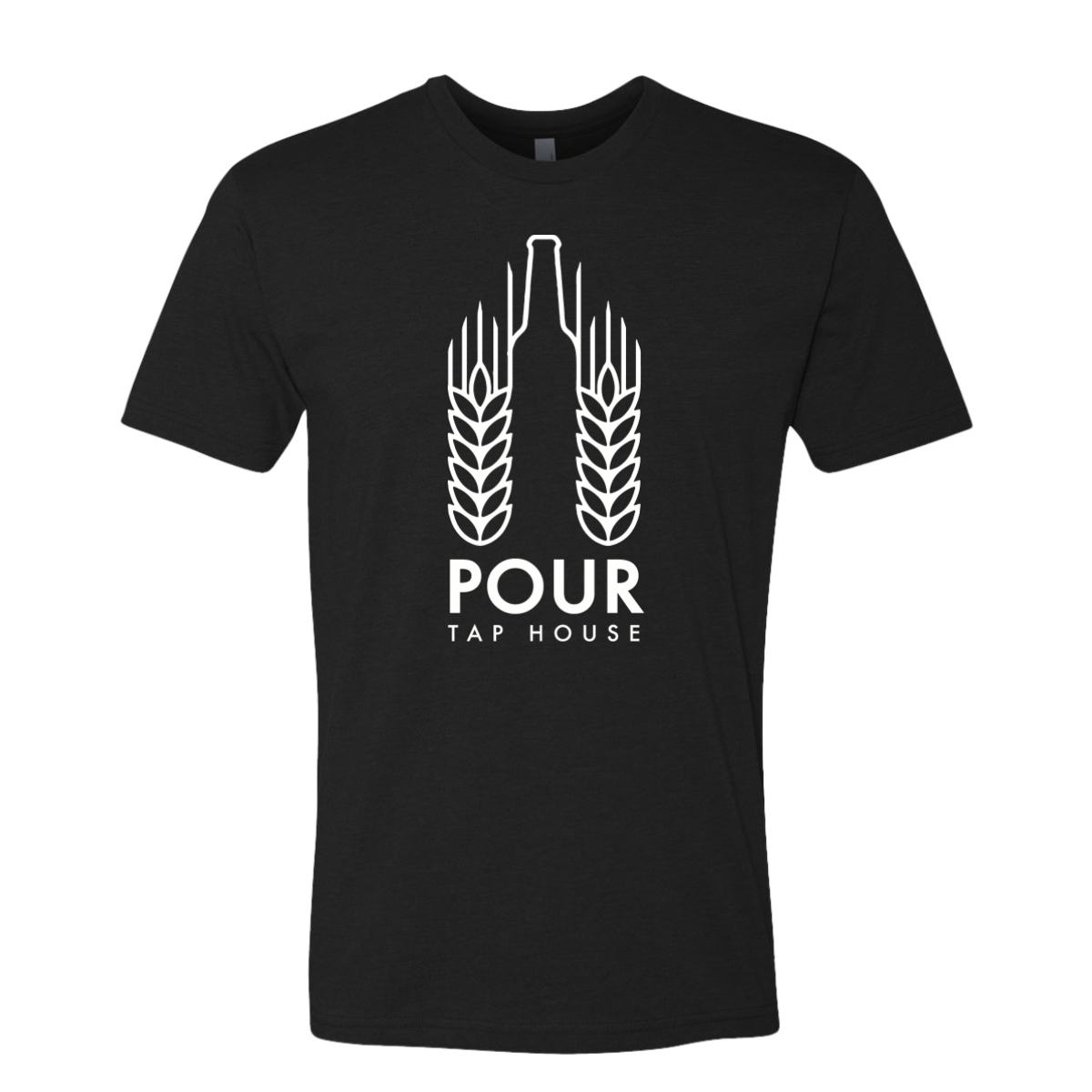
Pour Tap House Tee

This design kept things simple and strong. It matched the brand and felt easy to wear anywhere.

Overview

We used a black tee to create strong contrast with the white print. The design featured a clean beer bottle icon framed by wheat elements, tying directly to the tap house identity. The type stayed bold and minimal to keep the focus on the mark. Everything was centered to create a balanced and timeless look.

Results

The shirt became an easy go to for both staff and customers. The simple layout made it work in the bar or out in public. The strong contrast helped the design stand out without needing extra color. The final piece gave the brand a clean and recognizable staple item.

Love What You See? Make This Layout Yours!

Tell us what to swap, and our team will send you a digital proof and quote ASAP!*


*Some of the artwork presented in our portfolio is our client’s actual logos. While you are free to use anything you see as inspiration, out of respect for that client we’d obviously revise any artwork and make it more individual to your specific group or event.