

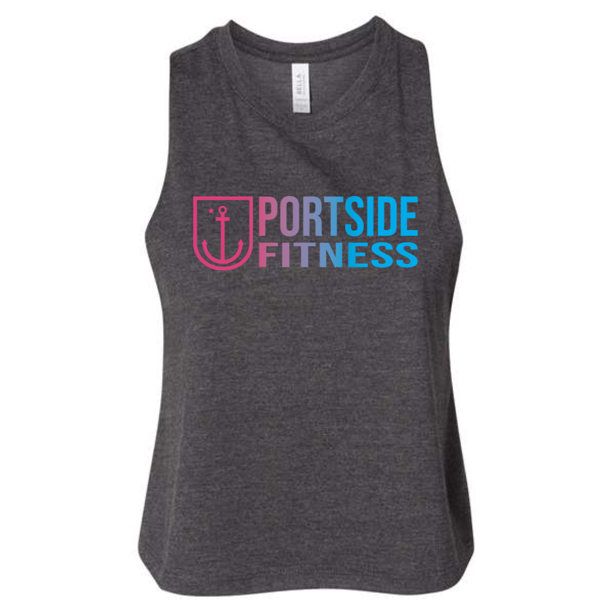
Portside Fitness Gradient Tank
This version gave the design more edge. It kept the same energy but added a stronger everyday feel.
Overview
We used a dark heather tank to ground the bright gradient logo. The Portside Fitness mark kept the pink to blue blend which added a fresh and modern look. The darker garment helped the colors pop while still feeling wearable in and out of the gym. The layout stayed clean and centered for easy readability.
Results
The tank became a go to option for members who wanted something less bright but still eye catching. The contrast made the logo stand out more during workouts and in photos. It gave the brand more range across different styles and preferences. The final piece balanced performance and lifestyle in a simple and strong way.
