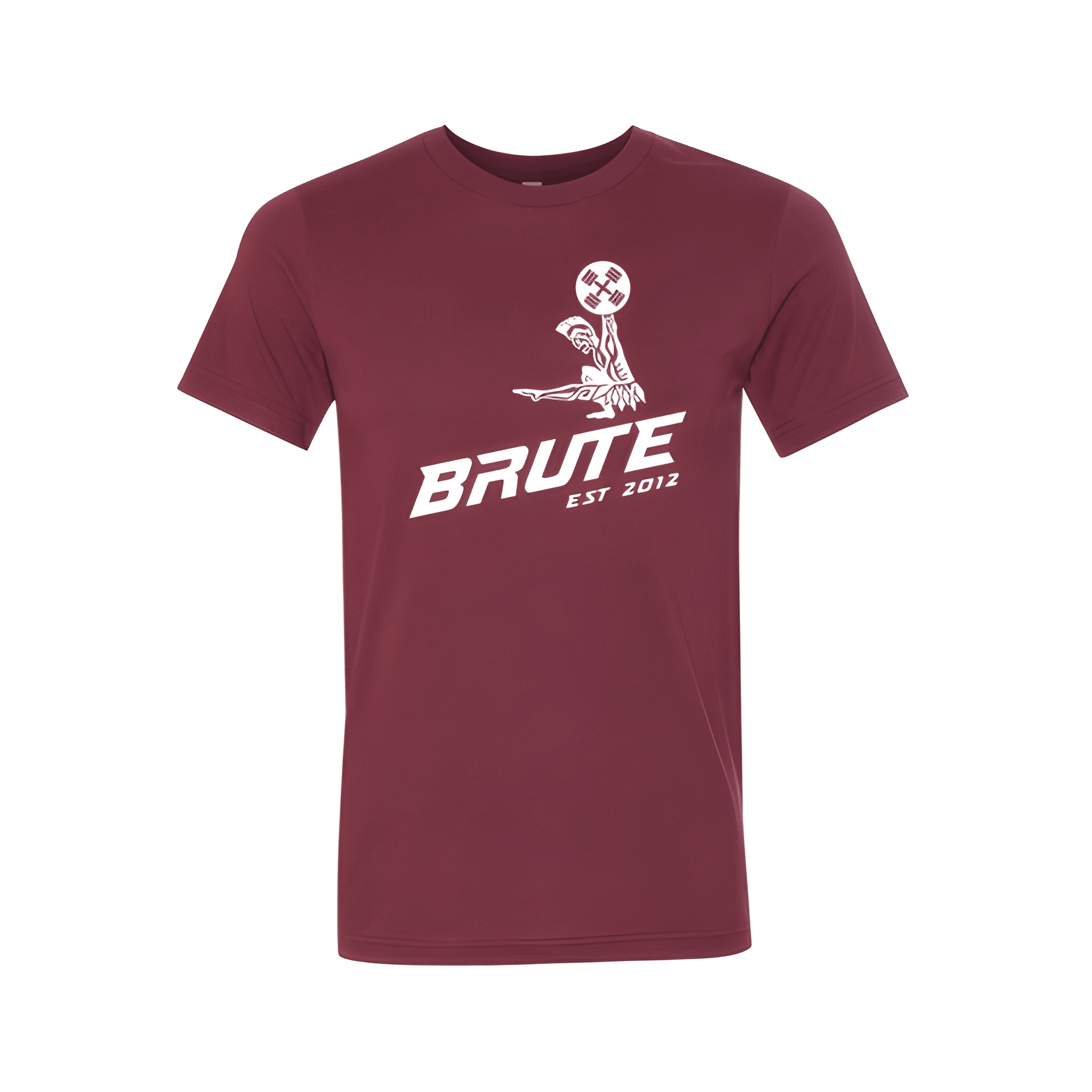
Brute: Fall Tee
BRUTE on top. EST in the middle. 2012 at the bottom. The name leads, then the founding year sits below it.
Overview
We printed a three line stack on the center chest of a fall tee. The white lettering reads "BRUTE" then "EST" then "2012" with the gym name sized largest at the top. We placed the year below the name to show how long this brand has been around.
Results
The final shirt puts Brute first. Members see the name. The 2012 below reminds them this gym has been building for over a decade. It is clean, proud, and built for fall.