Inspired by what you see?

Need A Design Like This In Your Life?

CrossFit BLSC: Shore Thing

Most gym shirts look like gym shirts. This one looks like a souvenir from somewhere you actually want to be.

Overview

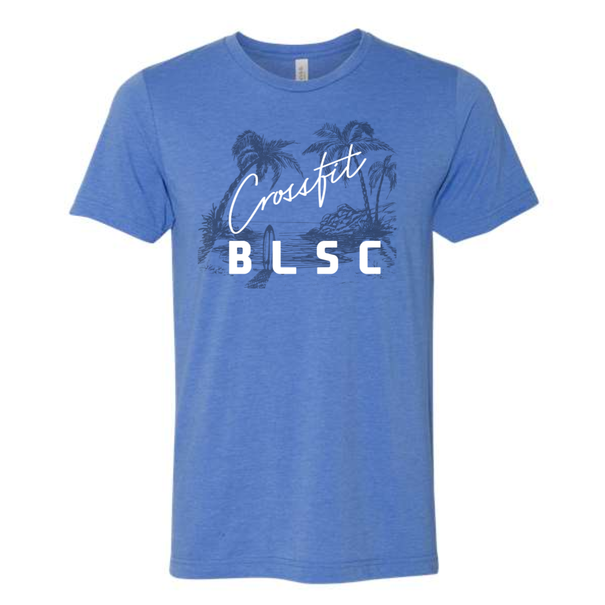
Navy and white ink on a heather blue tee. A hand-drawn tropical scene fills the chest — palm trees, water, and a lone surfboard — with "Crossfit" in flowing script overtop and "BLSC" in bold white block letters anchoring the bottom. Front center placement, full chest graphic.

Results

The illustrated scene gives this more editorial energy than a standard gym logo drop. Script over illustration over block type is a layering technique that takes real design confidence to pull off, and it works here. The blue on blue ink keeps the scene feeling tonal and cohesive while the white lettering keeps it readable. These are the crossfit shirts that feel more like a vacation tee than a gym shirt — which is exactly why members will wear them everywhere.

View More Work:

Love What You See? Make This Layout Yours!

Tell us what to swap, and our team will send you a digital proof and quote ASAP!*


*Some of the artwork presented in our portfolio is our client’s actual logos. While you are free to use anything you see as inspiration, out of respect for that client we’d obviously revise any artwork and make it more individual to your specific group or event.