

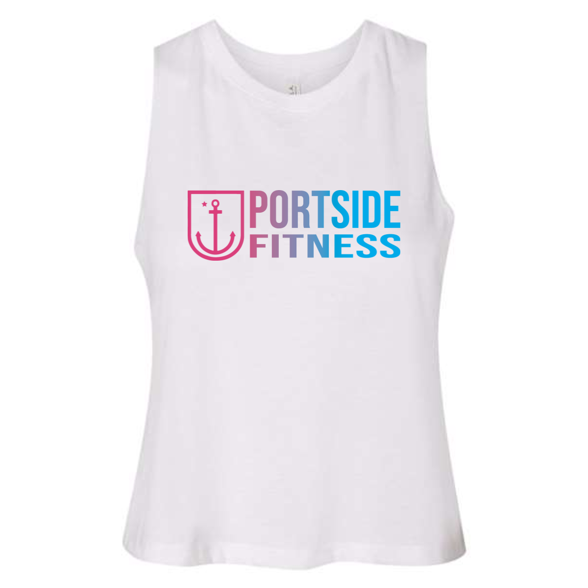
Portside Fitness Gradient Tank
This piece brought a fresh look to the floor. It felt bright, clean, and built for summer training.
Overview
We used a white flow tank to keep the garment light and breathable. The front design featured the Portside Fitness logo with a soft gradient blend of pink and blue. This gave the brand a more lifestyle feel while still keeping the strong anchor mark. The layout stayed centered and clean so it worked across all sizes.
Results
The tank stood out right away in the gym and in social posts. The color blend added energy without feeling heavy or loud. It gave members a new option that felt different from standard gym gear. The final piece helped expand the brand look while keeping it consistent and easy to wear.
