
UNITEE / Gym apparel buying guide
How to Design Gym Shirts Members Actually Want to Wear
Better artwork is just the beginning. The shirt, print coverage, placement, style, and audience all have to work together. Here's how we engineer gym apparel for success.
A great T-shirt isn't just a great graphic slapped onto whatever blank happens to be available.
We've spent years designing and printing apparel for gyms. Some of our most valuable lessons have come from understanding why certain shirts get worn constantly while others barely leave the gym.
Sometimes the artwork is the problem. Sometimes it's the garment, the fit, the placement, or an idea that only a handful of members understand.
We call it engineering the shirt for success. Not because this needs to be complicated, but because dozens of small decisions eventually determine whether someone reaches for that shirt on Saturday morning—or leaves it buried in a drawer.
We're not designing for the moment a gym owner approves the artwork. We're designing for the hundred times a member might choose to wear the finished shirt.
01 / Less is more
A More Breathable Graphic Is Usually a Better Graphic
You know those giant prints that feel like somebody glued a rubber dinner plate to your chest? We try to avoid that.
As a general rule, the less fabric you cover with decoration, the more natural the garment will feel. That matters when you're sweating through a workout, not just standing in front of a mirror.
It's a design problem as much as a printing problem. A large graphic doesn't have to become one enormous solid block of ink or transfer material.
The goal isn't always to make the artwork smaller. It's to make smarter use of the space.
How We Lighten a Design
Halftoning: Breaking solid areas into small dots to create shading with less continuous print coverage.
Knockouts: Removing printed colors or shapes so the actual garment color becomes part of the artwork.
Distressing and weathering: Intentionally opening parts of a graphic to create a worn-in appearance and reduce solid coverage.
We use these approaches when they improve the design. Not every graphic needs distressing, and too much can destroy readability.
Usually less comfortable
A Large Solid Graphic
Heavy continuous coverage across the chest or back can make a shirt feel stiffer and less breathable, regardless of the artwork's visual appeal.
Our preferred approach
An Open, Intentional Graphic
Use negative space, halftones, or the garment color itself to keep the design visually strong without covering every inch with decoration.
02 / Avoid unnecessary expense
Stop Printing the Same Logo Everywhere
We occasionally get requests for the exact same gym logo on the front, back, and sleeve of one shirt.
There's nothing technically wrong with it. But every additional print location can add production steps and cost. And repeating the same graphic three times usually doesn't make the shirt three times better.
Our approach is to give each placement a job. Maybe the front carries the main artwork. The sleeve gets a small gym identifier. The back stays clean—or adds something that genuinely contributes to the design.
If the extra placement isn't improving the shirt, why are we asking the customer to pay for it?
One strong placement usually beats three redundant ones. Spend the savings on a better garment or a more thoughtful design.
03 / Know your actual audience
Long-Tail Concepts Suck When You're Trying to Sell Shirts
We've seen gym owners get excited about an inside joke that only four coaches and three members at the 3:00 afternoon class will understand.
That can be hilarious among those seven people. It's also a terrible starting point if you're trying to sell 40 shirts.
The narrower the concept, the smaller the potential audience. This becomes a real issue when you're trying to meet minimum order quantities, keep the program profitable, and get the shirts worn.
We make no apologies for speaking up when we believe an idea has limited appeal. That's part of what you're hiring us for.
Inside jokes have their place. Make seven shirts for the seven people who understand the joke, if that makes sense. Just don't confuse a novelty gift with a design intended to represent your entire gym.
04 / Replace guesses with evidence
Your Members Have Already Told You What They Like
Before choosing the next shirt, look at the previous ones. What sold? What didn't? Which colors were popular? What garments were people actually wearing six months later?
Gym owners naturally have personal preferences. We do too. But the next release shouldn't depend entirely on somebody's gut feeling.
| What to review | What it can tell us | How we'd use it |
|---|---|---|
| Previous best sellers | Which designs have broad appeal | Keep useful visual themes and develop new directions around them. |
| Popular colors | What members tend to choose | Make proven colors part of the next collection while introducing something fresh. |
| Sizes and fits | What members actually wear comfortably | Choose garment styles that suit the people buying them. |
| Unsold stock | Where the last purchase missed expectations | Change the artwork, garment, quantity, or price rather than repeating the mistake. |
Communicate this information to UNITEE. Even informal feedback like "everyone loved that faded green shirt, but the heavyweight tee didn't move" can help us make better decisions.
05 / The new-age clipart problem
AI Slop Is the New Clipart
Remember when everybody had access to the same clipart libraries? The result was thousands of designs that looked suspiciously similar.
AI has introduced a new version of that problem.
Ask an image generator for a muscular tiger lifting weights, surrounded by flames and aggressive lettering, and you'll probably get exactly that. The problem is thousands of other people can ask for essentially the same thing.
The most obvious visual answer is often the one you're going to see everywhere.
We call that default AI slop. The result might look polished, but it lacks the specific thinking that makes a piece of apparel distinctive.
At UNITEE, we study those recurring patterns and deliberately look for other directions. Different visual references. Unexpected typography. Better use of negative space. A concept connected to the gym's actual community rather than generic fitness imagery.
AI can be a useful creative tool. But knowing what to reject, what to refine, and what is already oversaturated matters more than how quickly you can generate a picture.
We're not trying to make a shirt that looks like what everybody else is making. We're trying to make the shirt that everybody else wishes they'd thought of.
06 / An overlooked design principle
The Graphic and the Garment Need to Belong Together
This is one of the most overlooked decisions in custom apparel.
Think of an old-school vintage script with a long swash running underneath the letters. That graphic could look fantastic on a retro raglan baseball tee because the artwork and garment share the same visual era.
Put that same graphic on a modern technical performance shirt and it may lose some of its character.
The garment isn't just a surface for the artwork. It's part of the design.
Vintage Artwork + Retro Garment
Old-school lettering, weathered colors, and nostalgic graphics can work beautifully with raglans, ringers, or soft vintage-feeling tees.
Modern Branding + Technical Garment
Clean typography, restrained graphics, and thoughtful placements often work better on lightweight training gear and modern performance apparel.
Small Embroidered Mark + Elevated Apparel
A simple embroidered identity can give a quarter-zip, structured cap, or premium outerwear piece a more refined appearance.
Distressed Artwork + Casual Lifestyle Tee
Worn textures and relaxed graphics can feel natural on a washed or heavyweight everyday shirt intended to be worn outside the gym.
None of these are hard rules. They're examples of how the graphic, material, fit, and cultural reference can reinforce one another instead of competing.
Our CLE Rock & Iron Design Lab collection is a good example of this thinking. The raglan, retro character artwork, industrial typography, and garment choices were developed as parts of one visual system.
07 / Curate the collection
A Collection Needs Balance, Not More Choices
When a gym wants several apparel items, we don't recommend making every piece look exactly the same. We also don't recommend creating ten unrelated designs and hoping something sticks.
Think of a balanced collection with different jobs for different items.
The Hero Piece
The most distinctive item in the collection. Strong artwork, personality, and a reason for members to get excited about the release.
The Everyday Seller
A more versatile shirt or tank with broader appeal. Easy to wear, easy to pair with other clothing, and suitable for frequent use.
The Premium Upgrade
Maybe a hoodie, jogger, embroidered cap, or elevated garment for members willing to spend more on something special.
That's a framework, not a requirement to offer three products. A smaller gym may be better served by one exceptional shirt. The point is to give each item a purpose.
Member demographics matter too. Age, body type, garment preferences, and fit expectations can influence what people actually buy. Some members prefer relaxed shirts. Others want fitted tanks, crops, or more structured pieces.
We should respect those differences without turning the order into an overwhelming catalog.
Different products can speak to different members. The collection still needs to feel like it belongs to the same gym.
Our The Open, Recut. Design Lab project explores this idea: garments with distinct personalities that still work together as one apparel collection.
08 / Know who you are
Your Gym's Personality Should Shape the Artwork
Imagine two independent gyms.
One is in Baton Rouge with 300 members, a broad range of fitness services, and a polished, professional brand. Its members may respond well to clean typography, refined colors, and a more established visual identity.
The other is a funky gym in Midtown Austin with a kraken for a mascot, loud music, and a community that embraces the weird. That gym might be a perfect fit for experimental graphics, unexpected placements, and artwork that doesn't take itself too seriously.
Neither gym has a better personality. But trying to dress them the same would be a mistake.
Different design styles also connect with different audiences. Some members love athletic uniforms. Others gravitate toward vintage concert shirts, skate graphics, streetwear, retro collegiate art, or understated lifestyle apparel.
Our job is to understand what makes your gym different and translate that into something people genuinely want to wear.
That thinking also drives our Elite Gym League project, where local culture, visual history, and regional personality become the starting points for distinctive fitness apparel.
09 / Our investment before your investment
Why UNITEE Builds Designs Before You Even Ask
The creative process takes time and money. A lot of both.
Researching trends, experimenting with typography, developing artwork, sampling garments, and testing decoration techniques aren't free.
We do that work anyway.
Our Design Lab works like an automotive concept studio. We develop apparel ideas before we have a customer for them, not because every concept will sell, but because experimentation raises the standard of everything we produce.
We also invest in trying garments, testing combinations, and making prototypes before customers necessarily know they want those options.
UNITEE carries that upfront creative investment. Independent gyms can benefit from those ideas without funding a separate research-and-development department. Artwork support is included with our standard apparel orders.
What That Investment Gives You
Better starting points. You aren't forced to invent an entire collection from a blank page.
More original ideas. We explore beyond default templates and overused design styles.
Better garment decisions. We've already spent time looking at how different graphics and products work together.
Fewer unnecessary experiments. We can use what we've learned from past projects to guide your choices.
A creative partner. You're getting design and production experience, not just access to a printer.
It's an expensive way for us to operate. But we believe it's one of the most important reasons gyms work with UNITEE.
See the thinking behind the artwork
Three Design Lab Projects That Illustrate the Point
These are UNITEE concept projects showing how garment choices, creative direction, and visual identity can be developed together.
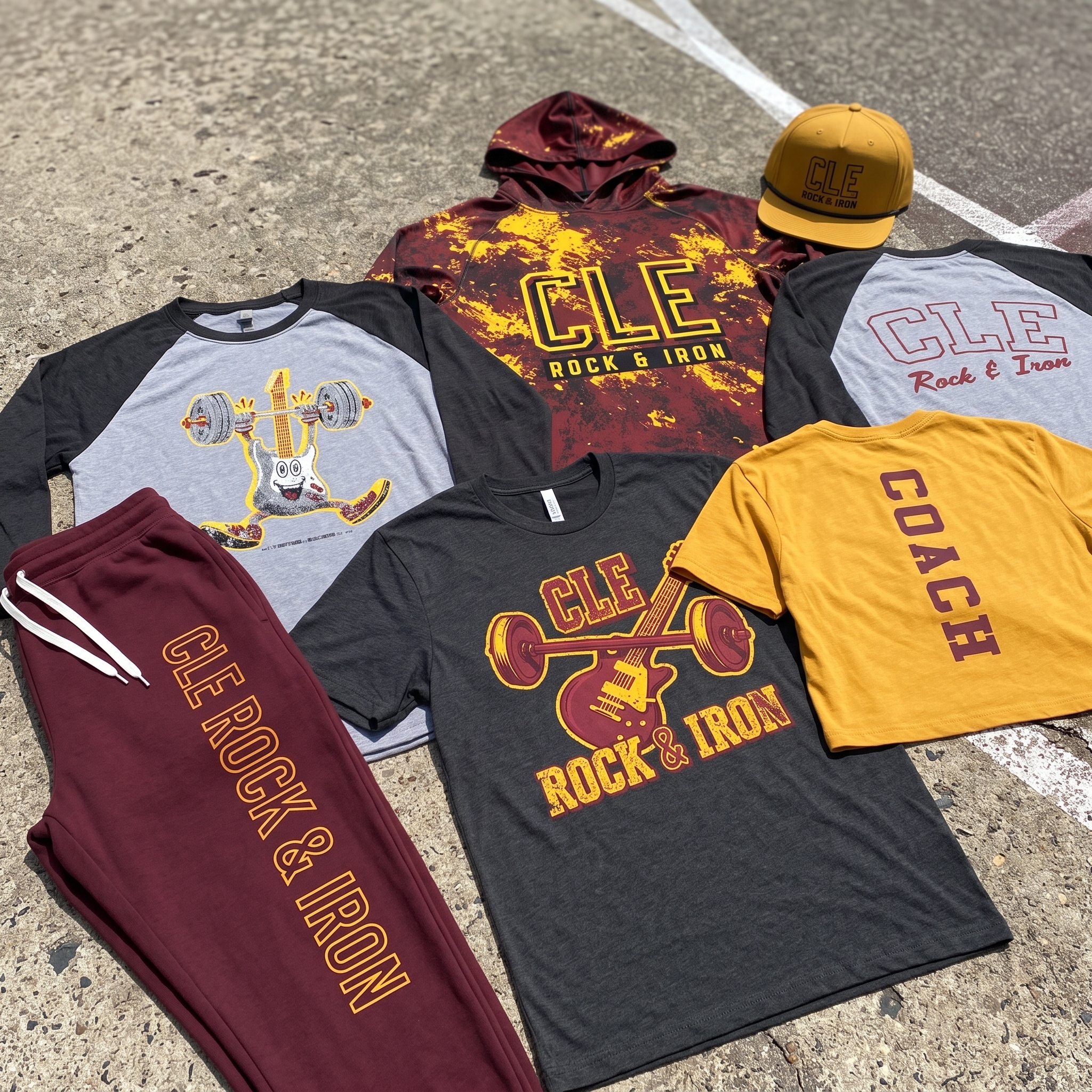
Graphic + garment pairing
CLE Rock & Iron
Retro artwork, Cleveland music culture, industrial references, and carefully chosen garment styles—including a character-driven raglan—work together as one collection.
Explore the project →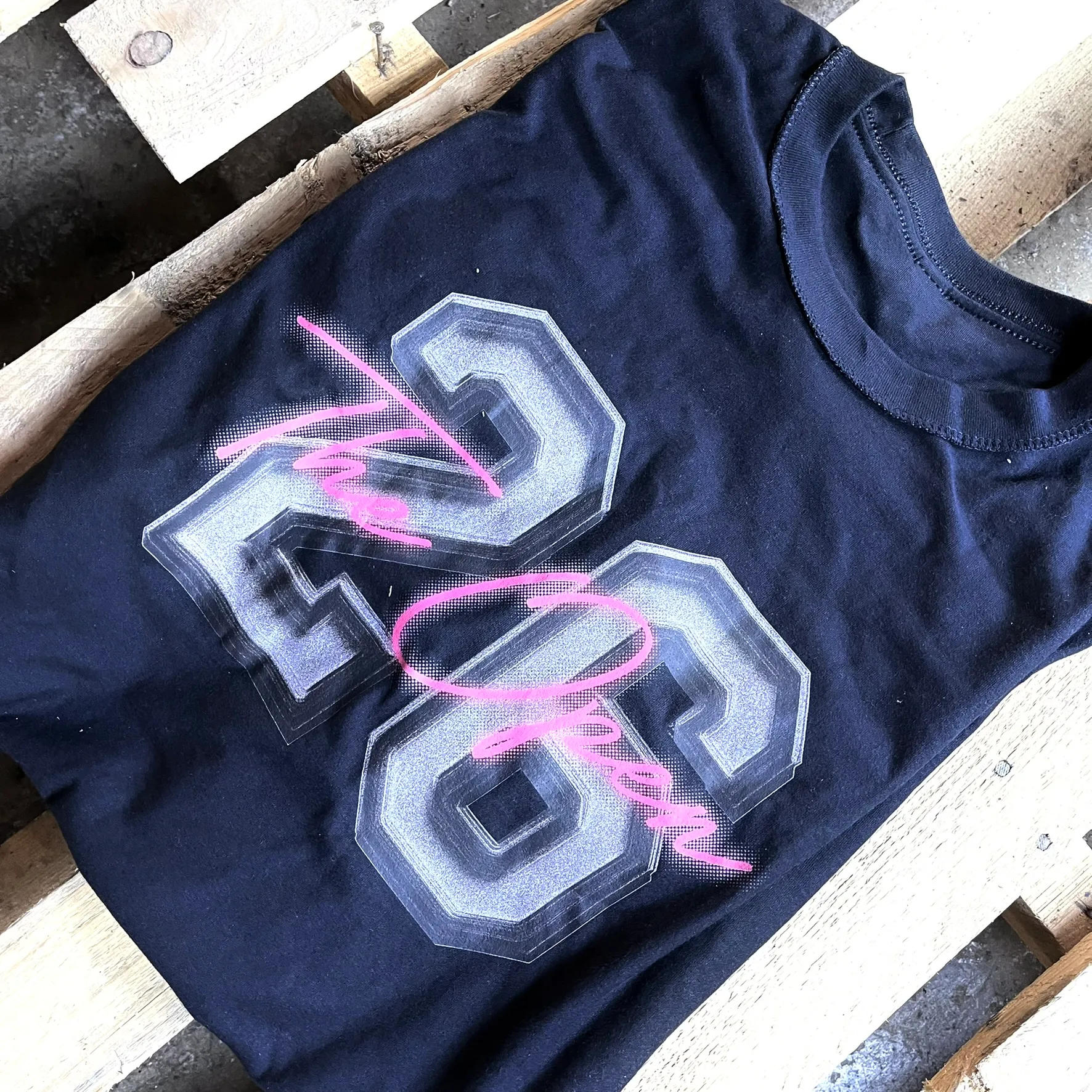
Collection balance
The Open, Recut.
An experiment in moving beyond predictable competition graphics while letting different garment styles and visual directions contribute to one larger collection.
Explore the project →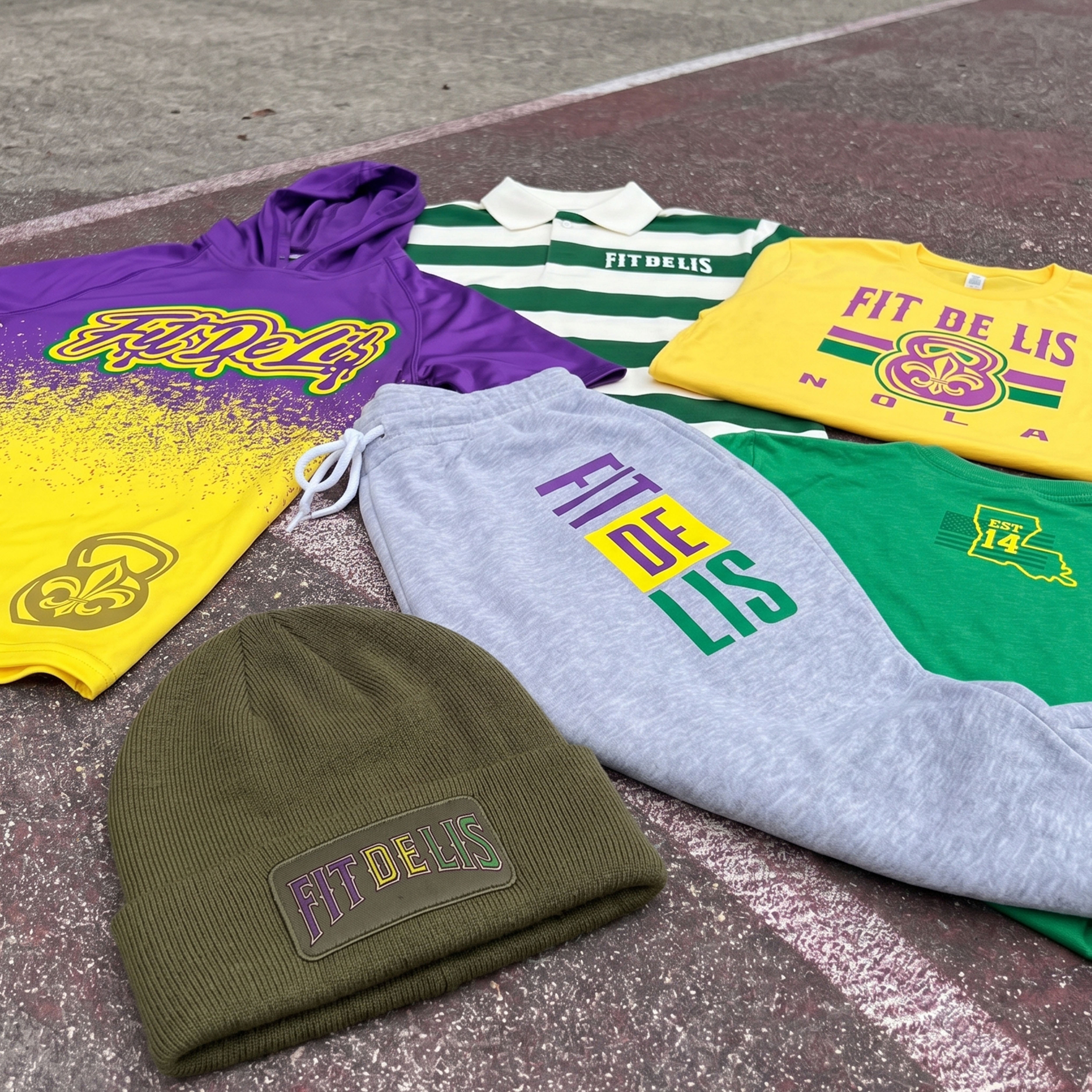
Brand personality
Elite Gym League
Regional colors, cultural references, and local identity become the foundation for gym apparel that doesn't feel like a generic fitness template. Pictured: Fit De Lis, New Orleans.
Explore the project →10 / The partnership
Good Shirts Require Good Information
We can bring the design expertise, garment knowledge, and production experience. But some of the most important information has to come from the gym itself.
Successful apparel programs work best when both sides contribute.
- Tell us about your members. Who trains with you? What do they like wearing?
- Share past successes and failures. Colors, styles, fits, quantities, and feedback from previous releases are valuable.
- Explain your gym's personality. Your history, traditions, community, and attitude give us something real to work with.
- Let us challenge weak ideas. If we think a concept has limited appeal, we'll tell you. We expect the same candor in return.
- Approve milestones efficiently. Clear, timely feedback keeps the project moving and prevents last-minute problems.
- Promote the finished product. Great design increases the chance of success. Your coaches and members still help turn the idea into a successful release.
The best results come from combining what UNITEE knows about apparel with what you know about your gym.
A Few Questions Gym Owners Ask
What makes a good gym T-shirt design?
Strong artwork, a comfortable garment, intentional print coverage, a clear identity, and broad enough appeal for the intended audience. The design should feel like it belongs to the gym and look good when worn outside it.
Does a bigger print make a better shirt?
Not necessarily. Large graphics can be excellent, but excessive solid print coverage may reduce comfort. Techniques like halftoning, knockouts, and distressing can create strong designs with less continuous decoration.
Should gym shirts all use the same design?
Not always. A balanced collection can have a hero piece, an everyday option, and a premium upgrade. Different artwork and garment types should still share enough visual identity to feel connected.
Does UNITEE charge separately for design ideas?
Custom artwork assistance is included with UNITEE's standard apparel orders. Our Design Lab also develops concepts and samples in advance, giving customers creative starting points without having to fund that exploratory work themselves.