UNITEE Design Lab / Atlanta, Georgia
ATL Fitness
ATL is more than a short way to say Atlanta.
It works like a city code.
A travel code.
A local mark.
For ATL Fitness, we built the collection around that kind of speed. The apparel uses bright aqua, sharp orange, Georgia cues, coach gear, a lifted peach mascot, a rope hat, and street-style graphics that feel tied to the city without turning into tourist merch.
Built From Movement
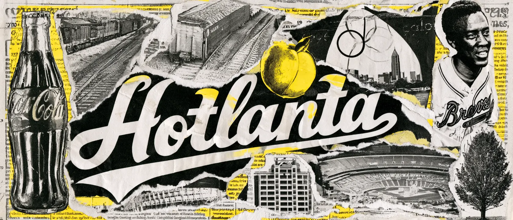
Atlanta started as a place things moved through.
Before it became Atlanta, the city grew around a railroad terminus. The town was first called Terminus, then Marthasville, and later Atlanta. The rail lines helped shape the city as a place where people, goods, teams, and ideas moved through the South.
That history gave us a useful design lens for ATL Fitness. The collection did not need a slow or overbuilt mark. It needed a mark that could move fast.
ATL already does that work. It reads like a city nickname, a travel code, and a training mark at the same time. It is short enough for a hat. Big enough for a back print. Clear enough for a coach tee. Strong enough to carry a full drop.
Atlanta also has a strong public graphic history. The 1996 Olympic Games gave the city one of its biggest visual moments, with marks used across shirts, banners, buildings, murals, pins, badges, and medals.
That matters here because ATL Fitness is also an apparel-first identity. The graphic has to work on the garment, not just on a screen.
The Coca-Cola connection adds another layer. Atlanta has long understood the power of letters that can travel. We did not copy that history, but we used the same basic lesson: simple letters can carry a lot when they are built with the right rhythm.
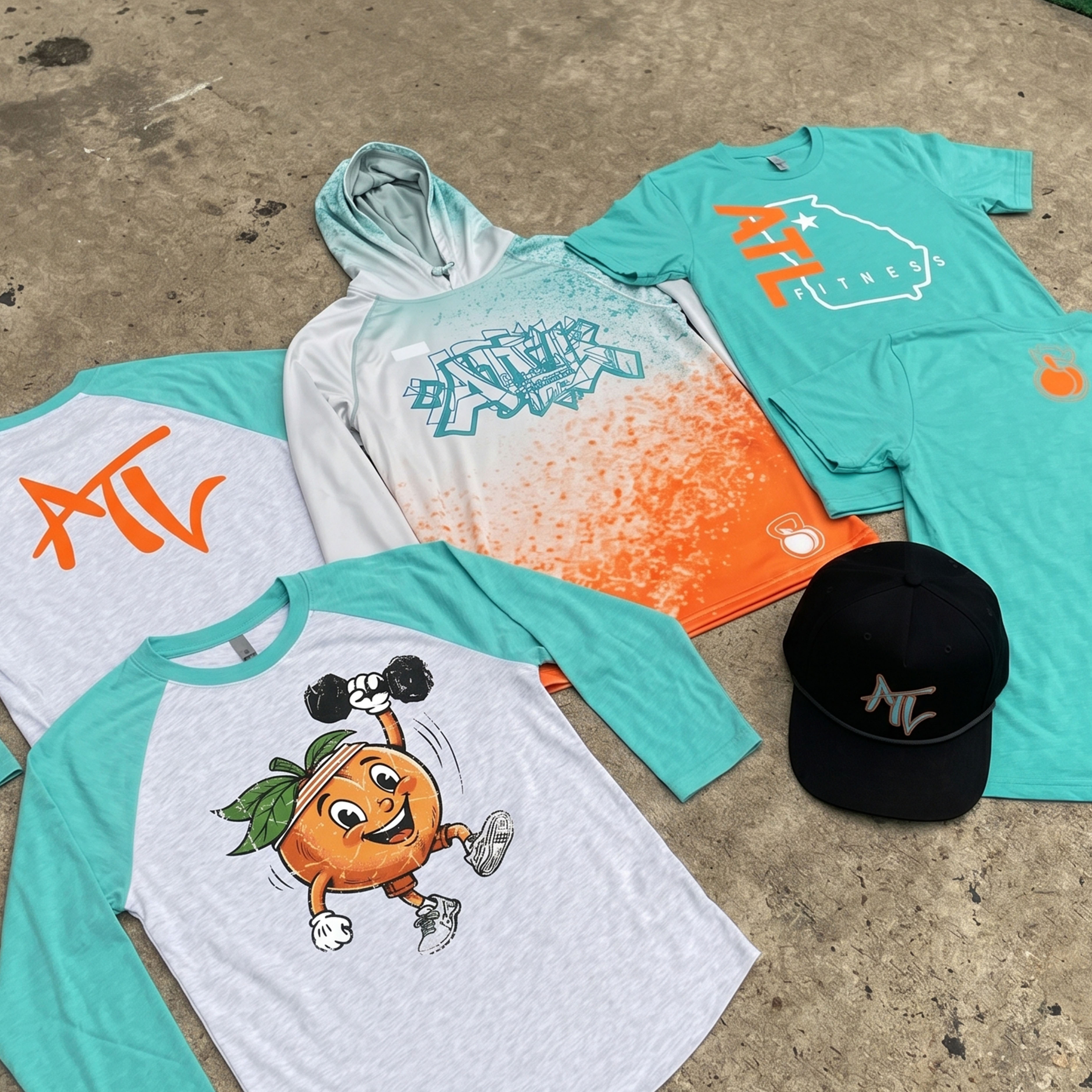
The full collection uses several connected marks instead of repeating one logo across every garment.
Concept + Design Rationale
ATL works because it is short and flexible. In other words, it works well across different garment types and media. For instance, it can sit large on a tee. It can shrink onto a hat. It can mark the back of a raglan. It can live inside the Georgia outline.
That flexibility shaped the collection. Instead of using one logo the same way on every piece, we built several connected marks: the block ATL state graphic, the loose ATL script, the coach back type, the peach mascot, the kettlebell-peach icon, and the graffiti-style ATL hoodie graphic.
Color System
Gate City Aqua
Bright athletic base
Peach Rep Orange
State cue, heat, contrast
Asphalt Black
Streetwear anchor
Warm-Up Lavender
Softer lifestyle lane
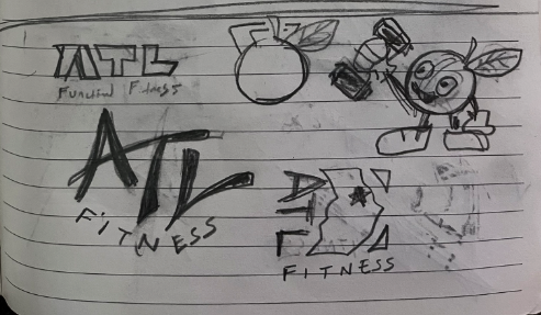
Early thumbnail sketches showed where our head was at with the core marks. We always design with the end in mind, so we know walking into a project that we are going to need a system of marks in order to properly match the merchandising pieces. In fact, we typically choose the garments before we build the identity graphics. This ensures both the merchandising and design choices are compatible and optimized.
The sketch phase is where the state shape, ATL lettering, peach character, and smaller icon language started to separate into clear merch roles.
The peach became the character piece in the collection. Georgia’s connection to the peach is already well known, so the goal was not just to place a peach on a shirt. The goal was to turn a familiar state symbol into a training graphic.
The dumbbell, sneakers, gloves, headband, and motion lines move the peach out of basic souvenir territory. It becomes a gym character with movement, sport, and a clear connection to ATL Fitness.
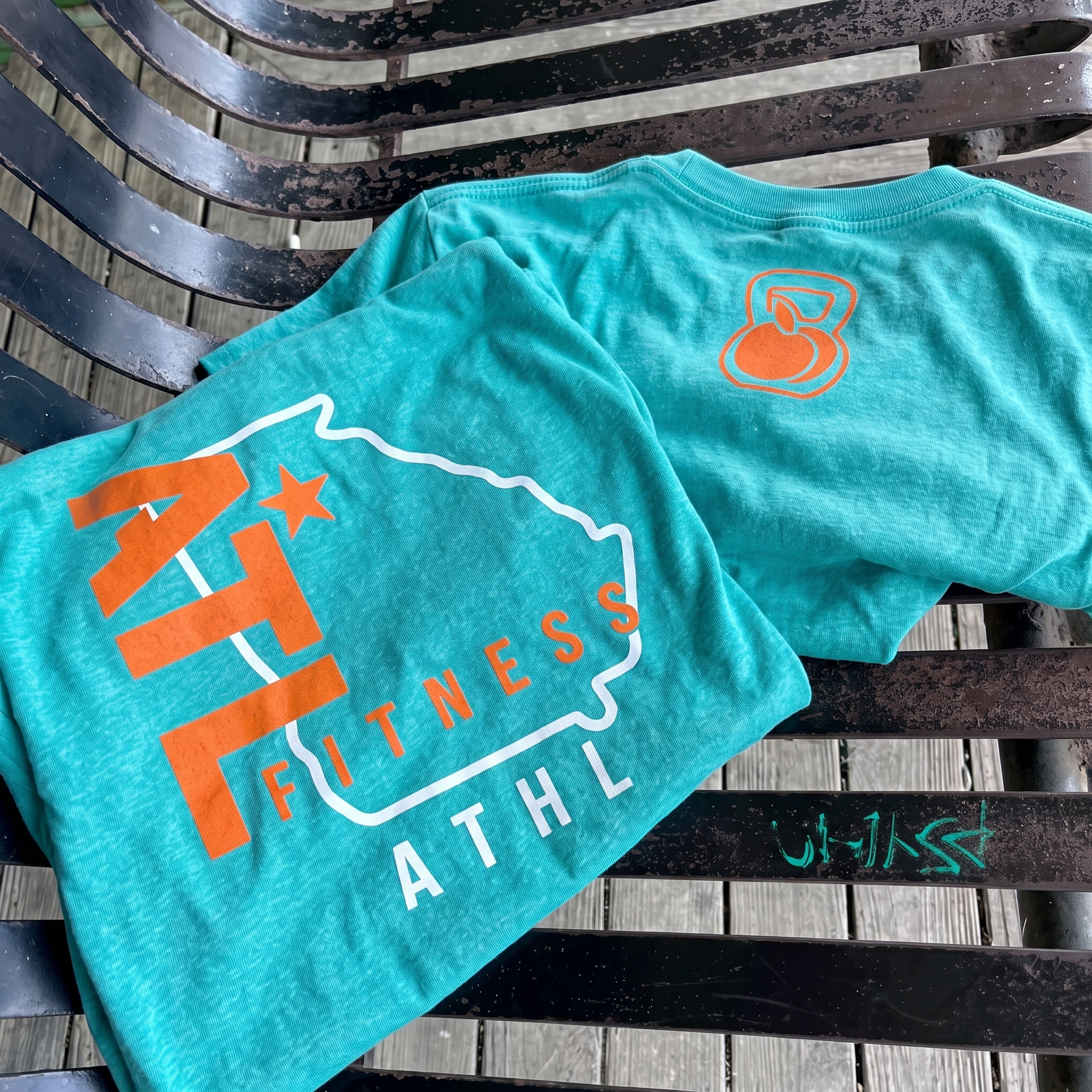
The ATL State Tee
The Georgia outline anchors the shirt locally, while the large ATL type keeps the design readable from a distance.
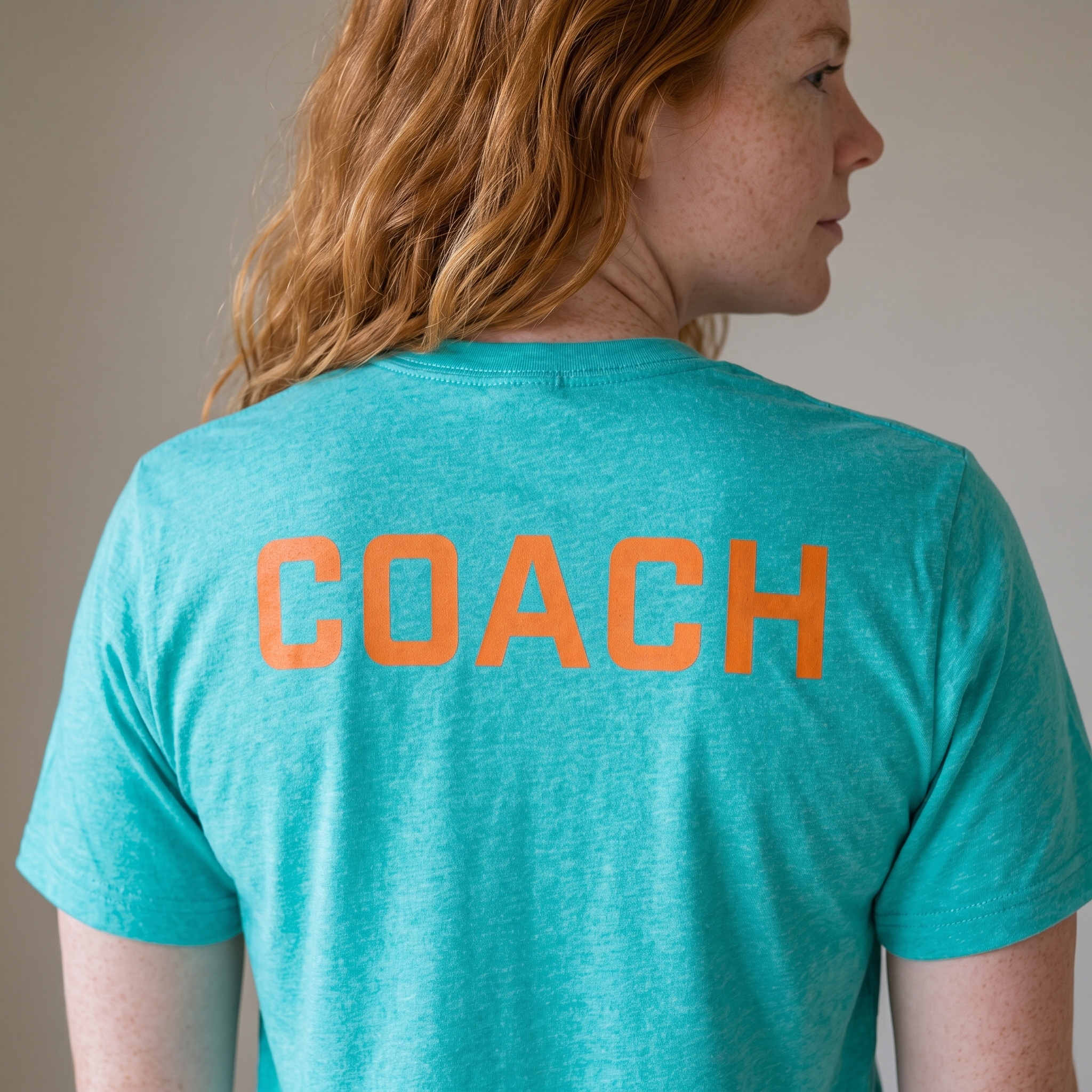
The Coach Back Tee
Designed for clarity.
The coach back uses direct type and high-contrast orange to make staff easy to identify in the gym.
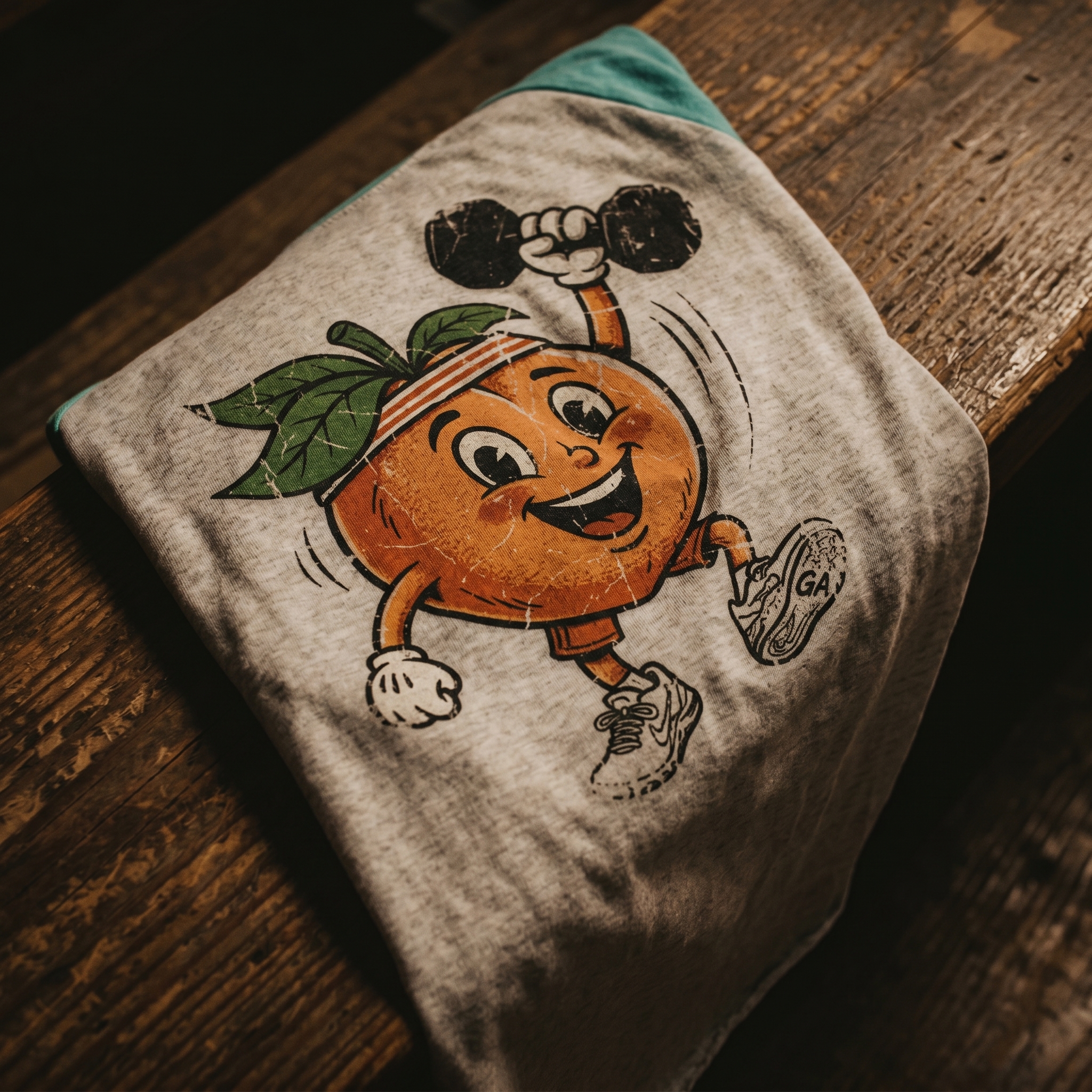
The Mascot Raglan
The strongest character moment.
The lifted peach turns a familiar Georgia symbol into a training character with motion, sport, and vintage apparel texture.
The Street Hoodie
A more expressive city lane.
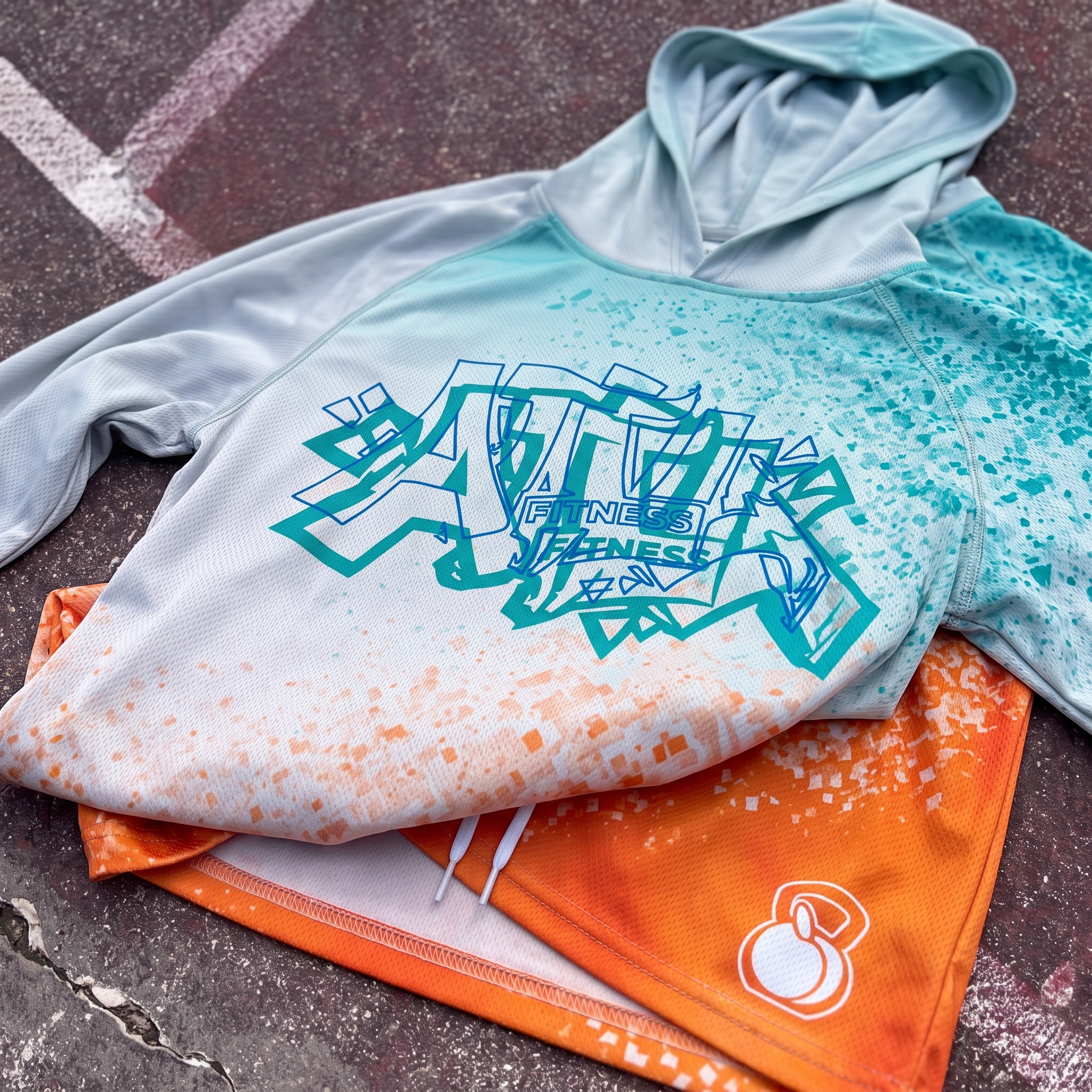
The hoodie adds a street-driven ATL mark, splatter texture, and a matching kettlebell-peach detail to expand the system beyond core tees.
The Rope Hat
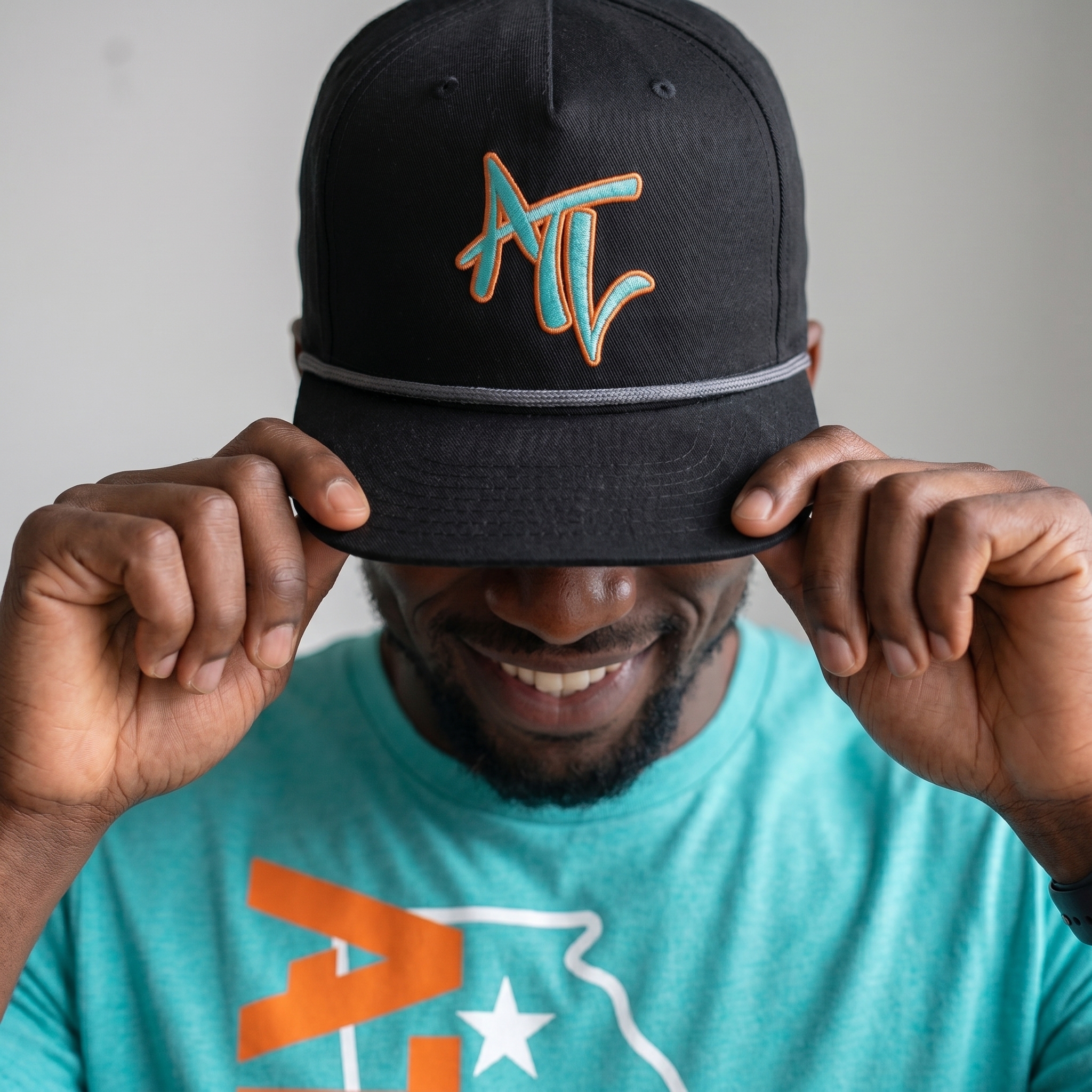
Testing the mark at embroidery scale.
The embroidered rope hat uses the same aqua and orange palette, but shifts the ATL mark into a smaller everyday format.
UNITEE Design Lab
Concept cars for custom gym apparel.
The UNITEE Design Lab works like concept cars for gym apparel. We start with an idea, then turn it into a real concept people can see: a shirt, hat, hoodie, uniform set, or full merch drop. Then we explain the thinking behind it. Why this garment? Why this graphic? Why this placement? Why this kind of finish? The work is built to inspire, test new ideas, and give our clients better custom gym apparel before they ever place an order.
For larger fitness brands, multi-location gyms, event groups, and enterprise clients, the Design Lab is where brand kits and full merch programs take shape. We build the look, then we print the gear. That means the same team can help shape the brand story, plan the apparel, design the graphics, and produce the final pieces.
For an independent gym owner, the value is simple: you get the benefit of our research and development without needing to buy a full brand package. Your order may be a small run of tees, hats, hoodies, or event shirts, but the thinking behind it comes from a team that studies gym merch every day.
Need better gym merch?
Tell us what you are trying to make. We can help with one shirt, a full drop, or a larger apparel program.
Start a Design Lab Conversation