
UNITEE Design Lab / Indianapolis, Indiana
Victory Lift Co
Indianapolis has a visual language built around the finish line. Checkered flags, race numbers, pit crews, speed, timing, and the word victory all carry real weight here. For Victory Lift Co, the goal was to build gym apparel that connected that racing energy to training culture without making every piece feel like a souvenir from the Speedway.
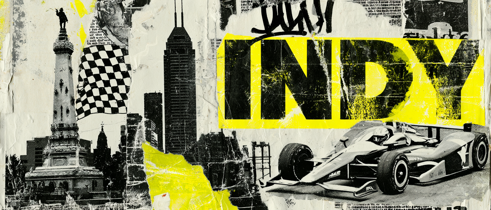
Indianapolis As A Finish-Line Language
A city built around the center and the race.
Indianapolis is often called Circle City because of Monument Circle, the downtown center point built around the Soldiers and Sailors Monument. That gives the city a strong visual anchor: a circle, a center, and a civic mark that feels easy to build around.
The other major visual language is racing. Indianapolis is tied to the Indianapolis Motor Speedway and the Indy 500, which gives the city a clear set of design cues: checkered flags, number plates, pace, track lines, speed marks, and victory lane.
For a gym named Victory Lift Co, those cues made sense. Victory is not just a winning word here. It connects to the city. It connects to racing. It connects to training. Every rep is a small lap. Every workout is a timed effort. Every coach acts a little like a pit crew.
The apparel system uses that idea in layers. The script mark gives the brand a clean athletic feel. The checkered flags bring in the race language. The Indiana outline localizes the pieces. The engine-and-barbell back graphic turns horsepower into human power.
The result is not one racing shirt. It is a collection with a full pace: staff gear, joggers, hats, raglans, graphic tees, and local marks all built around the same Indianapolis idea.
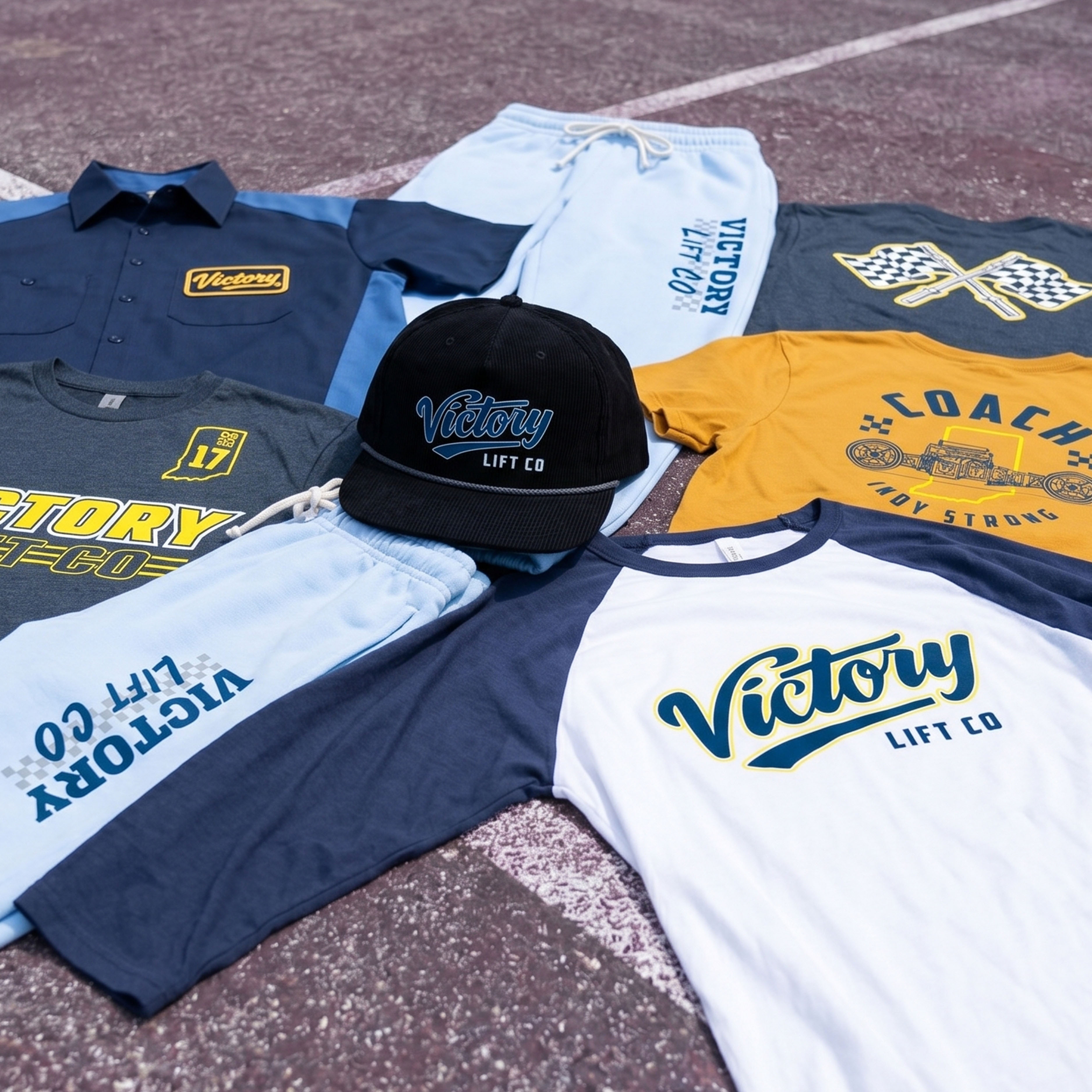
The Collection brings the full system together: script tees, checkered flag graphics, coach gear, joggers, headwear, race-style marks, and a navy / gold / light blue palette built around Indianapolis.
Concept + Design Rationale
The concept starts with the word Victory. In most gyms, that word could feel generic. In Indianapolis, it becomes specific. It points to the track, the finish line, the flag, and the work it takes to get there.
The system uses racing cues without letting them take over the gym identity. Checkers become texture. Flags become icons. The Indiana outline becomes a local marker. The engine detail becomes a strength symbol when paired with a barbell.
The collection was designed to move between two lanes. One lane is clean and wearable: the script Victory mark, the rope hat, and the raglan. The other lane is louder: the coach back, checkered flag tee, joggers, and Indy Strong graphic.
Together, the pieces feel like a team kit for a gym that trains with pace, structure, and finish-line energy.
Color System
Victory Gold
Energy, speed, and race-day emphasis
Track Navy
Primary athletic base and contrast
Pit Blue
Secondary color for joggers and raglans
Garage Grey
Soft neutral for coach and lifestyle pieces
Flag Black
Headwear, outlines, and grounding detail
Indy Strong Coach Tee
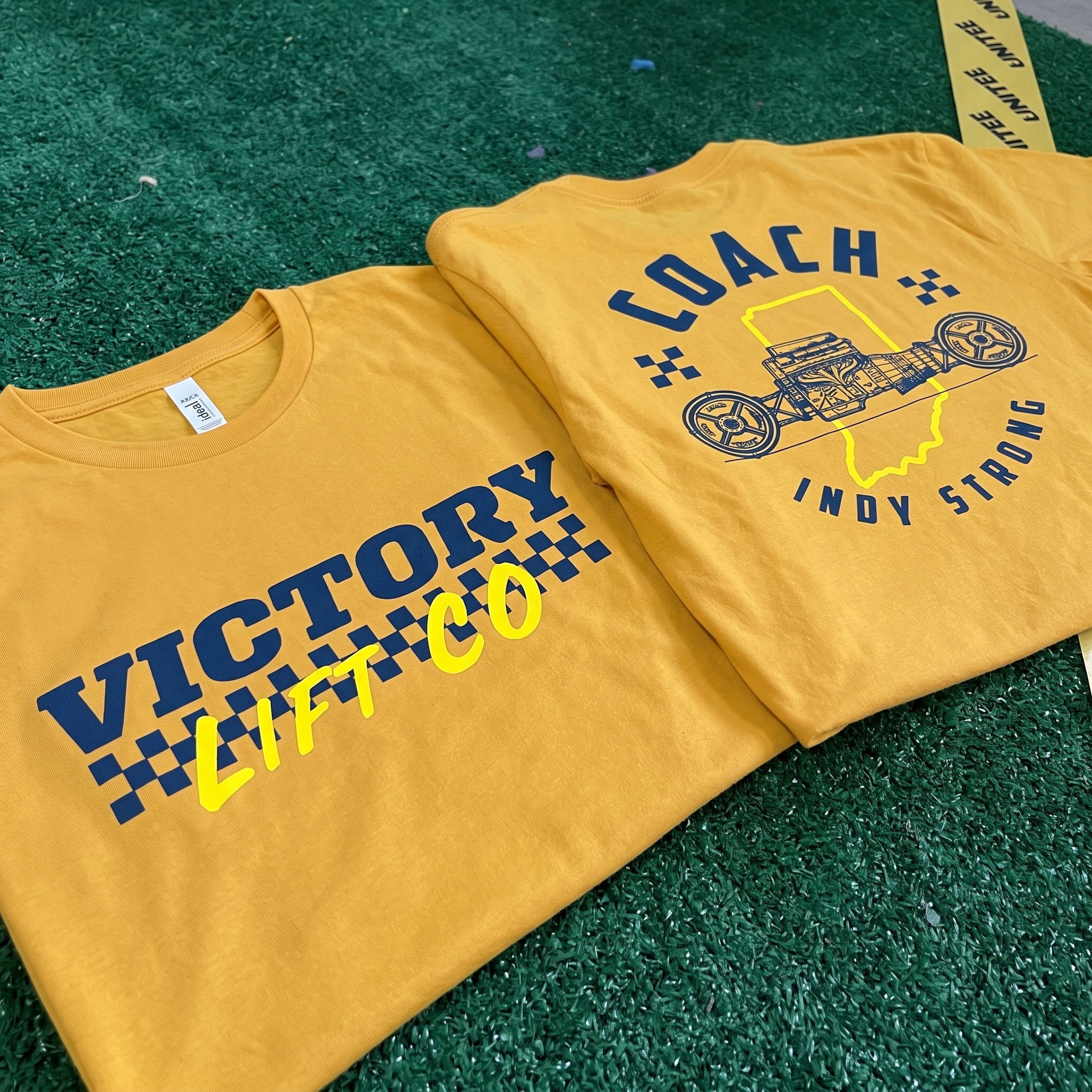
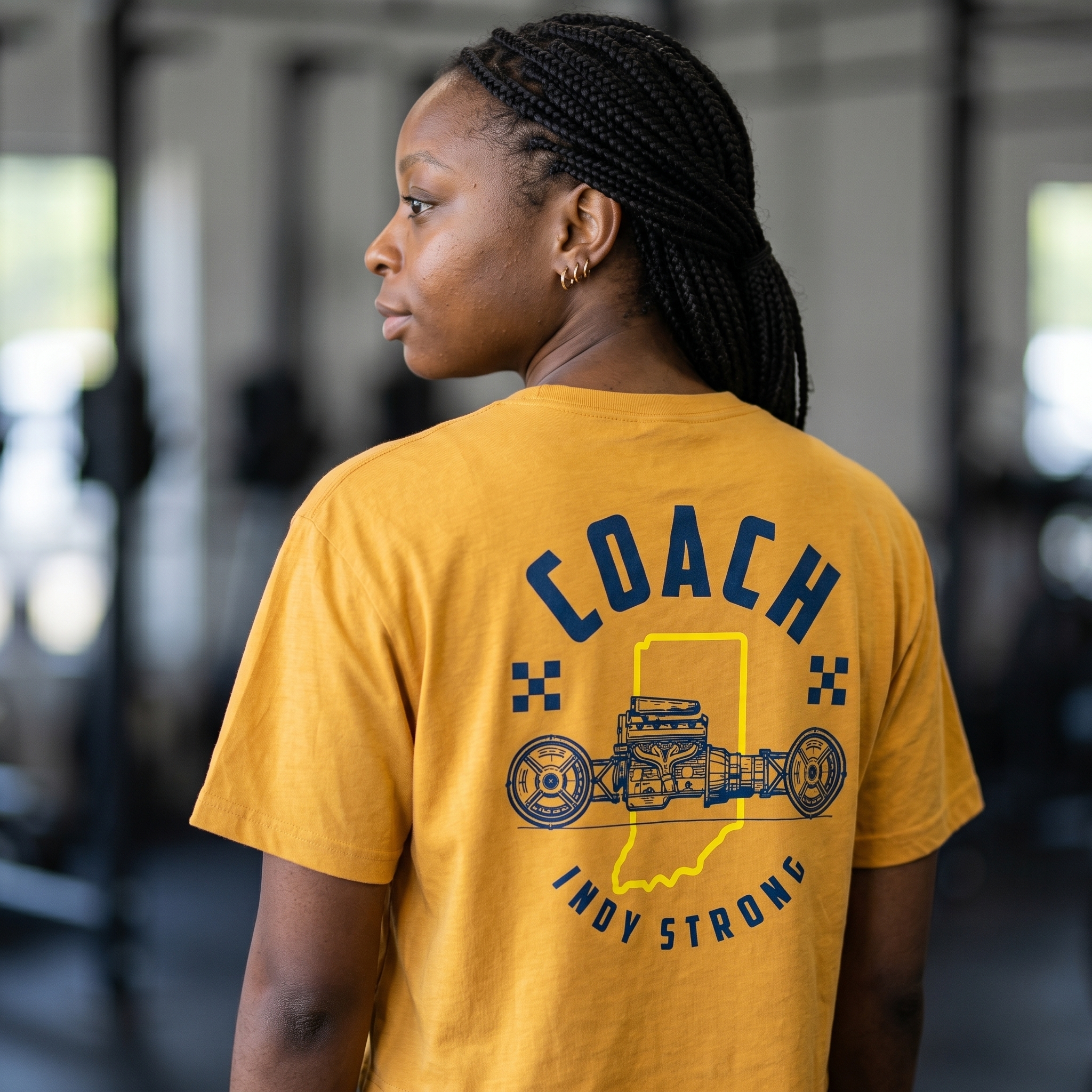
The yellow coach tee uses the Indiana outline, engine detail, and curved coach type to turn the staff piece into one of the most local garments in the system.
Victory Script Raglan
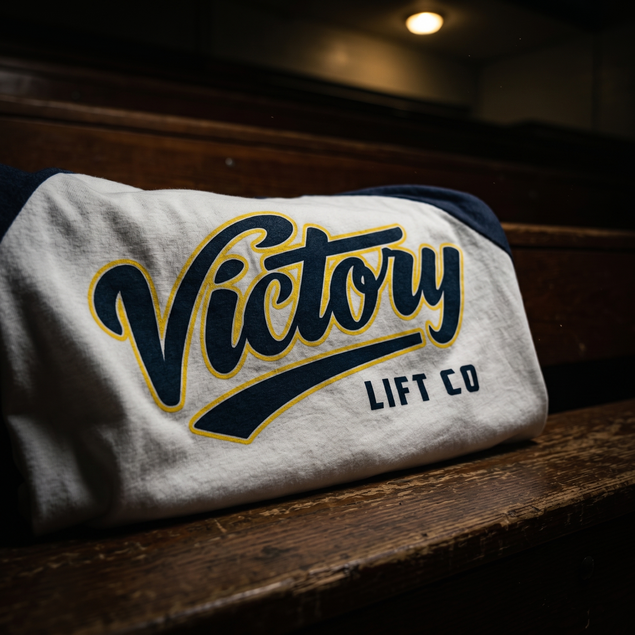
The raglan gives the drop its cleanest retro lane, using script lettering and navy sleeves to make the Victory mark feel athletic and easy to wear.
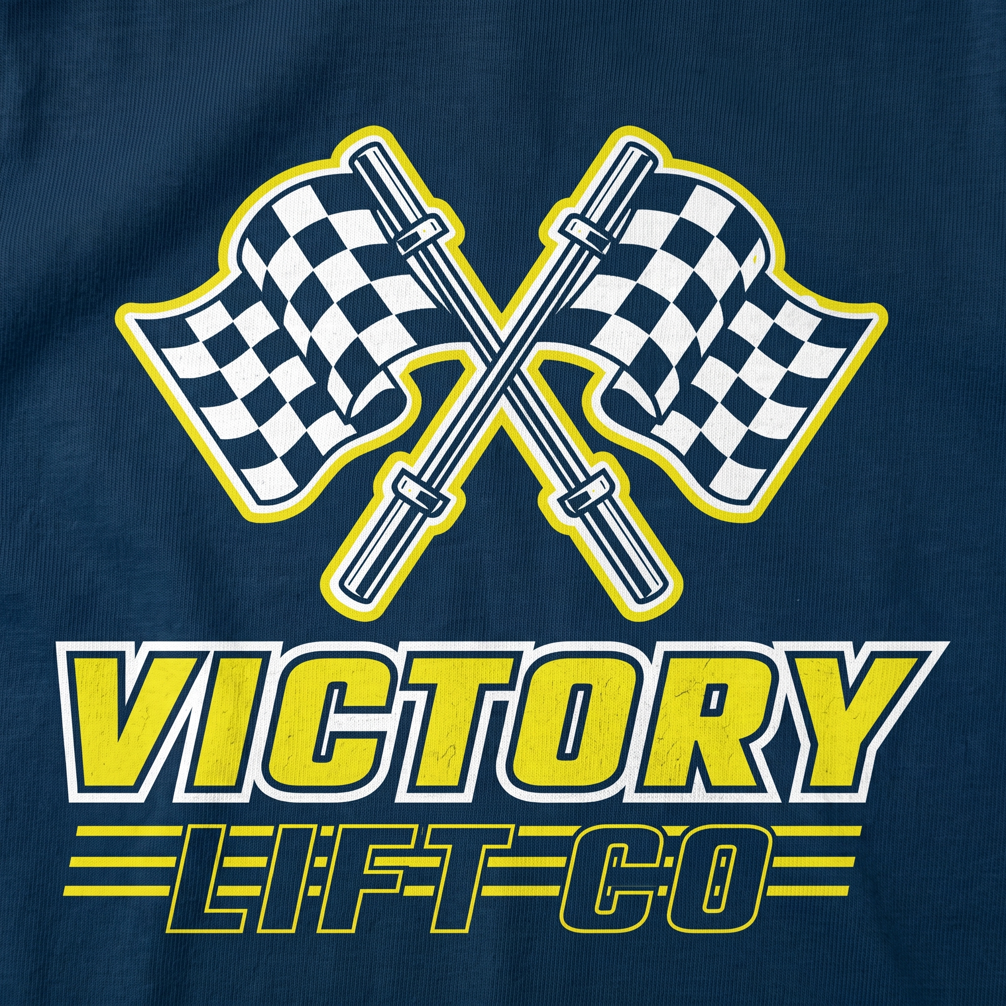
Checkered Flag Tee
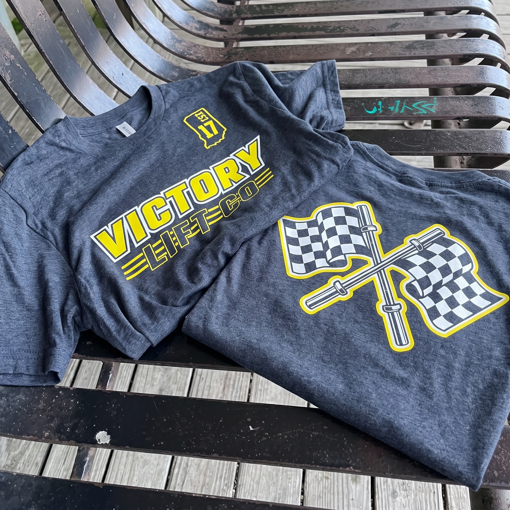
The checkered flag tee turns the finish-line symbol into a gym graphic by crossing the flags with barbells and setting the mark in a bold race-style layout.
Pit Lane Joggers
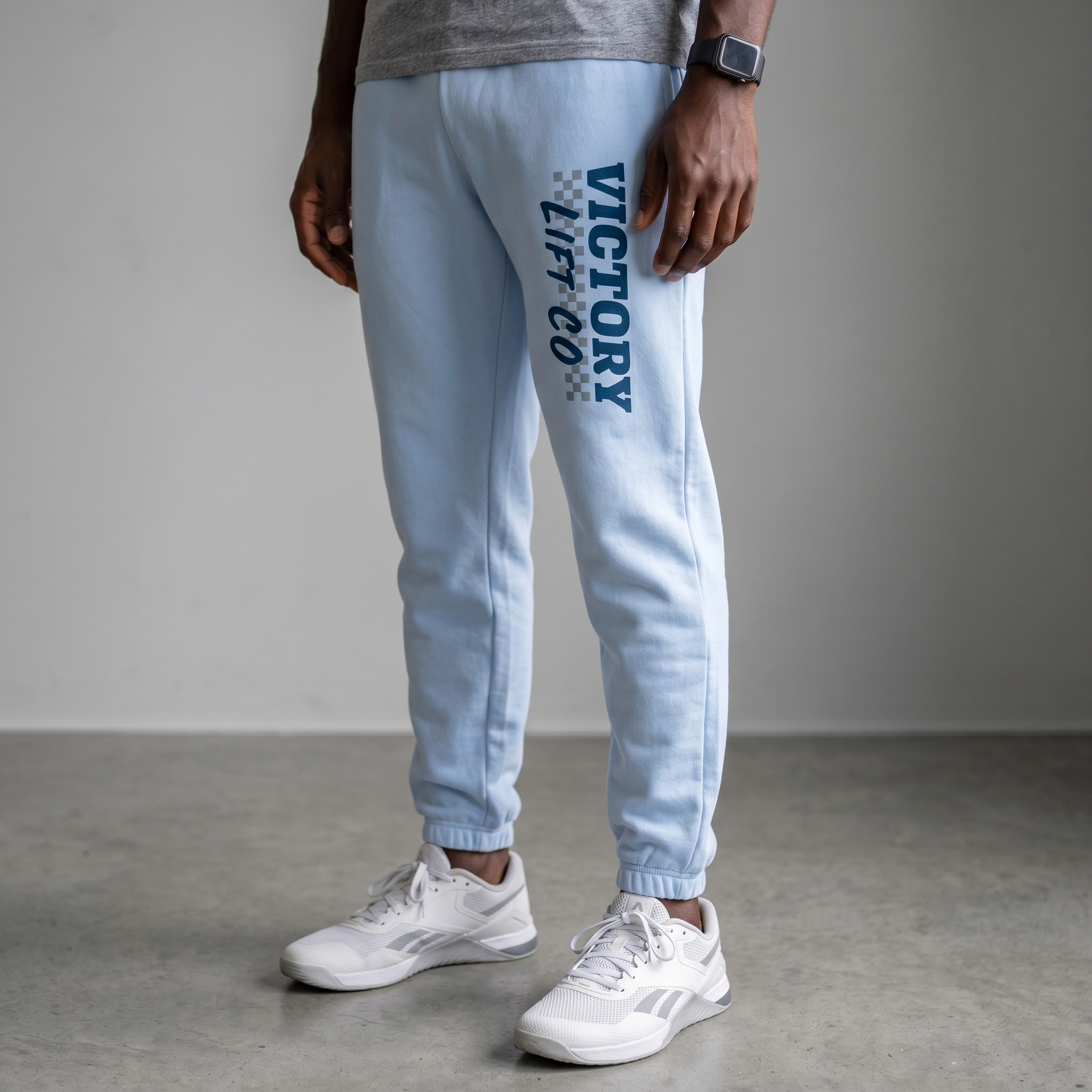
The light blue joggers carry the Victory Lift Co mark down the leg with checkered details, making the lower-body piece feel fully connected to the collection.
Indy Strong Coach Back
The coach back graphic uses a big readable arc, checkered side marks, and the Indy Strong line to make staff easy to spot while keeping the piece rooted in place.
Victory Rope Hat
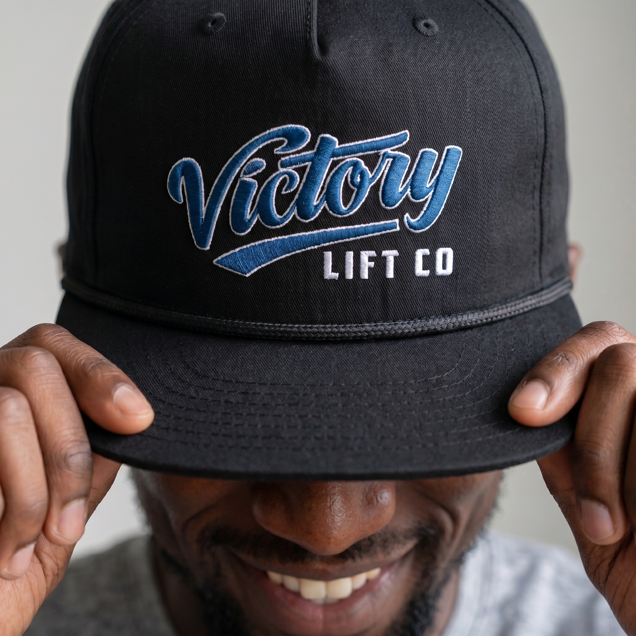
The black rope hat moves the Victory script into embroidery, giving the collection a finished everyday piece that can live outside the gym.
Pit Crew Button-Down
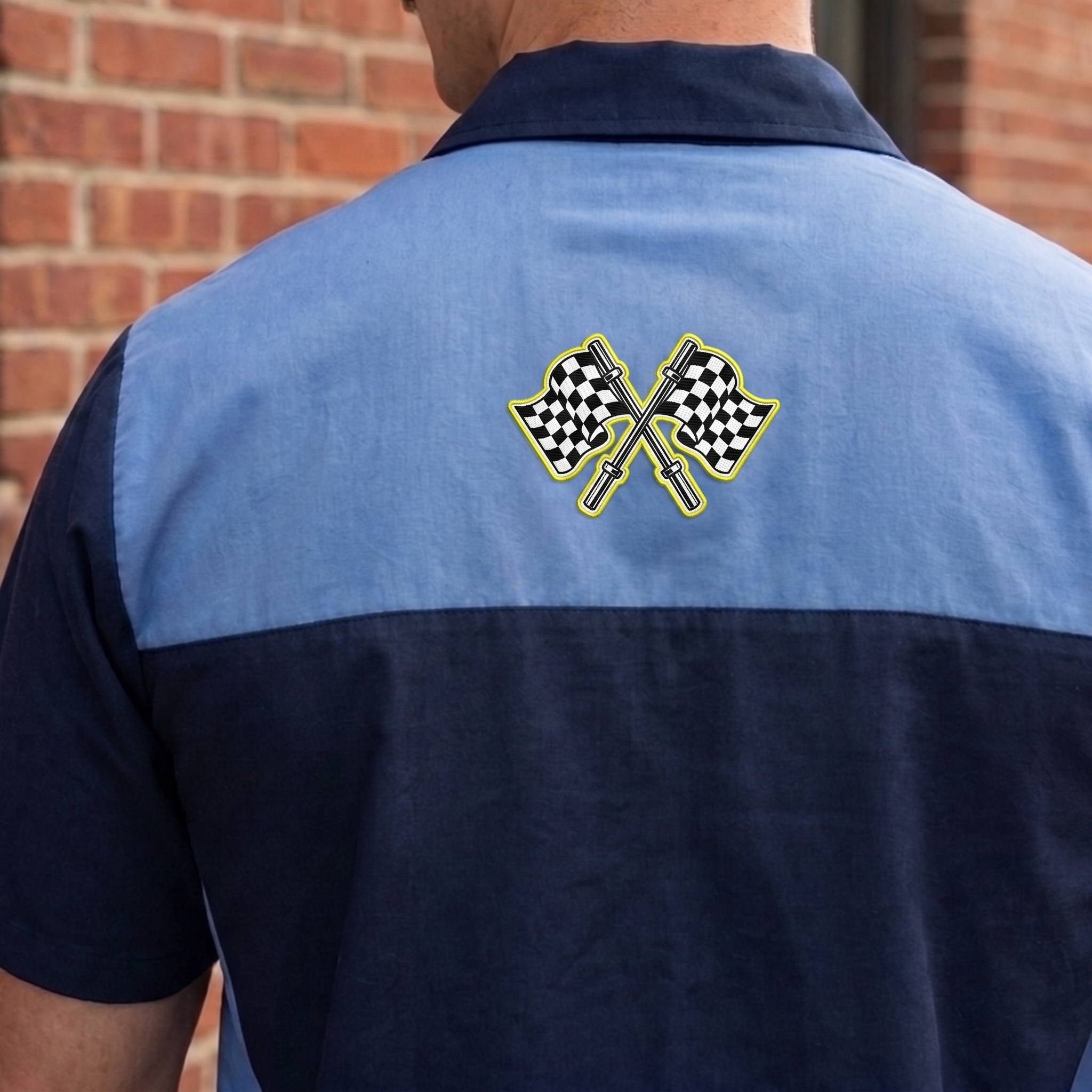
The button-down gives the Victory Lift Co system a clean pit-crew layer, using the blue color block and back-neck placement to make the piece feel more like team gear than standard gym merch. The crossed checkered flags and barbell detail keep the Indianapolis racing reference tight, small, and premium.
UNITEE Design Lab
Concept cars for custom gym apparel.
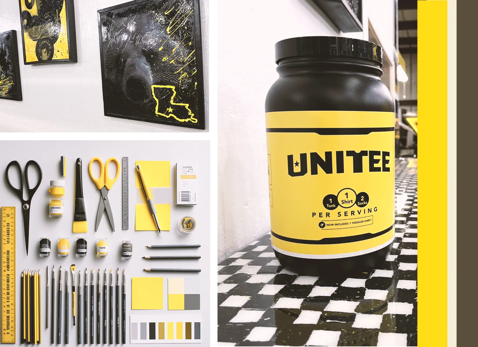
The UNITEE Design Lab works like concept cars for gym apparel. We start with an idea, then turn it into a real concept people can see: a shirt, hat, hoodie, uniform set, or full merch drop. Then we explain the thinking behind it. Why this garment? Why this graphic? Why this placement? Why this kind of finish? The work is built to inspire, test new ideas, and give our clients better custom gym apparel before they ever place an order.
For larger fitness brands, multi-location gyms, event groups, and enterprise clients, the Design Lab is where brand kits and full merch programs take shape. We build the look, then we print the gear. That means the same team can help shape the brand story, plan the apparel, design the graphics, and produce the final pieces.
For an independent gym owner, the value is simple: you get the benefit of our research and development without needing to buy a full brand package. Your order may be a small run of tees, hats, hoodies, or event shirts, but the thinking behind it comes from a team that studies gym merch every day.
Need better gym merch?
Tell us what you are trying to make. We can help with one shirt, a full drop, or a larger apparel program.
Start a Design Lab Conversation