
UNITEE Design Lab / Toronto, Ontario
Dominion
Toronto gives this collection a sharp national language: Lake Ontario, the CN Tower, downtown grid lines, maple leaf symbolism, waterfront concrete, red-and-white flag references, black athletic contrast, and the civic shorthand of TOR / CA.
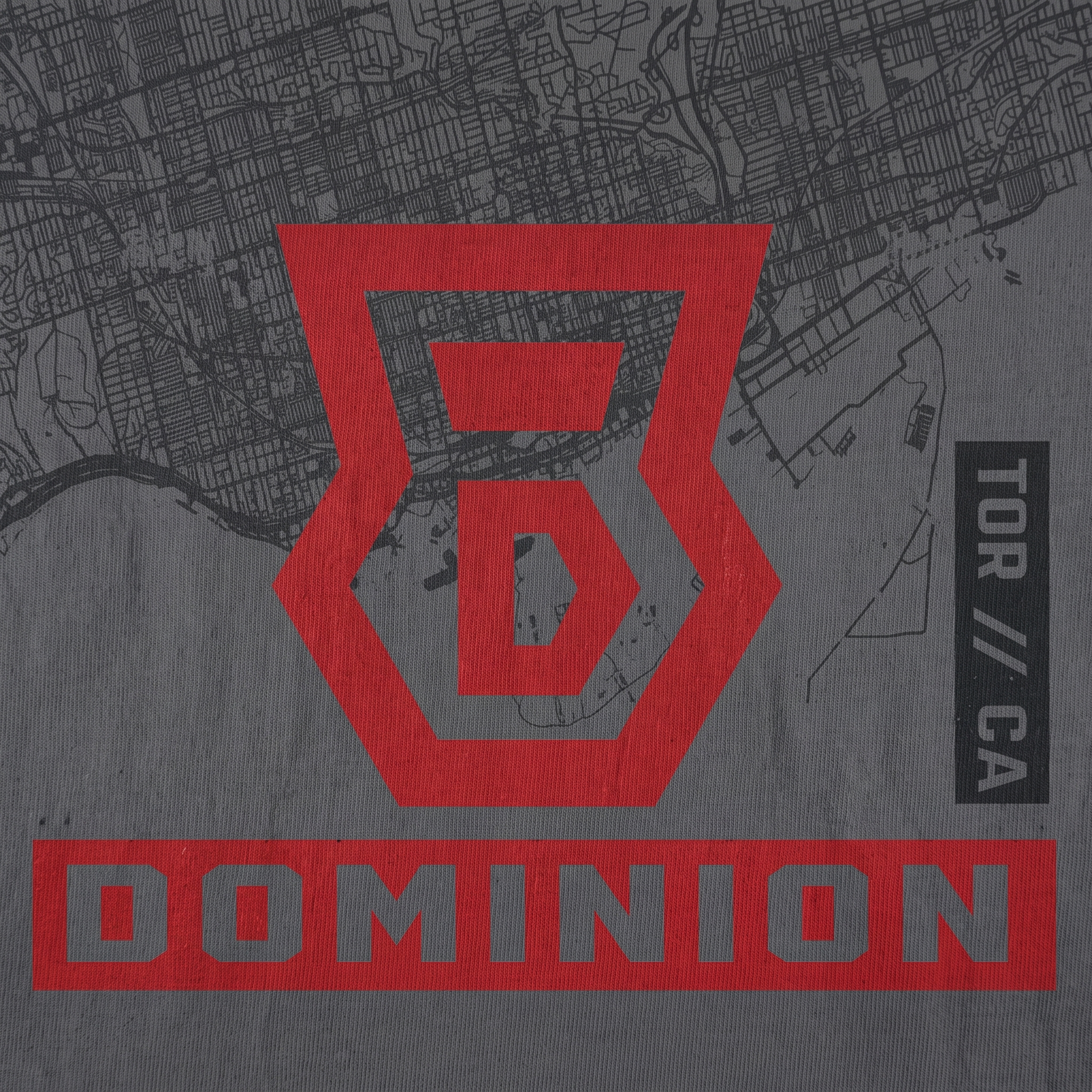
For Dominion, the design system leans into Canadian strength without becoming a tourist shirt. The collection uses a hard shield monogram, vertical block type, maple leaf and barbell references, red-black contrast, ash grey fleece, tonal coach graphics, and map texture to build a Toronto gym identity with national weight.
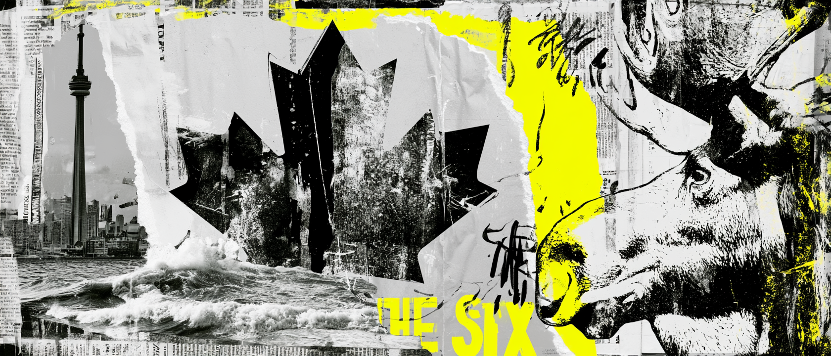
Toronto, Dominion, Lake Ontario, And Canadian Identity
National Weight, City Structure.
Toronto sits on the traditional territory of many nations, including the Mississaugas of the Credit, the Anishnabeg, the Chippewa, the Haudenosaunee, and the Wendat peoples. Its position on Lake Ontario made it a place of movement long before it became Canada’s largest city: shoreline, river mouths, trade routes, port access, and later rail and industry all shaped how Toronto grew. That layered geography informed the collection’s map texture, shoreline references, and hard city-grid structure.
The colonial town was renamed York in 1793 when John Graves Simcoe chose it as the capital of Upper Canada, then the name Toronto returned when the town was incorporated as a city in 1834. That switch from York to Toronto gives the city a built-in identity story: old British structure on top of an older Indigenous place name, followed by a modern city that kept growing outward. The Dominion graphics echo that tension through formal block type, old-athletic crest shapes, and a system that feels both historical and current.
The name Dominion ties directly into Canada’s national story. The Dominion of Canada was officially born on July 1, 1867, and the maple leaf flag became the country’s modern visual symbol when it was raised for the first time in 1965. The collection uses those references with restraint: a maple leaf becomes part of a barbell flag, red becomes the key national color, and ash grey fleece creates a colder, northern base instead of a loud souvenir palette.
Toronto’s modern skyline gives the system its sharper edge. The CN Tower was completed in 1975 and opened to the public in 1976, becoming the city’s most recognizable vertical landmark. That verticality shows up in the tall Dominion chest print, the jogger leg hit, the coach back type, and the TOR / CA sleeve-style marks. The result is a design system built from real Toronto cues: lake, tower, grid, flag, national history, and a strong black-red-grey athletic language.
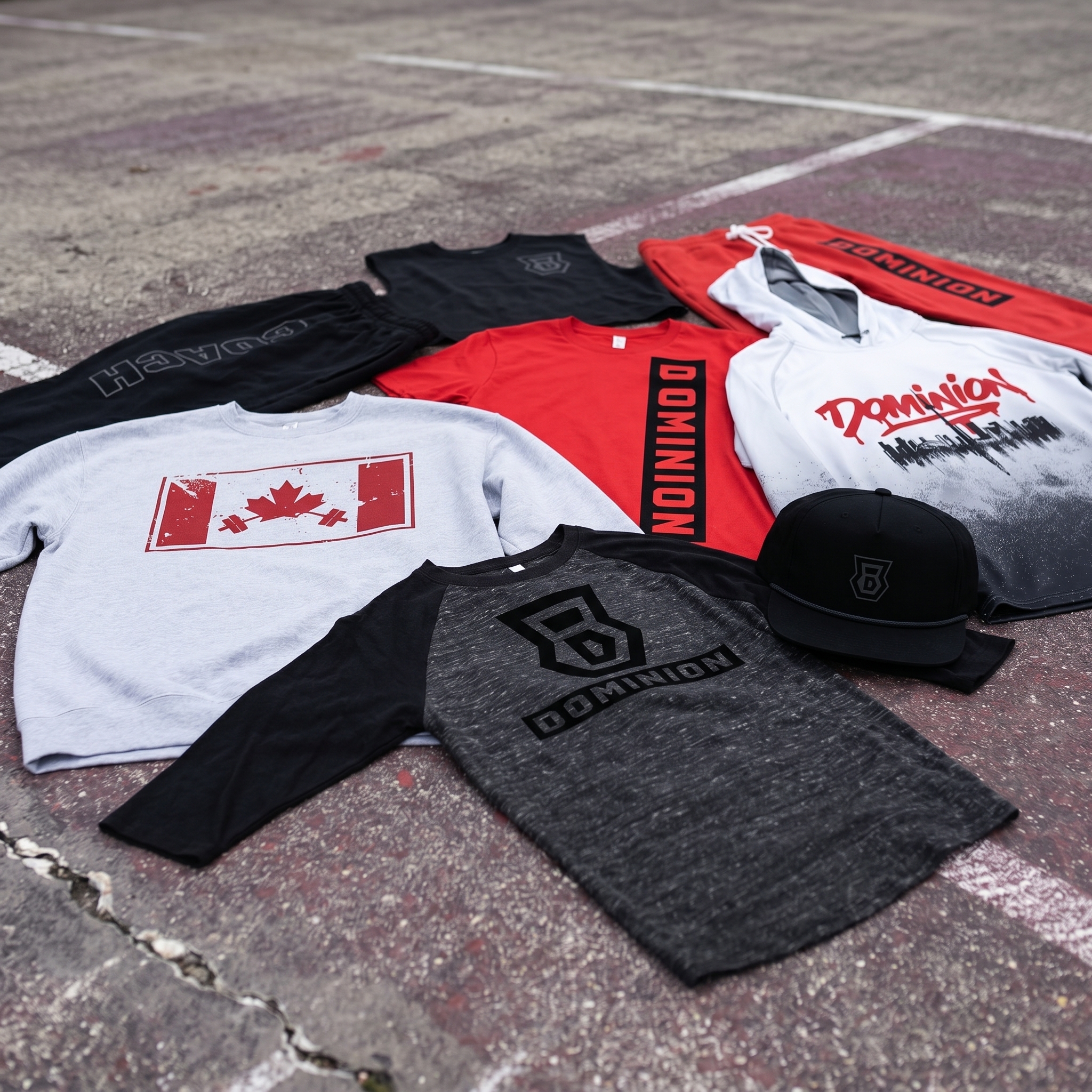
The collection brings the full Dominion system together: maple leaf barbell fleece, red vertical Dominion tee, black tonal coach pieces, ash raglan, rope cap, joggers, skyline hoodie, and a red / black / grey palette built around Toronto and Canadian national identity.
Concept + Design Rationale
The collection starts with the name. “Dominion” carries Canadian history, weight, and authority, so the graphics had to feel less like a casual city drop and more like a national strength program. The system uses direct typography, heavy blocks, and a strong monogram to create that tone.
The primary mark is a shield-style B / D monogram. It was built to feel like a sports crest, a weight-room badge, and a civic emblem at the same time. The hard angles make the identity feel structured, while the interior letterform gives the gym a simple mark that can work on hats, tees, fleece, and tonal prints.
The maple leaf and barbell flag graphic gives the collection its clearest Canadian moment. Instead of using the national flag literally, the design rebuilds it for a gym: the maple leaf stays central, the side bars remain, and the barbell creates the training reference.
The final system is intentionally restrained. Red carries the national energy, black gives the line weight, grey references Toronto concrete, lakefront weather, and winter fleece, and tonal printing gives the coach apparel a quieter, more premium training feel.
Color System
Dominion Red
Primary national color used for flag references, vertical type, joggers, and the strongest Toronto pieces
Iron Black
Used for monograms, coach pieces, hats, heavy contrast, and the weight-room side of the system
Ash Grey
Fleece base color inspired by Canadian winter wear, concrete, cloud cover, and rink-adjacent athletic basics
Map Charcoal
Used for tonal map textures, raglan bodies, and dark city-grid references
Flag White
Clean support color for flag balance, drawcords, contrast marks, and logo separation
Lake Steel
Secondary grey-blue tone tied to Lake Ontario, skyline haze, and cold waterfront atmosphere
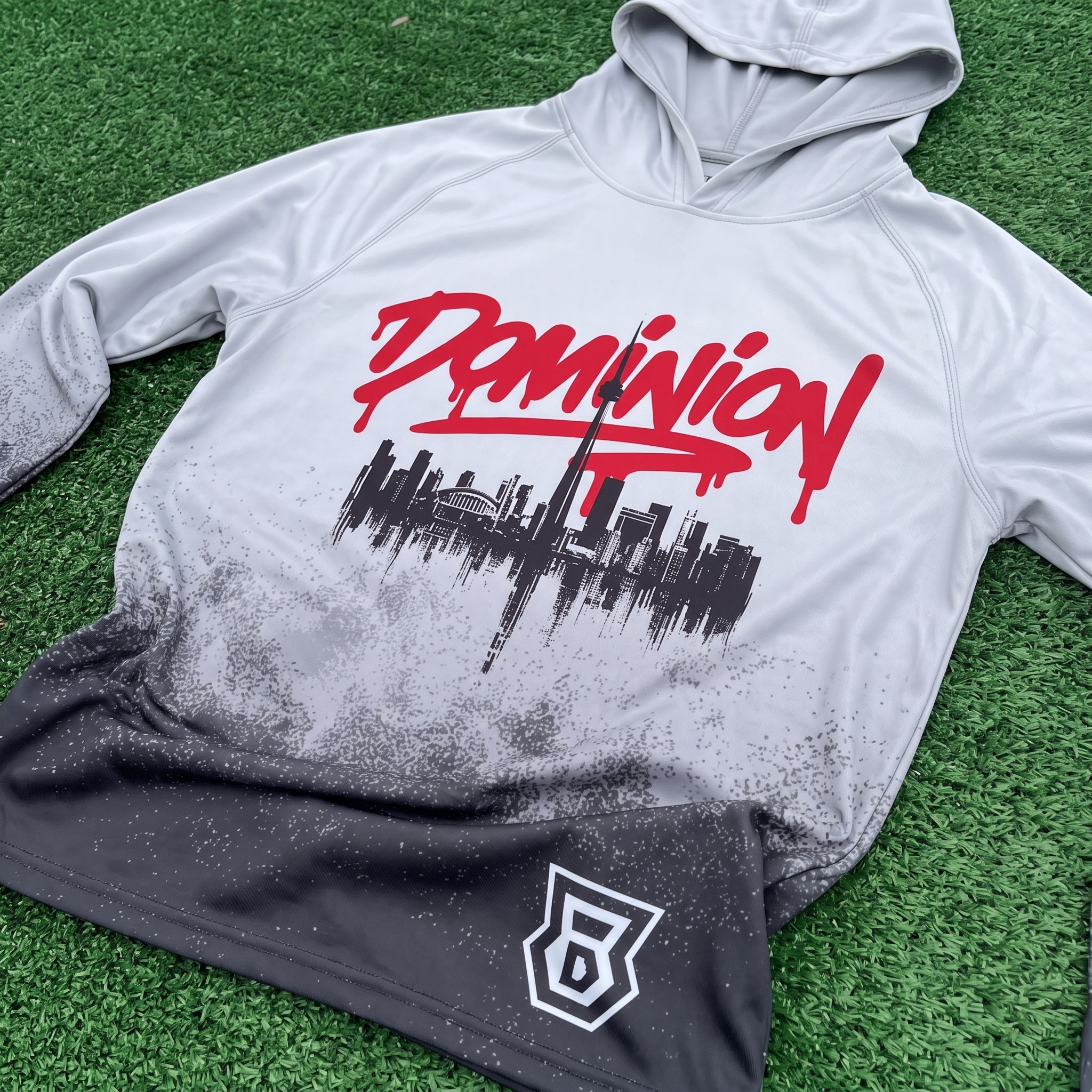
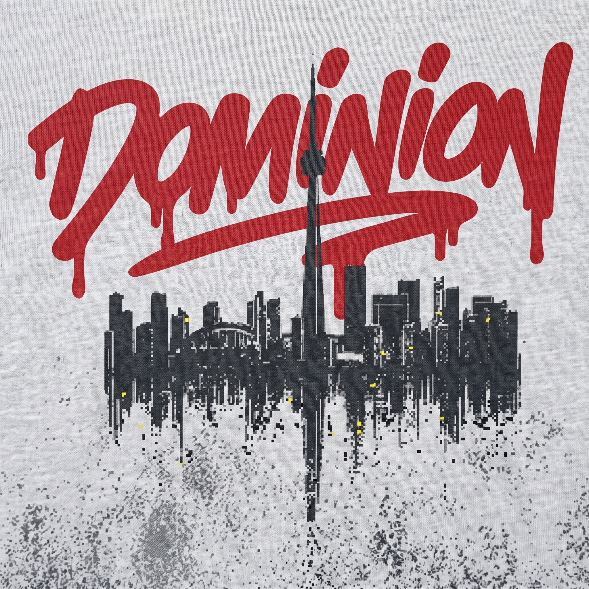
Performance Hoodie
A performance hoodie featuring the TOR skyline and a drip logo.
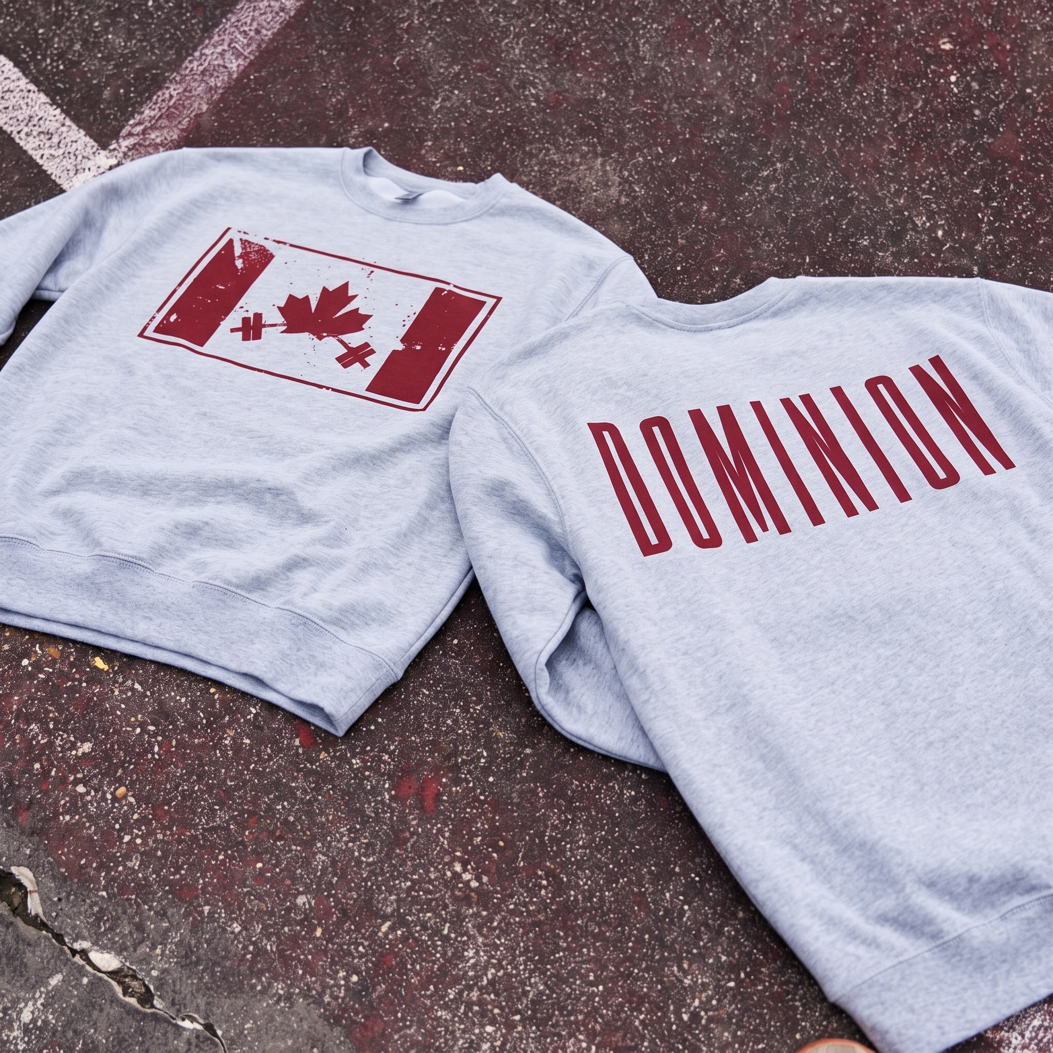
Canada Barbell Crewneck Sweater
The Canada Barbell Crew turns the national flag idea into a strength graphic by placing the maple leaf between barbell ends. The distressed red print was used to keep the fleece from feeling too polished and to give the national symbol a weight-room texture.
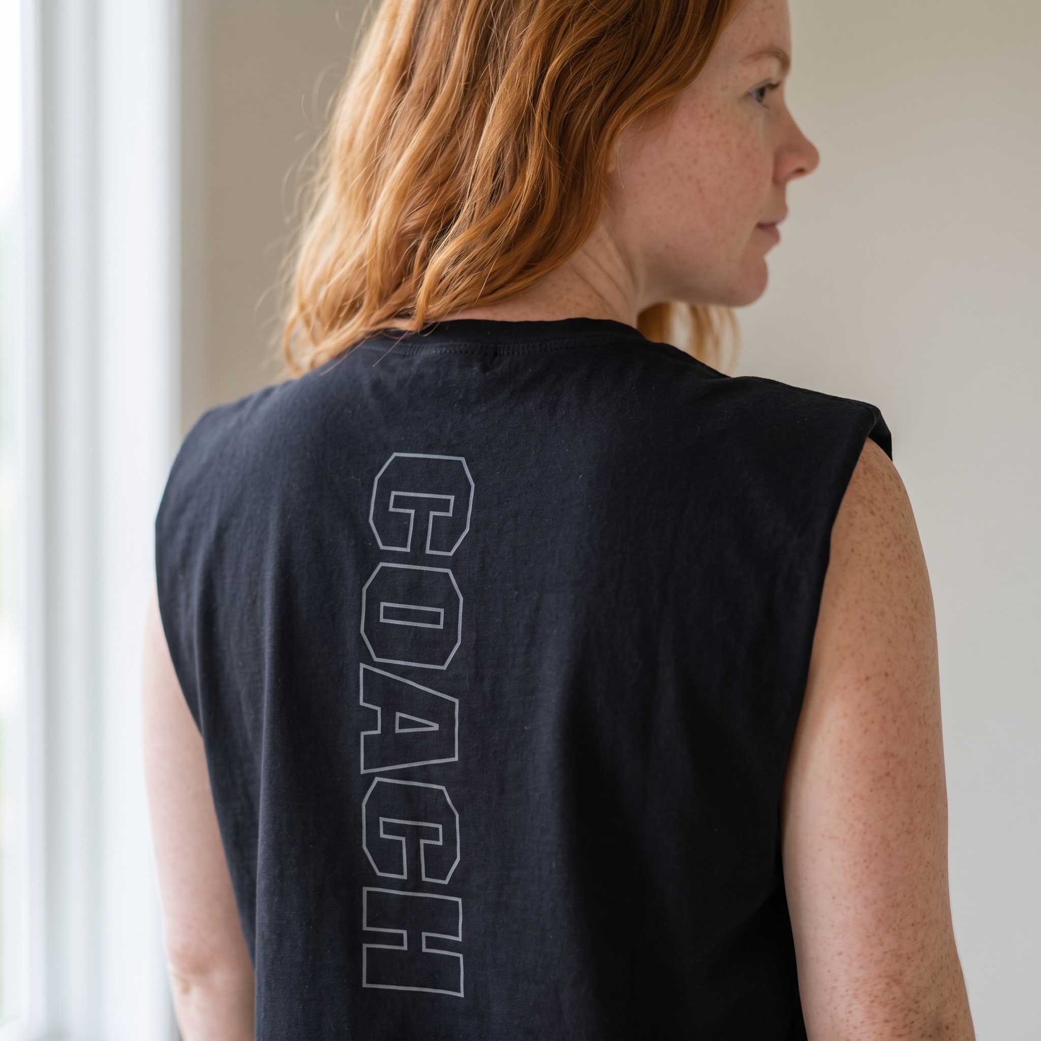
Coach Column Muscle
The coach muscle uses a vertical back print that turns a staff label into a strong graphic column. The tonal black-on-black treatment was chosen to make the piece feel premium and understated while still reading clearly up close.
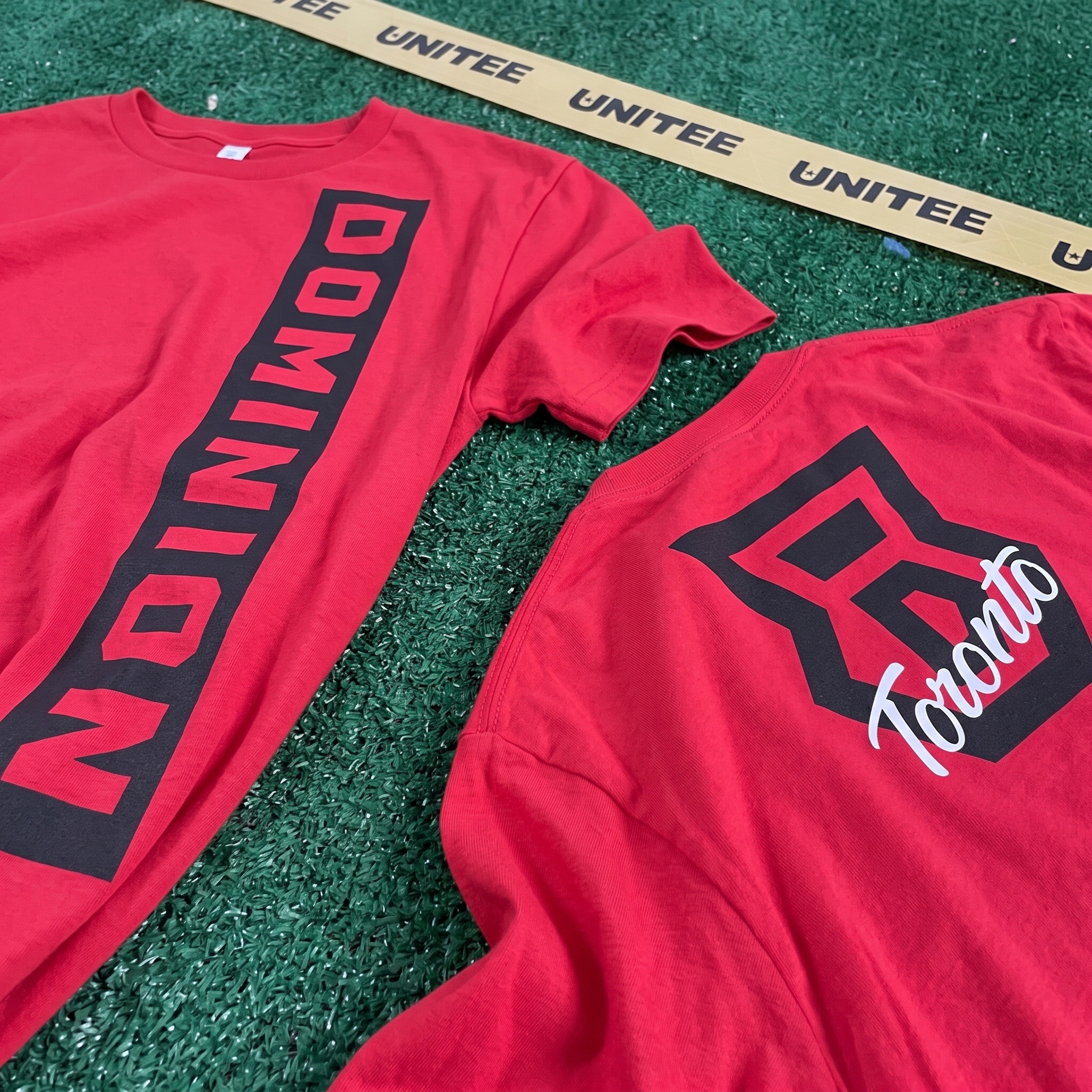
Dominion Drop-In Tee
The red tee is the loudest core piece in the collection, using a vertical Dominion print on the front and the shield mark on the back. The tall placement was chosen to echo Toronto’s vertical skyline language while giving the shirt a stronger athletic read.
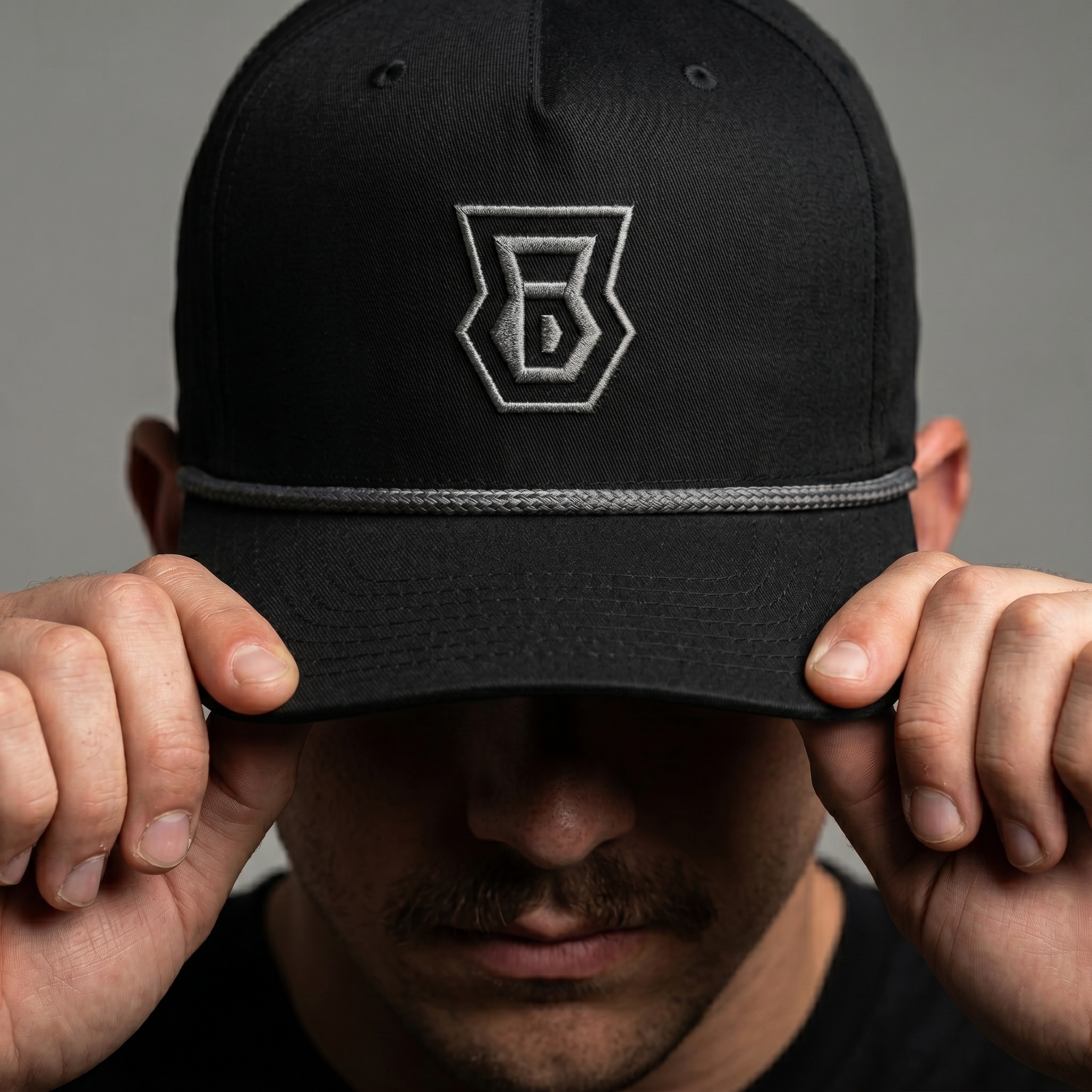
Dominion Rope Cap
The rope cap reduces the system to its cleanest mark: the Dominion shield embroidered on a black field. The grey embroidery and rope were used to keep the accessory subtle, wearable, and tied to the collection’s tonal coach pieces.
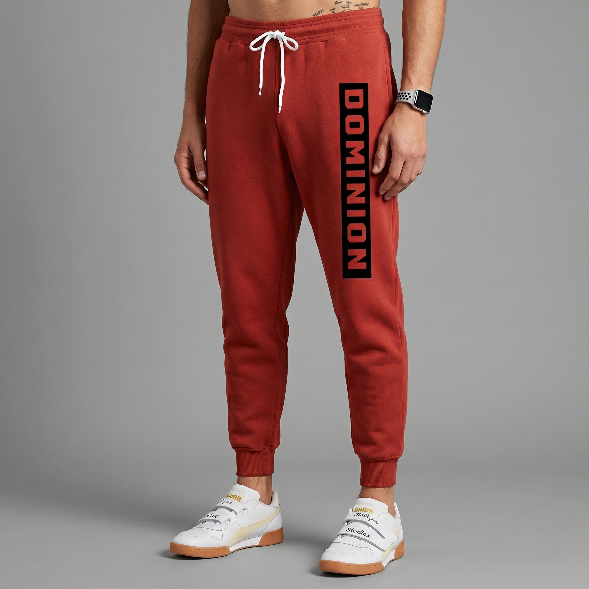
Red Dominion Jogger
The jogger carries the vertical Dominion lockup down the leg, turning the lower-body piece into a full part of the identity system. The black panel behind the type was added to sharpen legibility and give the red fleece a stronger graphic anchor.
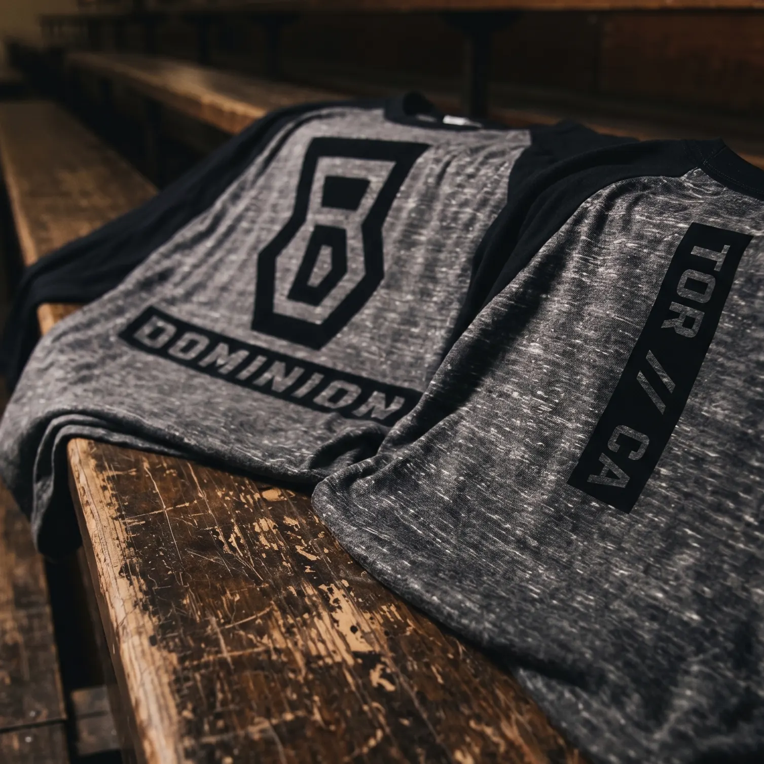
Bench Crest Raglan
The raglan gives the collection its most classic gym-sport piece, pairing heather texture with black sleeves and the Dominion crest system. The bench setting and tonal black print were used to make the piece feel like old training gear rather than a bright city souvenir.
UNITEE Design Lab
Concept cars for custom gym apparel.
The UNITEE Design Lab works like concept cars for gym apparel. We start with an idea, then turn it into a real concept people can see: a shirt, hat, hoodie, uniform set, or full merch drop. Then we explain the thinking behind it. Why this garment? Why this graphic? Why this placement? Why this kind of finish? The work is built to inspire, test new ideas, and give our clients better custom gym apparel before they ever place an order.
For larger fitness brands, multi-location gyms, event groups, and enterprise clients, the Design Lab is where brand kits and full merch programs take shape. We build the look, then we print the gear. That means the same team can help shape the brand story, plan the apparel, design the graphics, and produce the final pieces.
For an independent gym owner, the value is simple: you get the benefit of our research and development without needing to buy a full brand package. Your order may be a small run of tees, hats, hoodies, or event shirts, but the thinking behind it comes from a team that studies gym merch every day.
Need better gym merch?
Tell us what you are trying to make. We can help with one shirt, a full drop, or a larger apparel program.
Start a Design Lab Conversation