
UNITEE Design Lab / Salt Lake City, Utah
Salty State Strength Co.
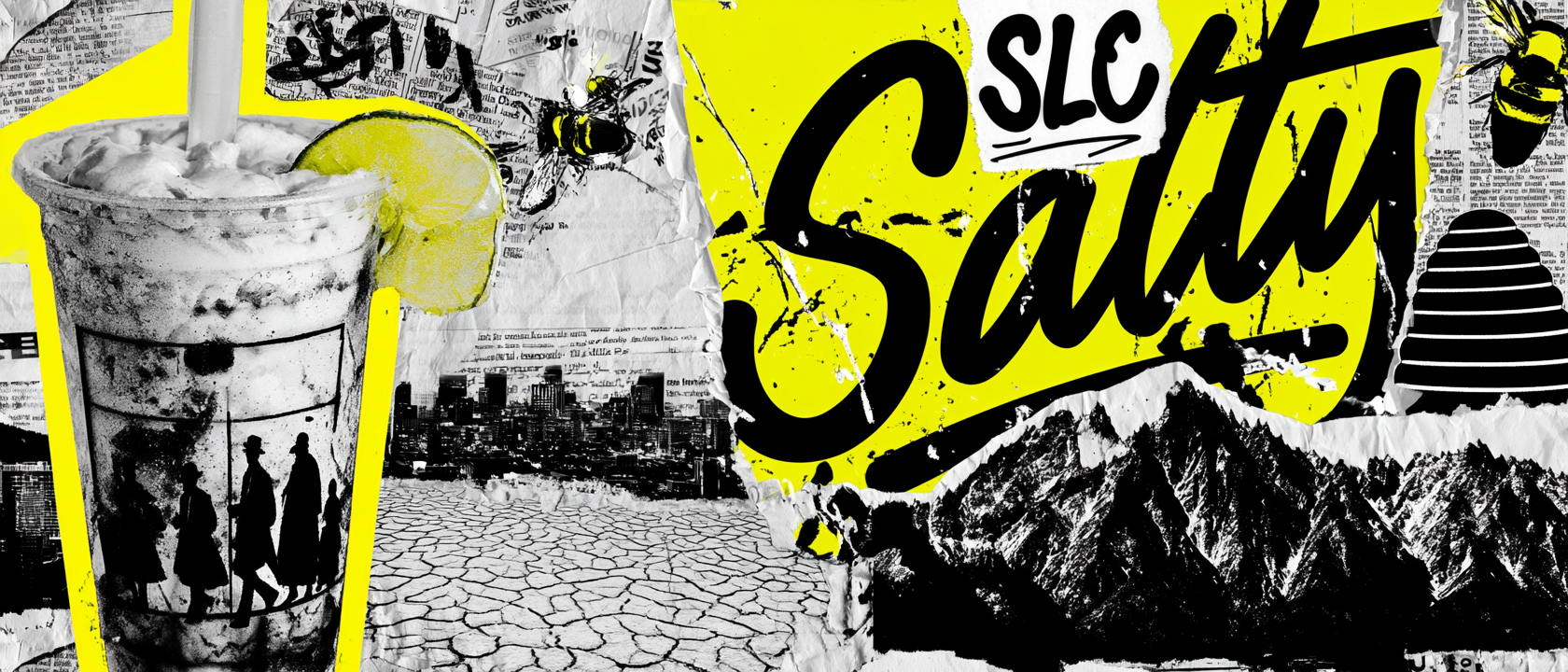
Salt Lake City gives this collection a clear visual world: mountain edges, salt-washed color, roadside neon, the Great Salt Lake, the beehive symbol, and a city name that already sounds like a gym brand when you shorten it to SLC.
For Salty State Strength Co., the job was to turn that place into a full apparel system. Not just one shirt. A gym identity built from script lettering, state pride, bee and honeycomb marks, Wasatch mountain shapes, acid yellow, black, mineral grey, cream, and a little roadside diner energy.
Salt Lake City, The Great Salt Lake, And The Beehive State
Salt, Stone, Signal, Strength.
Salt Lake City sits between two strong forces: the Wasatch Mountains to the east and the Great Salt Lake to the west. That contrast gives the city a hard visual edge. One side is rock, snow, ridgeline, and altitude. The other side is open basin, mineral water, dry flats, and salt.
The city grew as a planned settlement in the mountain West, with streets laid out around a central grid and public life built around community, work, and place. That ordered structure helped shape the apparel system. The graphics use strong containers, clear badges, centered marks, and type that feels organized instead of random.
The beehive became one of the clearest references. In Utah, the beehive points to industry, effort, and shared work. For a gym, that symbol is almost too perfect. The badge turns the bee into a strength mark, placing it with mountains, barbells, and a hexagon frame so the symbol feels earned, not decorative.
The color story comes from the city’s extremes. Acid yellow pulls from neon signs, salt-flat glare, and the bold punch of the history collage. Black gives the system weight. Cream softens the tees. Mineral grey brings in concrete, weather, and hoodie texture. Together, the pieces feel like Salt Lake City seen through a gym lens.
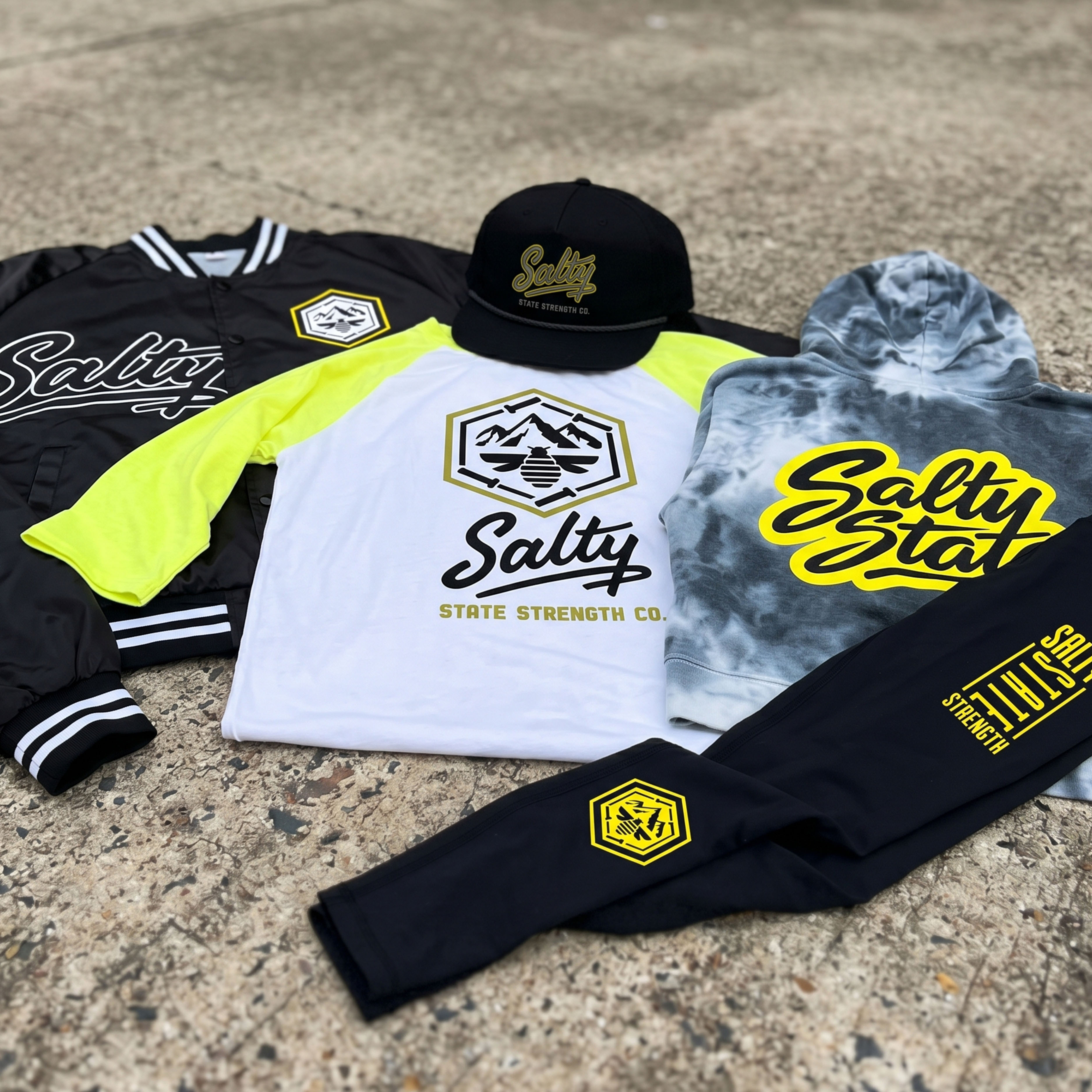
The collection brings the full system together: Salty script tees, Wasatch mountain badge, bee mark, black satin jacket, mineral wash hoodie, rope cap, training tights, and a black / yellow / cream / grey palette built for Salt Lake City.
Concept + Design Rationale
The system starts with the name. “Salty State” gives the gym a phrase that feels local, casual, and strong at the same time. It can live as a big script chest mark, a small hat logo, a hoodie back print, or a vertical leg graphic.
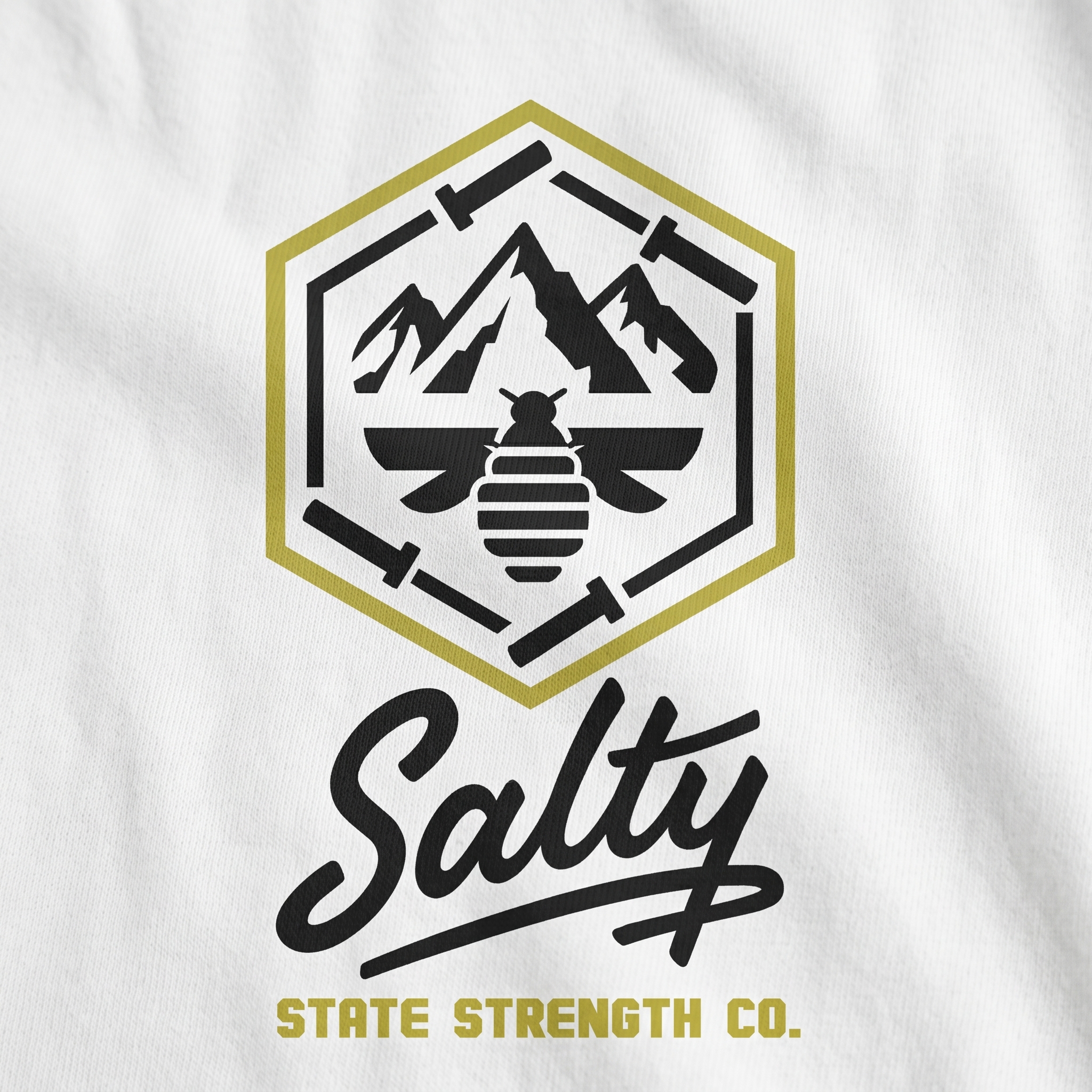
The main badge does the deeper storytelling. The mountains connect back to the Wasatch. The bee connects to Utah’s beehive identity. The hexagon frame gives the mark structure. The barbell pieces around the edge turn the whole symbol back toward strength training.
The typography is split into two voices. The Salty script gives the line a warm, local, slightly retro feel. The State Strength type adds the gym language: squared off, direct, and easy to read from a distance.
The goal was to make a Salt Lake City gym collection that can move across settings: training floor, coach apparel, hats, hoodies, streetwear, and full member drops.
Color System
Salt Neon
Primary pop color for leg prints, hoodie backs, badge hits, and SLC energy
Mineral Black
Base color for jackets, caps, tights, outlines, and heavy contrast
Utah Strong Cream
Soft tee base that keeps the system warm and wearable
Wasatch Grey
Hoodie wash color inspired by concrete, clouds, and mountain weather
Beehive Gold
Secondary badge tone used to separate the bee and mountain system
Alpine White
Clean contrast color for raglans, badge borders, and print clarity
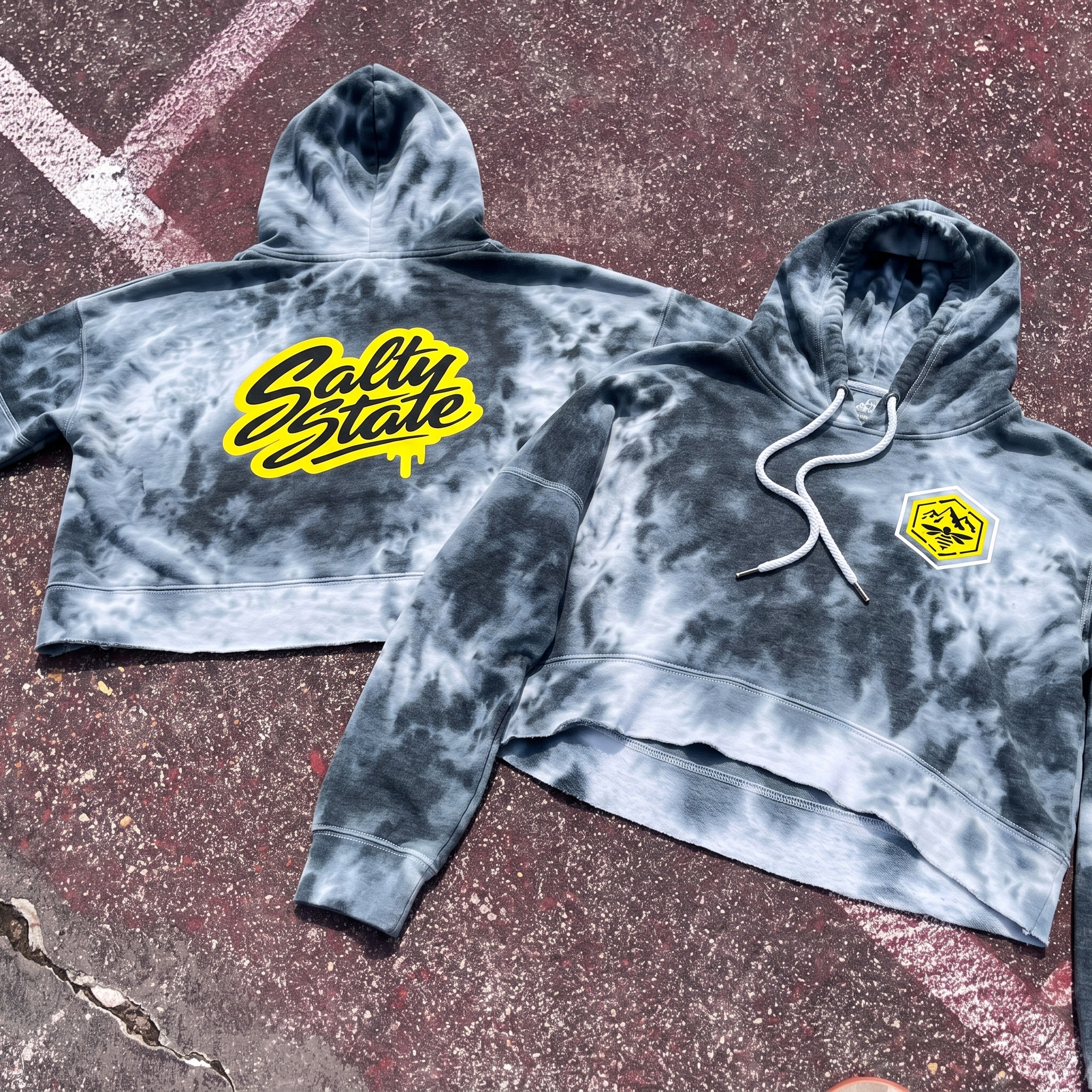
Mineral Wash Bee Hoodie
A custom dyed hoodie made perfect for SLC. The cropped hoodie brings the salt-wash texture into the garment itself, with the bee badge on the front and the loud Salty State script across the back.
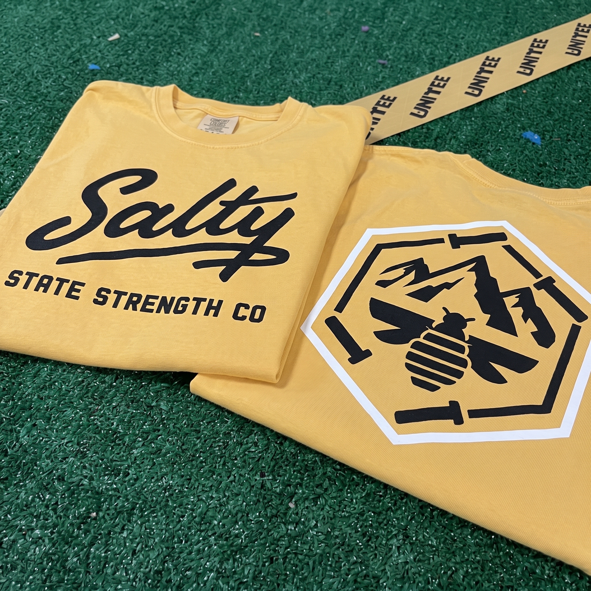
Salty Script T Shirt
The yellow tee set gives the collection its easiest member piece, pairing a clean Salty chest script with the larger Salty State mountain bee badge on the back.
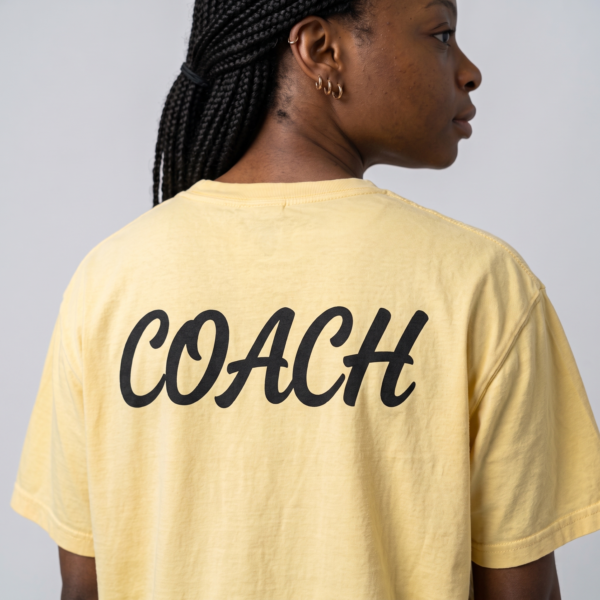
Salty Coach's Shirts
The coach tee keeps the staff role simple and bold, using oversized black script across the back so the piece reads quickly in class.
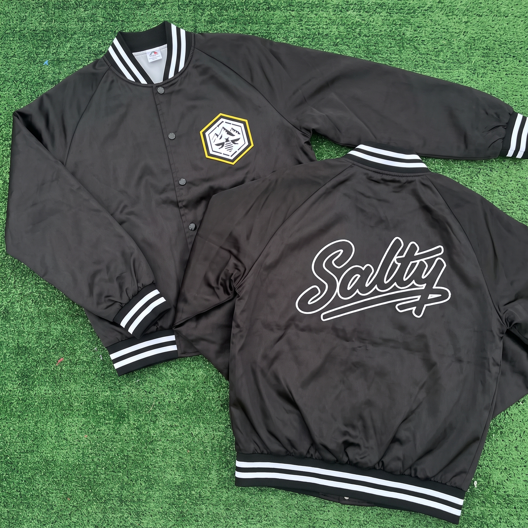
Salty Retro Jacket
A modern take on the classic retro jacket.
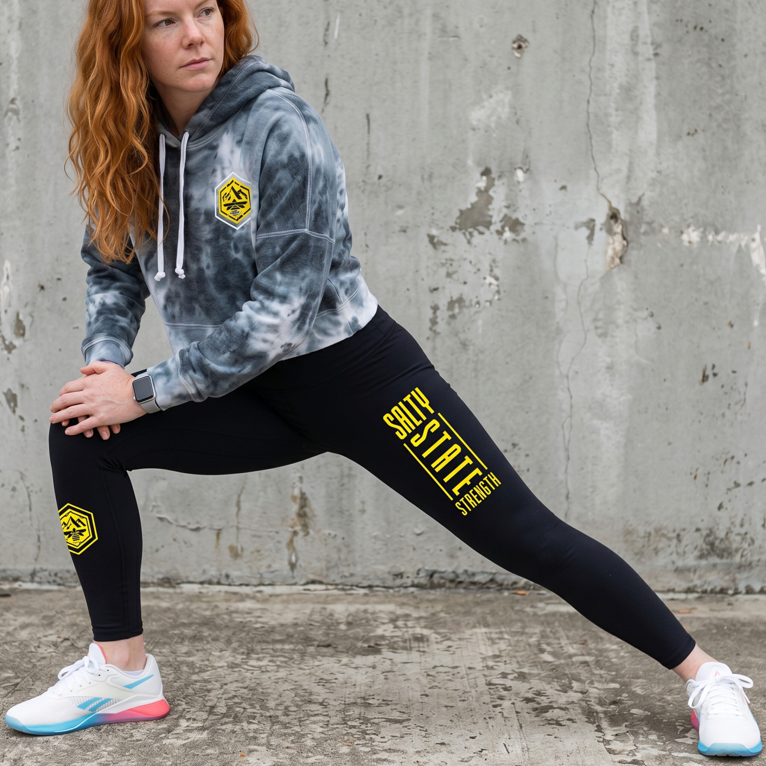
SLC State Strength Tight
The black training tight carries the system down the leg, using the vertical SLC mark and bee badge to make the lower-body piece feel fully designed.
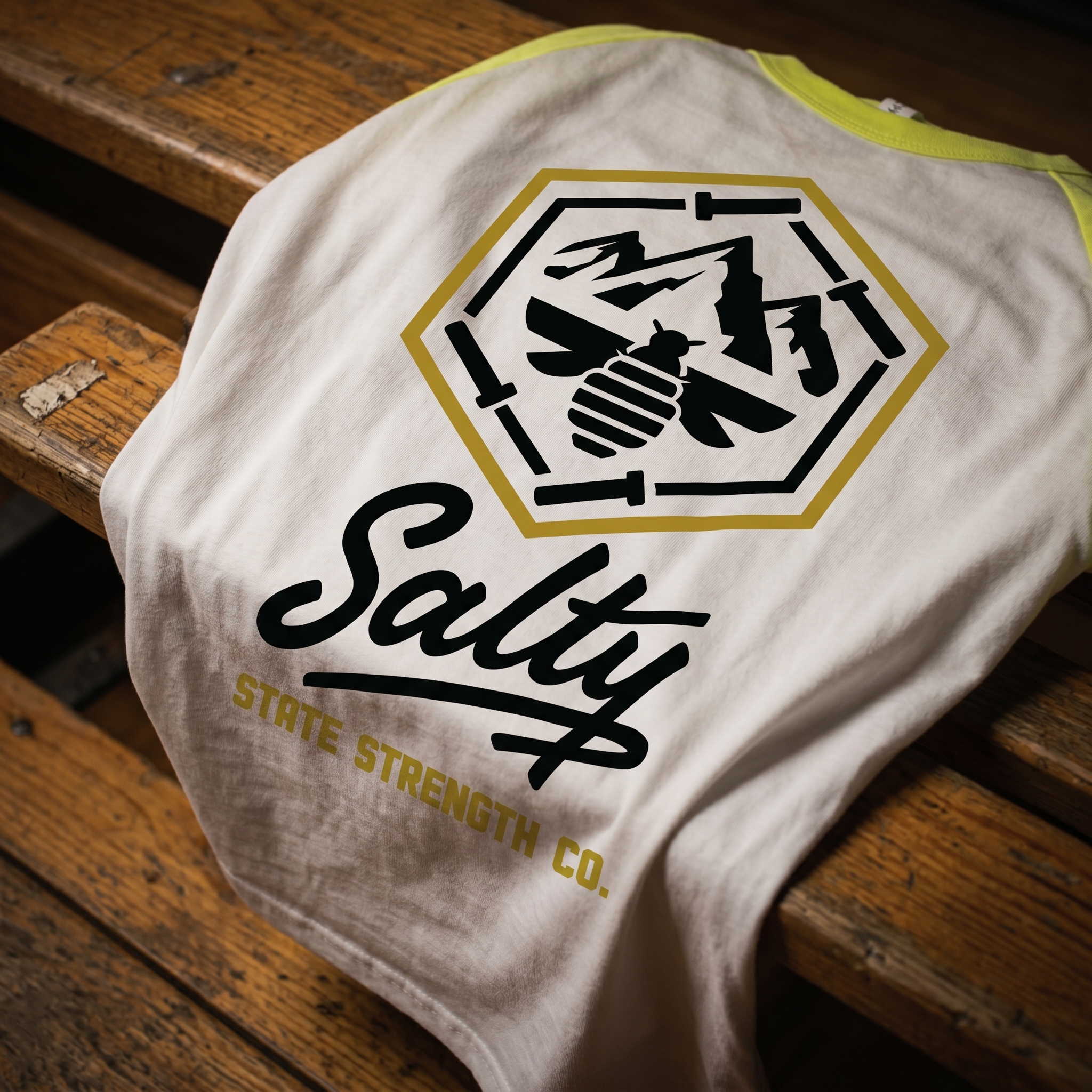
wasatch Crest Raglan
A Salty style raglan made for both in and out the gym
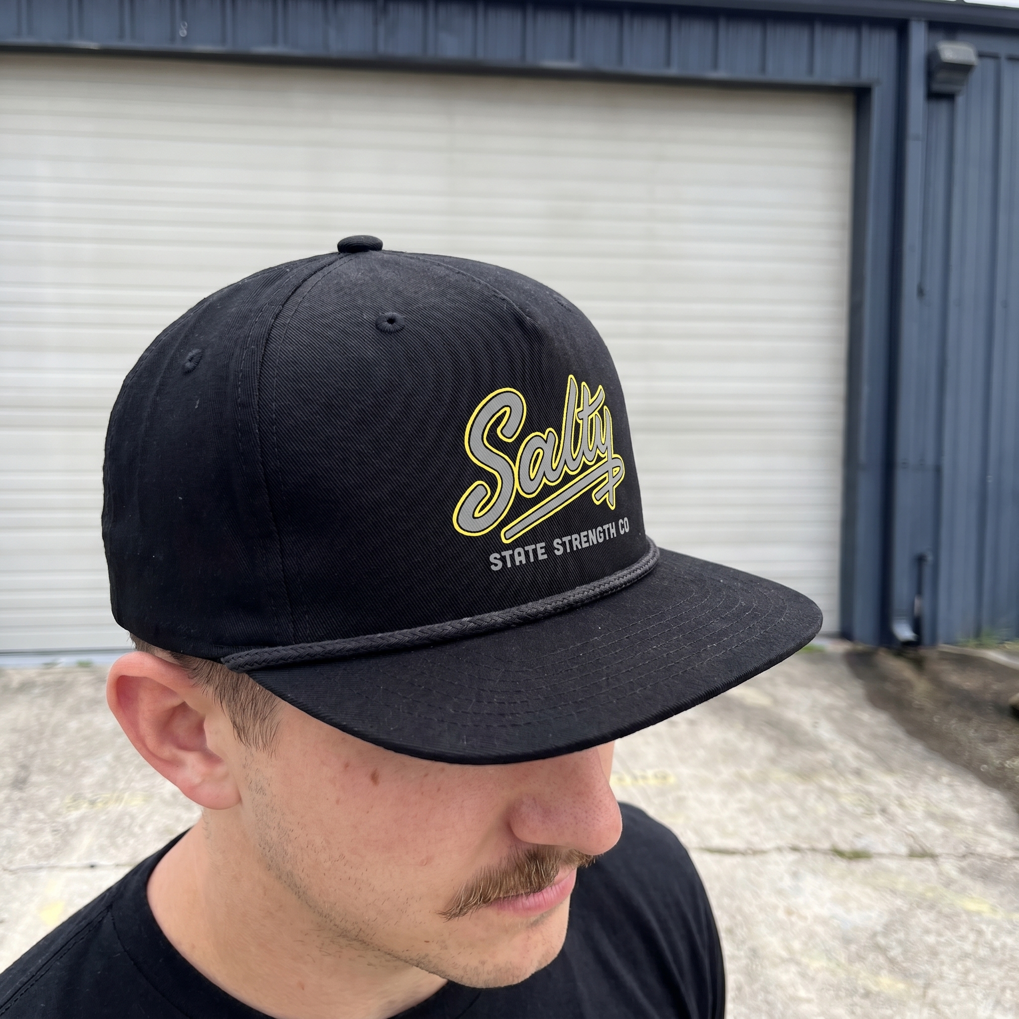
Black Salty Rope Cap
The rope cap reduces the system to its cleanest accessory mark, using the Salty script, grey support type, and yellow outline on a black field. The yellow outline stroke was implemented to increase legibility of the logo.
UNITEE Design Lab
Concept cars for custom gym apparel.
The UNITEE Design Lab works like concept cars for gym apparel. We start with an idea, then turn it into a real concept people can see: a shirt, hat, hoodie, uniform set, or full merch drop. Then we explain the thinking behind it. Why this garment? Why this graphic? Why this placement? Why this kind of finish? The work is built to inspire, test new ideas, and give our clients better custom gym apparel before they ever place an order.
For larger fitness brands, multi-location gyms, event groups, and enterprise clients, the Design Lab is where brand kits and full merch programs take shape. We build the look, then we print the gear. That means the same team can help shape the brand story, plan the apparel, design the graphics, and produce the final pieces.
For an independent gym owner, the value is simple: you get the benefit of our research and development without needing to buy a full brand package. Your order may be a small run of tees, hats, hoodies, or event shirts, but the thinking behind it comes from a team that studies gym merch every day.
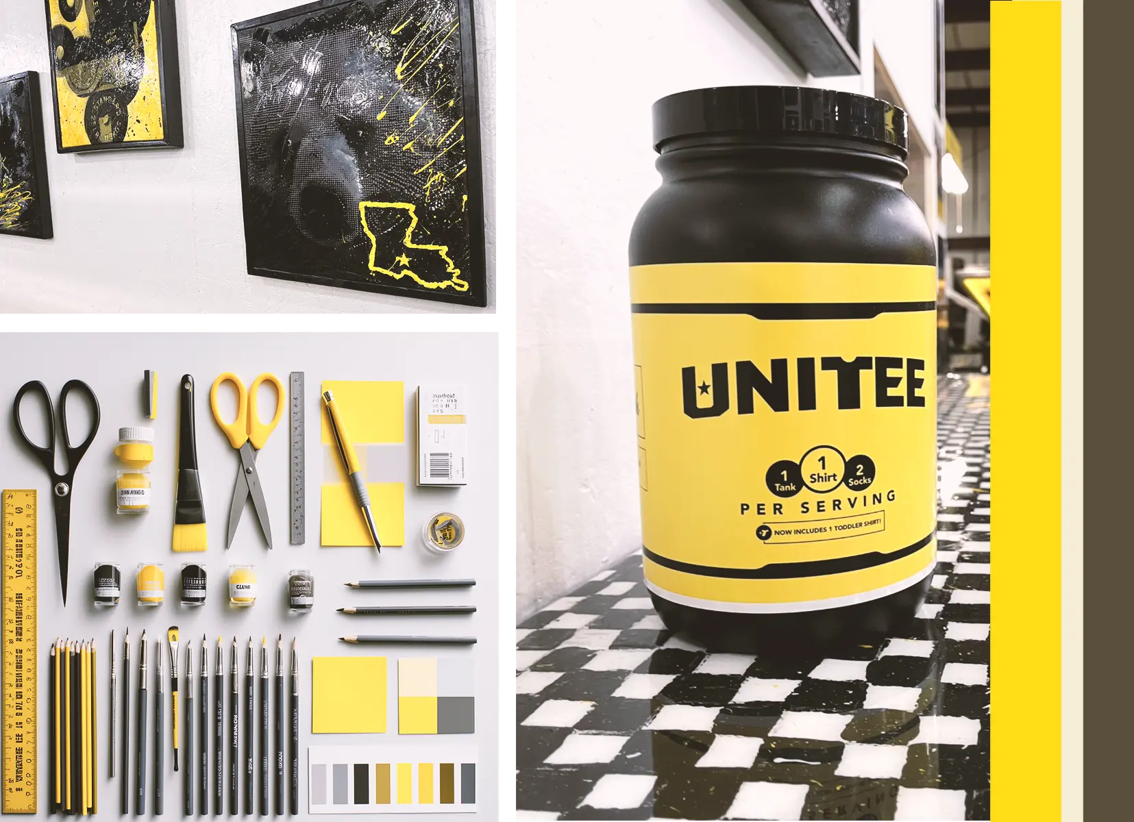
Need better gym merch?
Tell us what you are trying to make. We can help with one shirt, a full drop, or a larger apparel program.
Start a Design Lab Conversation