
UNITEE Design Lab / Milwaukee, Wisconsin
Antler Project
Antler Project is an “if you know, you know” Milwaukee gym identity. At the local level, it nods to the city’s fierce sports culture and the deer language tied to the Milwaukee Bucks. But the brand does not copy sports merch. It pulls the symbol into a darker, more premium gym system.
Antlers are natural weapons. They signal dominance, survival, and the cycle of shedding the old to build something stronger. By dropping standard gym words like “Fitness” or “Athletics” and using “Project,” the identity starts to feel like an underground streetwear label, a classified training initiative, and a gritty work-in-progress.
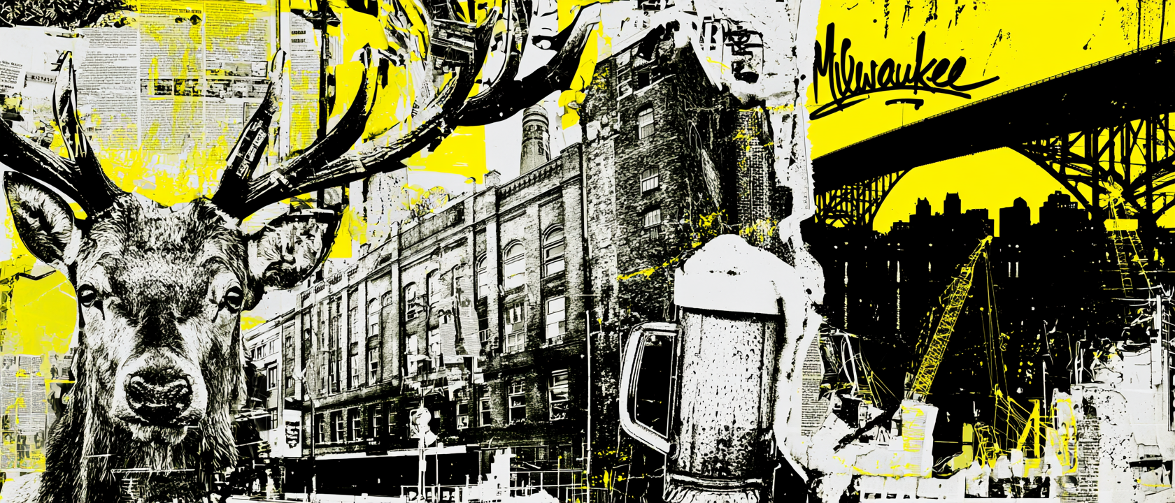
Water, Industry, Deer Symbolism, And Milwaukee Grit
A Local Symbol Rebuilt For Training.
Milwaukee’s story starts with water and land before it becomes a manufacturing city. The area sits along the southwest shores of Michigami, now Lake Michigan, where the Milwaukee, Menomonee, and Kinnickinnic rivers meet. It is also part of traditional Potawatomi, Ho-Chunk, and Menominee homelands. That layered geography shaped the color system. The collection uses sage, forest green, stone grey, washed black, and muted lime because the brand needed to feel rooted in river edges, lake air, marshland, concrete, and weathered outdoor ground rather than a polished indoor health club.
Milwaukee grew as a port and trading city because those three rivers fed into Lake Michigan and connected movement through the region. The early city developed around distinct districts and founder settlements, including Juneautown, Kilbourntown, and Walker’s Point, with the rivers acting as real dividing lines. That structure helped shape the apparel system as a set of related marks instead of one single logo. The Antler “A,” the script wordmark, the deer-skull barbell image, the state sleeve mark, and the rectangular patch logo all work like separate districts inside one brand.
By the mid-1800s, Milwaukee’s Menomonee Valley was being filled, straightened, and cut with canals to support shipping and industrial development. The city also became nationally tied to brewing, with Welsh and German immigrant brewers helping build one of Milwaukee’s defining industries. That history pushed the design language toward old production graphics: stamped labels, worn ink, barbell hardware, patch badges, rough halftone, brick-and-concrete photography, and dark workwear pieces. The deer skull print was treated less like a mascot and more like something found on a shop wall, brewery crate, or old weight-room poster.
The local sports layer gives the name its sharpest hook. The Milwaukee Bucks name was chosen in 1968 after a public naming contest, and the winning idea framed bucks as spirited, fast, agile animals. Antler Project takes that deer reference and moves it away from basketball merch into a gym-specific identity. Antlers become natural weapons. The skull becomes grit. The “Project” language makes fitness feel ongoing, unfinished, and earned. That is why the system mixes aggressive antler marks with muted earth tones, neon lime hits, black-on-black streetwear, and patch-based accessories: it feels Milwaukee, but not obvious.
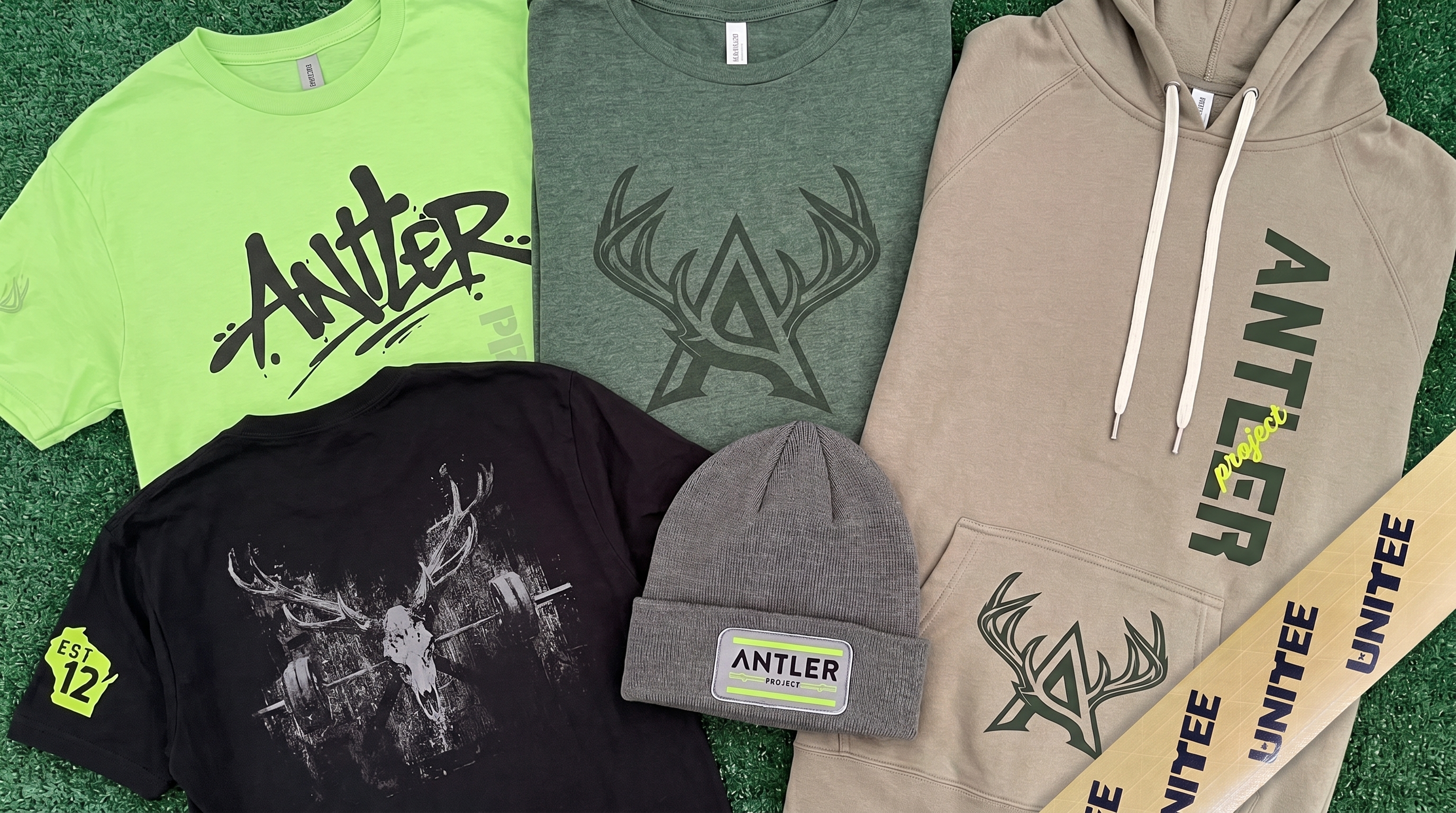
The full Antler Project system brings together lime training tees, washed black skull graphics, sage and forest green layers, a stone hoodie, patch beanies, antler monograms, deer-skull barbell imagery, and a premium streetwear palette built for Milwaukee’s industrial and sports-driven identity.
Concept + Design Rationale
The collection starts with a strategic name choice. “Antler” gives Milwaukee locals a quiet connection to the Bucks without turning the apparel into fan gear. It is familiar, but not literal. It gives the gym a symbol that can stand on its own.
From a branding perspective, antlers carry the right kind of gym language. They suggest dominance, natural power, defense, growth, and renewal. The idea of shedding and rebuilding connects directly to training: strength is not finished once; it is rebuilt over and over.
The word “Project” changes the psychology of the brand. It removes the corporate health-club feeling and makes the identity sound more like a classified athletic initiative or underground streetwear label. Members are not just joining a gym; they are becoming part of an ongoing build.
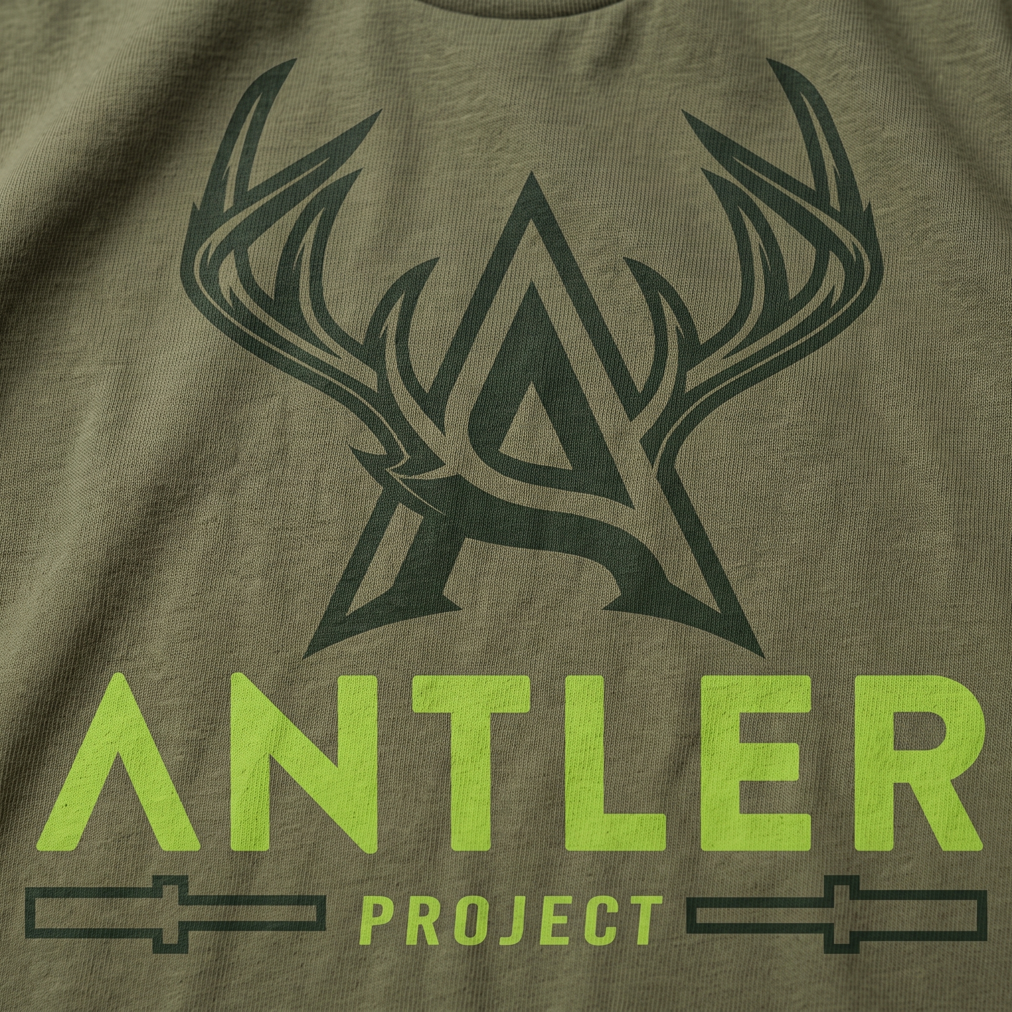
The visual system follows that same logic. The antler “A” mark gives the brand a clean premium icon. The deer-skull barbell graphic adds a darker training edge. The script mark brings streetwear motion. The patch beanie and muted earth colors make the whole drop feel more local, wearable, and retail-ready.
Color System
Antler Lime
High-visibility athletic accent used for energy, contrast, and the modern streetwear edge of the system
Forest Green
Primary support color tied to Wisconsin terrain, deer symbolism, outdoor grit, and local sports culture
River Sage
Soft garment tone that keeps the collection earthy, wearable, and removed from generic gym color palettes
Industrial Stone
Neutral hoodie and beanie tone tied to concrete, old brick corridors, sidewalks, and Milwaukee workwear
Washed Black
Used for the darker skull pieces, tonal marks, and the underground streetwear side of the identity
Bone Grey
Print support color used to give the deer skull graphic a raw, aged, and screen-printed texture
The Collection
The collection flat shows how the system moves from loud lime training pieces to muted sage, stone, and black streetwear. The spread was designed to feel like a complete project drop, not a single shirt design, with each mark carrying a different role inside the brand.
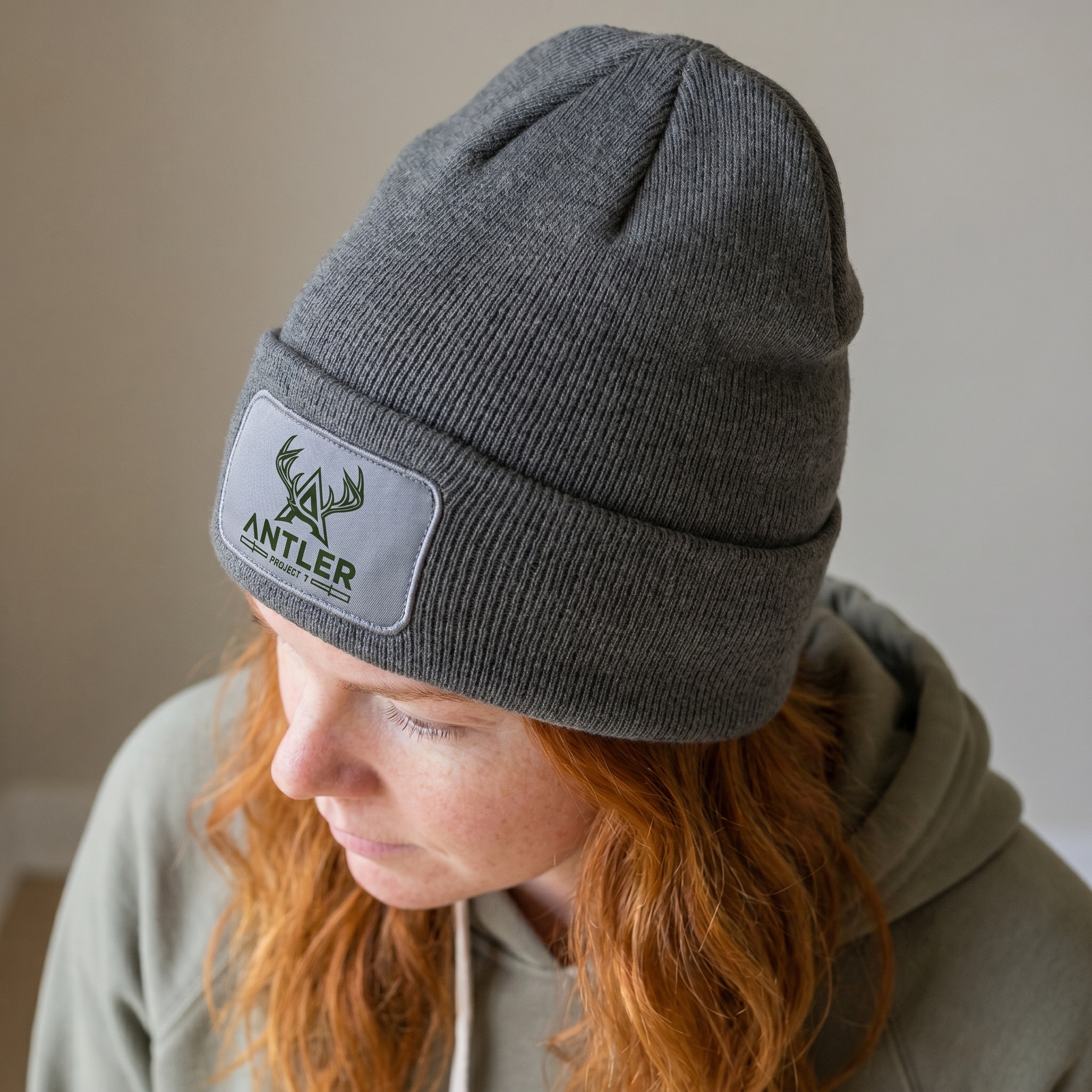
Antler Patch Beanie
The beanie reduces the identity to a compact woven-style patch, giving the collection its most practical cold-weather accessory. The grey field and dark green mark were chosen to connect with Milwaukee’s colder street environment while keeping the logo subtle and premium.
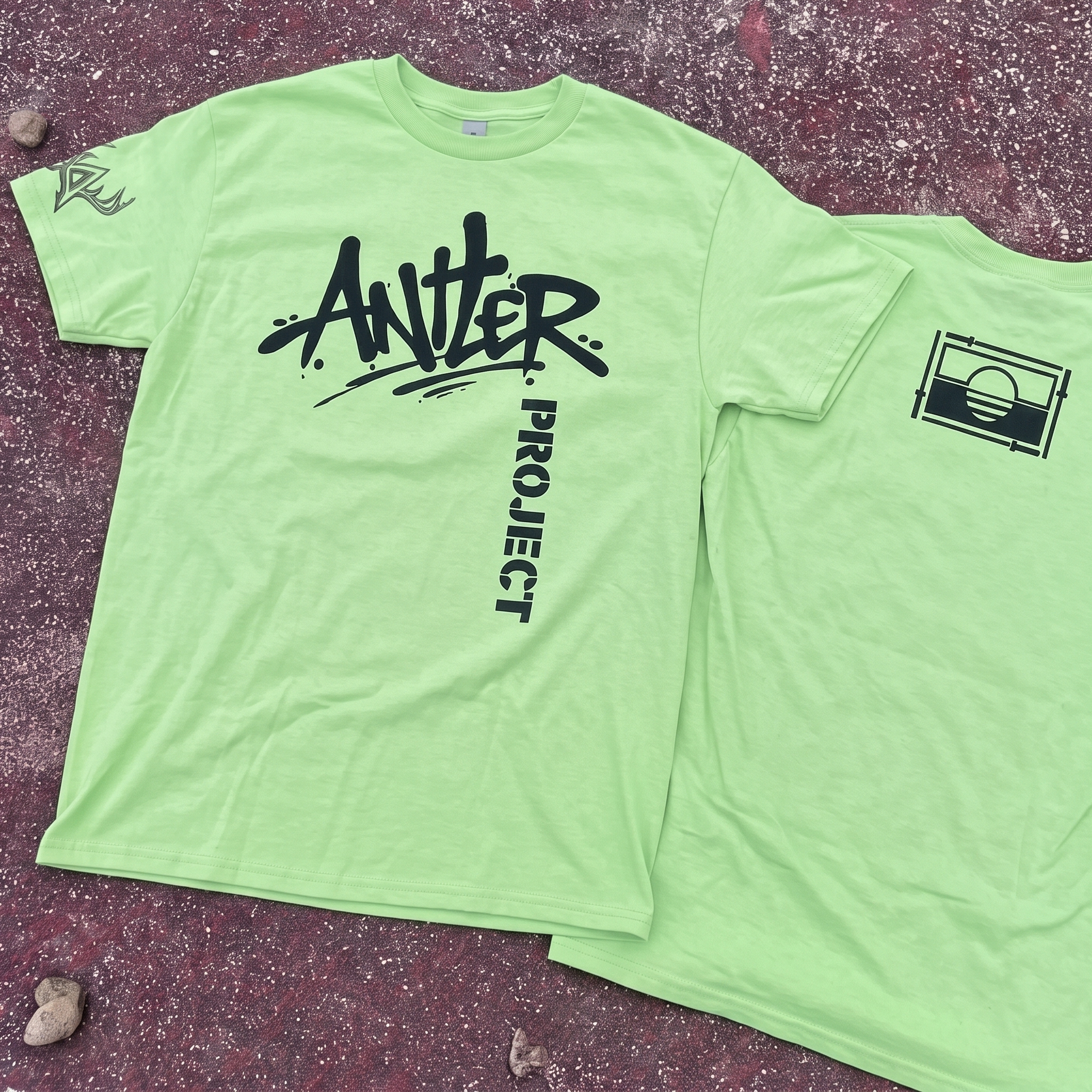
Drop-In Lime Tee
The lime tee gives the drop its loudest training-floor piece, using a graffiti-style Antler mark with a vertical Project hit. The bright garment was selected to create energy and visibility, while the black print keeps the design sharp enough to avoid looking like generic neon gym merch.
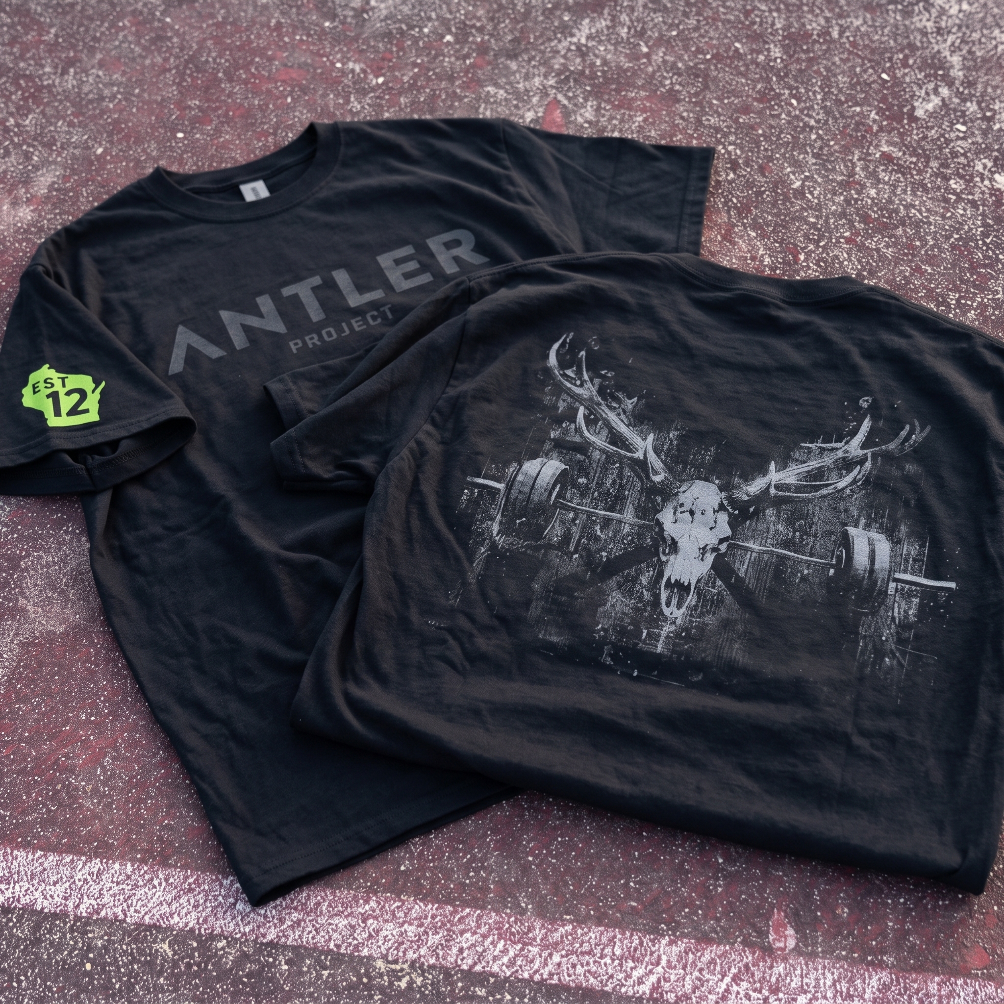
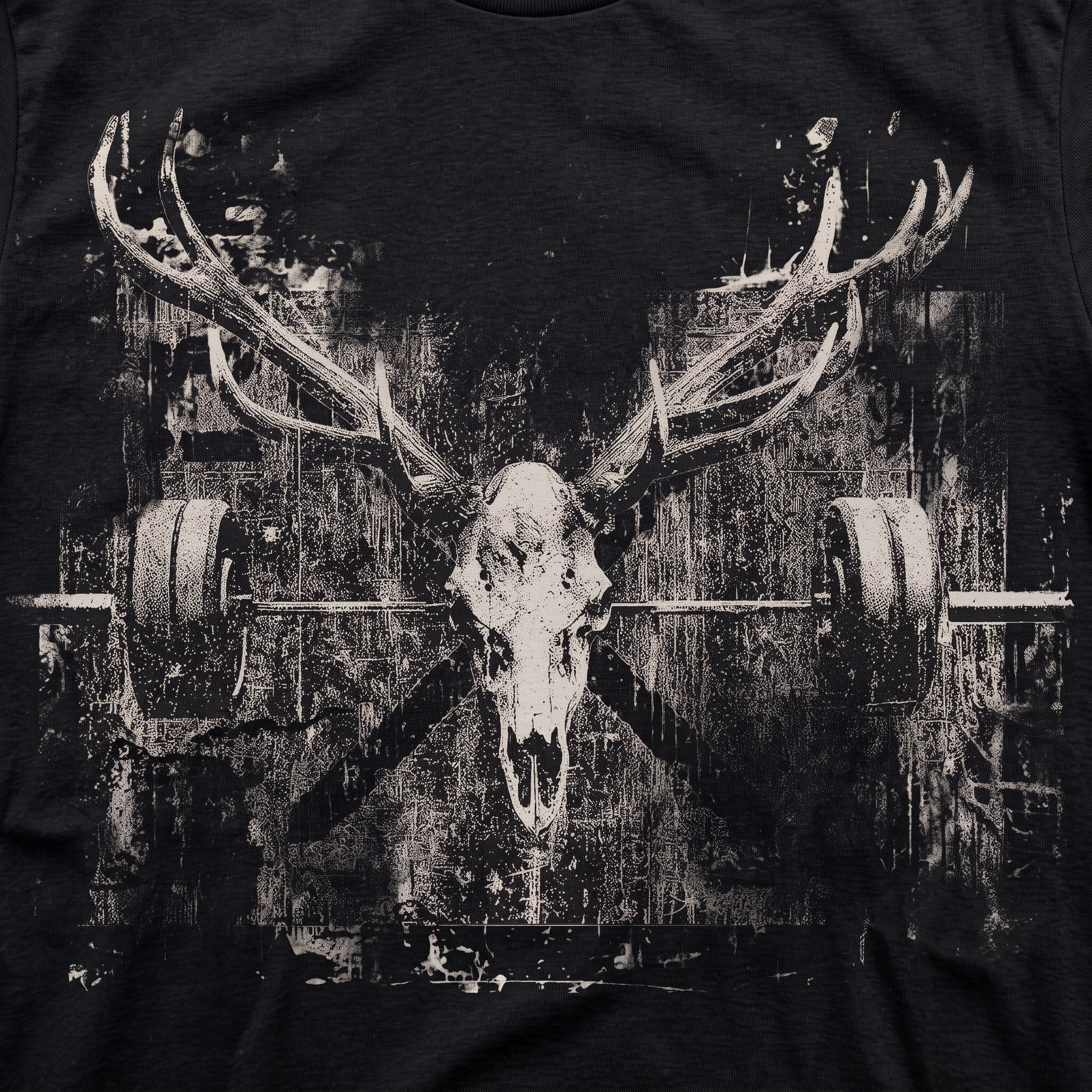
Antler Skull Black Tee
The tee set splits the identity between a quiet tonal front and a larger back graphic, creating a premium streetwear read from the front and a heavier training story from the back. The Wisconsin sleeve hit was added as a small local marker without making the piece feel like tourist apparel.The black skull tee is the darkest expression of the system, pairing antlers, a deer skull, and loaded barbells into one worn graphic field. The distressed bone print was used to make the image feel raw, heavy, and found-object instead of mascot-driven.
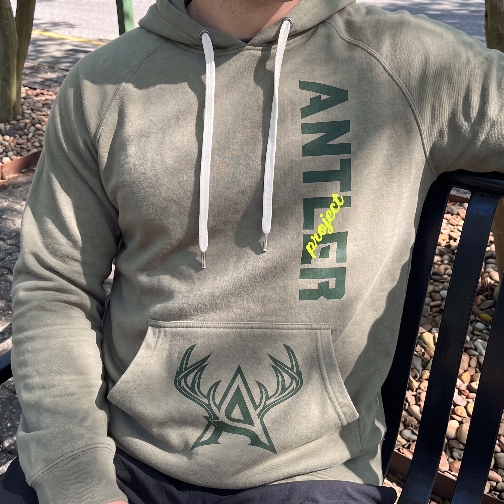
Project Hoodie
The hoodie turns the brand into a utility piece, using vertical type on the chest and the antler mark on the pouch pocket. The stone garment color was chosen to soften the system and make the hoodie feel more like Milwaukee workwear than a standard black gym sweatshirt.
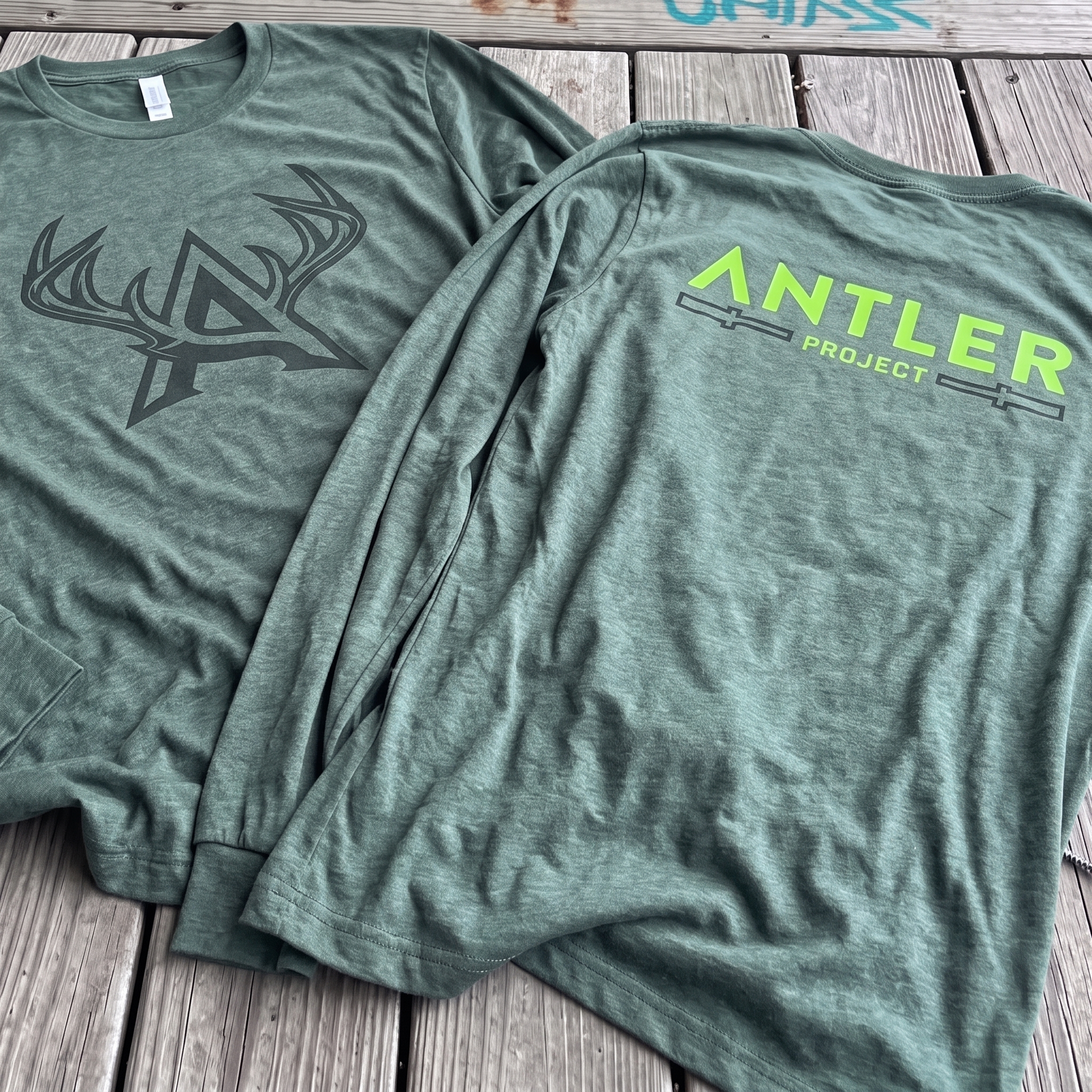
Forest Long Sleeve
The long sleeve uses the clean antler “A” mark on the front and a brighter Antler Project lockup on the back. The forest base and lime accent were selected to hold the local deer reference while giving the piece enough contrast to feel modern and retail-ready.
UNITEE Design Lab
Concept cars for custom gym apparel.
The UNITEE Design Lab works like concept cars for gym apparel. We start with an idea, then turn it into a real concept people can see: a shirt, hat, hoodie, uniform set, or full merch drop. Then we explain the thinking behind it. Why this garment? Why this graphic? Why this placement? Why this kind of finish? The work is built to inspire, test new ideas, and give our clients better custom gym apparel before they ever place an order.
For larger fitness brands, multi-location gyms, event groups, and enterprise clients, the Design Lab is where brand kits and full merch programs take shape. We build the look, then we print the gear. That means the same team can help shape the brand story, plan the apparel, design the graphics, and produce the final pieces.
For an independent gym owner, the value is simple: you get the benefit of our research and development without needing to buy a full brand package. Your order may be a small run of tees, hats, hoodies, or event shirts, but the thinking behind it comes from a team that studies gym merch every day.
Need better gym merch?
Tell us what you are trying to make. We can help with one shirt, a full drop, or a larger apparel program.
Start a Design Lab Conversation