
UNITEE Design Lab / Orlando, Florida
O Town Athletics
O Town Athletics started with a nickname. “O Town” immediately points to Orlando, but it also gives the gym a more local, wearable voice than a formal city name. It feels like something members would actually say, print, and wear.
The collection pulls from Orlando’s layered identity: citrus roots, Central Florida water and palms, theme-park imagination, space-coast proximity, blue-sky tourism, and a city that grew from regional Florida into one of the most recognizable destinations in the country.
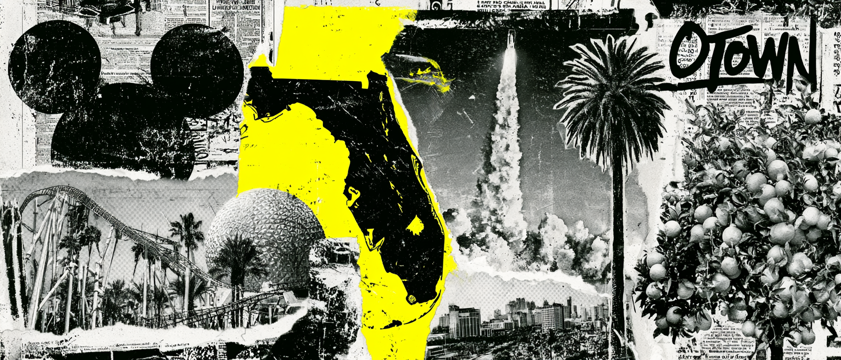
Citrus, Disney, Rockets, And Motion
A city built from groves, imagination, launch energy, and Florida movement.
Orlando’s story starts long before theme parks. Central Florida became known for citrus because the region had the right mix of warm weather, sandy soil, open land, rail access, and a long growing season. Orange groves helped shape the area’s early economy and gave Orlando part of its color memory.
Walt Disney chose Central Florida because it offered what California could not: massive land control, room to build a full resort system, highway access, a warm year-round climate, and a location far enough inland to feel more protected than the coast. That decision changed Orlando from a regional Florida city into a global destination.
The space reference comes from Orlando’s close relationship with Florida’s Space Coast. Rockets launch from Cape Canaveral and Kennedy Space Center because Florida’s east coast gives launches a safer path over the Atlantic, while the state’s lower latitude helps rockets gain extra speed from Earth’s rotation.
For O Town Athletics, those layers gave the collection more to work with than a simple tourism theme. Citrus explains the old Florida base. Disney explains the sense of imagination. The Space Coast explains the launch energy. Water, palms, and bright resort color explain the cool teal and aqua palette.
The result is a gym apparel system built around motion: a swirl mark that can read as water, orbit, ride energy, or a training arc; script typography that feels sunny and local; and clean athletic pieces that let Orlando show up without turning the apparel into souvenir merch.
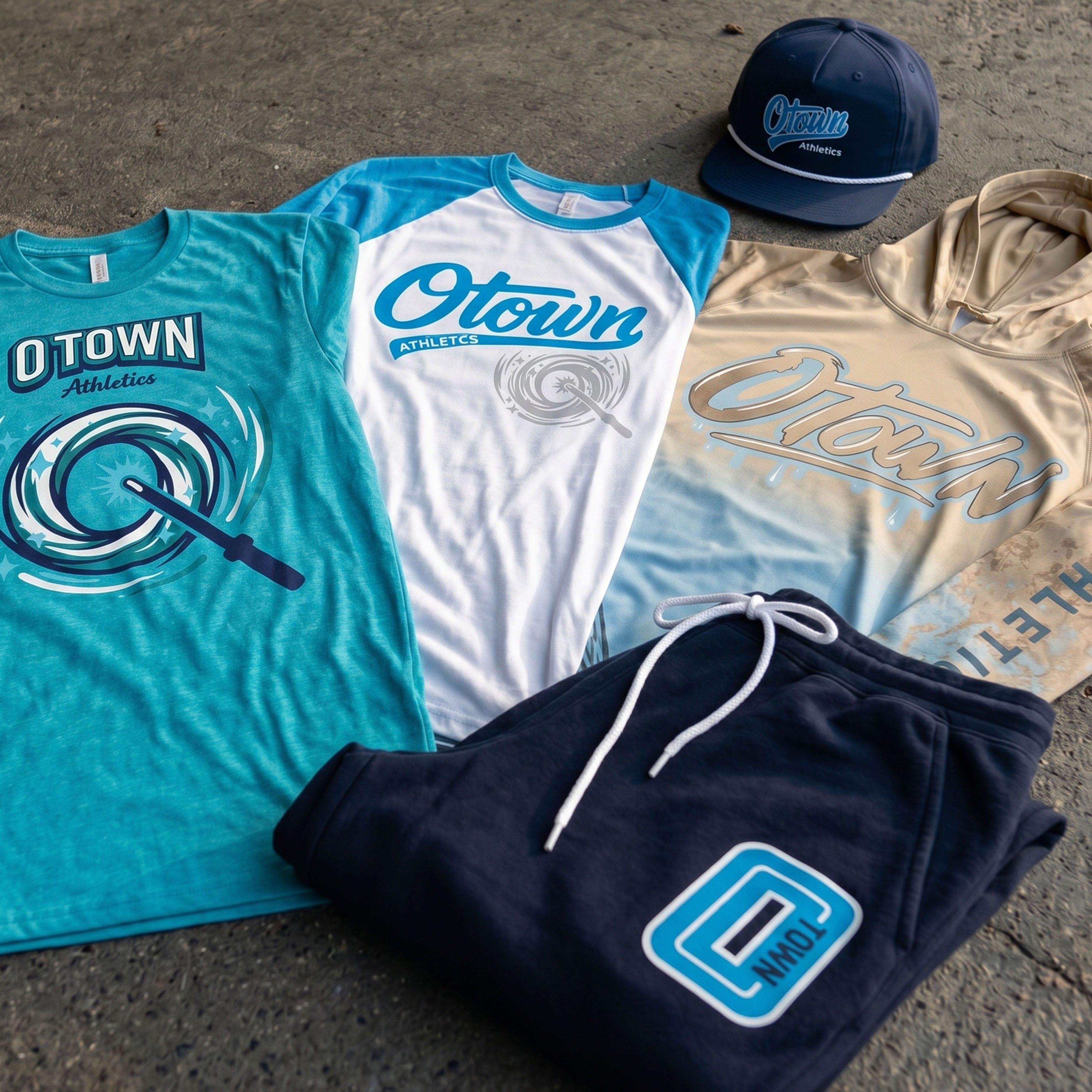
The Collection brings the full O Town system together: script raglan, coach tanks, teal graphic tee, joggers, rope cap, sand-toned hoodie, swirl marks, Florida outline details, and a cool blue palette built for Orlando.
Concept + Design Rationale
The concept starts with the name. O Town is compact, local, and flexible. It can live as a script logo, a block athletic mark, a cap embroidery, a jogger patch, or a full front tee graphic without feeling overexplained.
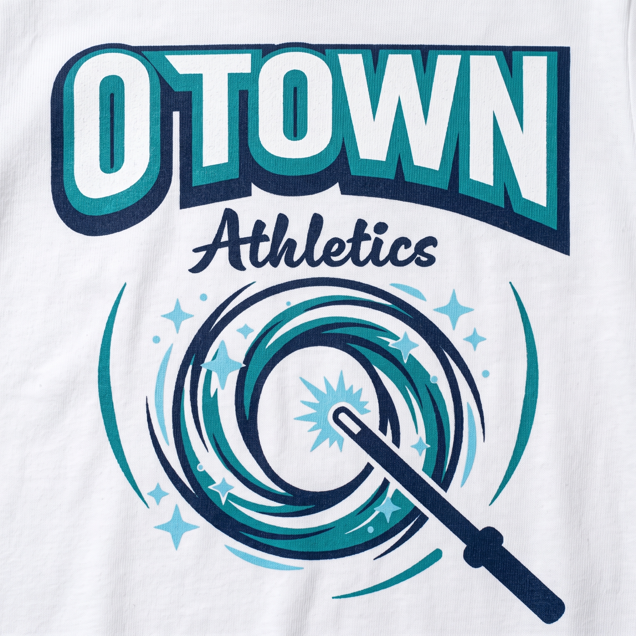
The main graphic language was designed around circular motion. The swirl mark references movement, energy, water, rides, and a little bit of Orlando magic, while the wand-like element turns the graphic into a sharper athletic icon.
Typography carries two different jobs. The script logo gives the collection a relaxed Florida athletic feel, while the block “O TOWN” layout gives the tees and tanks a stronger gym-read from distance.
The apparel mix was built to feel like a real member drop: coach pieces, training joggers, graphic tees, a hoodie, and headwear. Every item uses the same visual system, but each piece has a different reason to exist.
Color System
O Town Teal
Primary identity color used for the main marks and Florida water energy
Sky Aqua
Bright secondary tone for raglans, outlines, and movement graphics
Deep Navy
Base color for joggers, caps, outlines, and stronger athletic contrast
Attraction Silver
Neutral print tone for swirl graphics, hoodie marks, and coach details
Resort Sand
Warm hoodie base that brings in old Florida and travel-wear softness
Cloud White
Clean base and contrast color for raglans, tanks, and print clarity
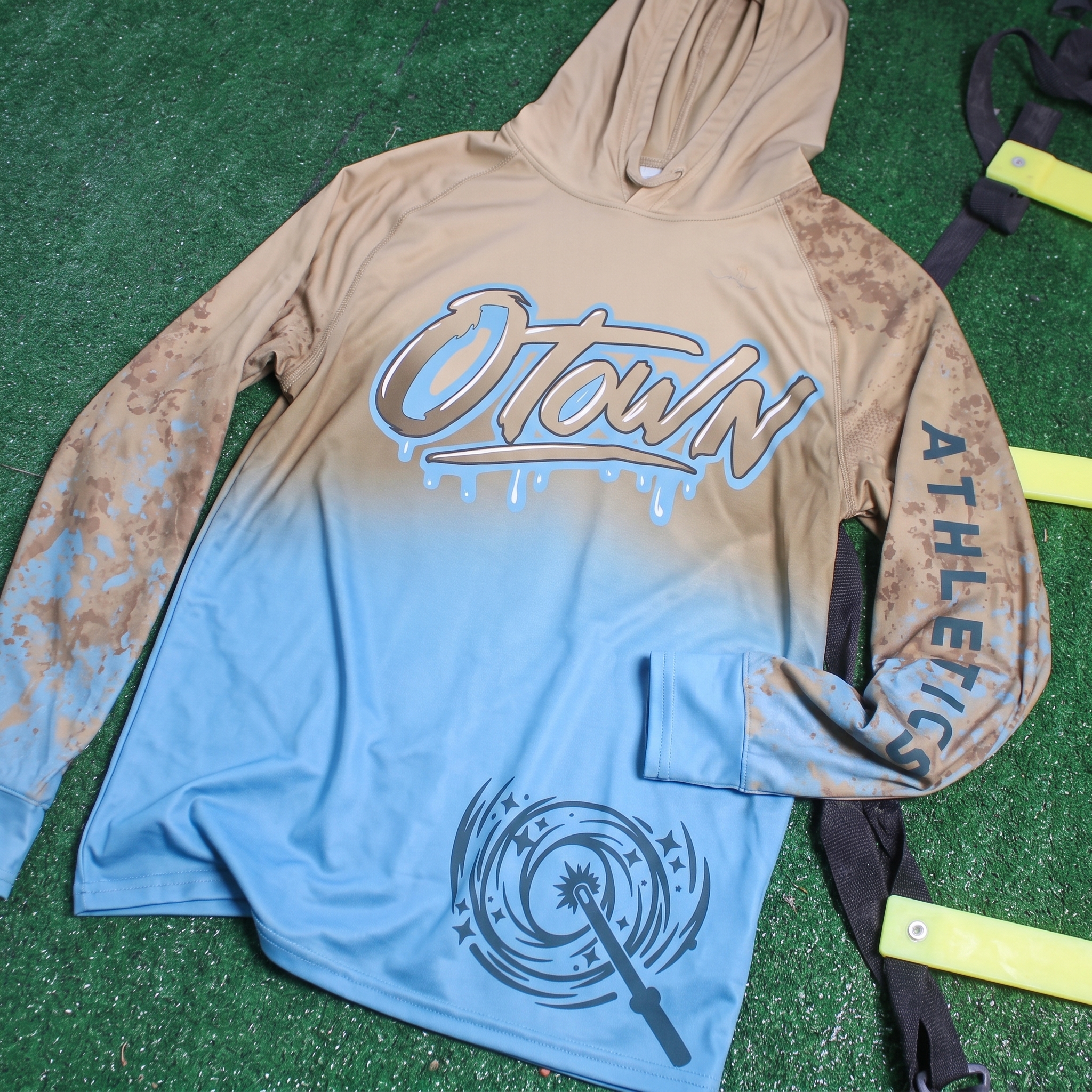
Drip Performance Hoodie
Made to wear while going to Disney World, the space coast, the gym, the beach and back all in an hr or less.
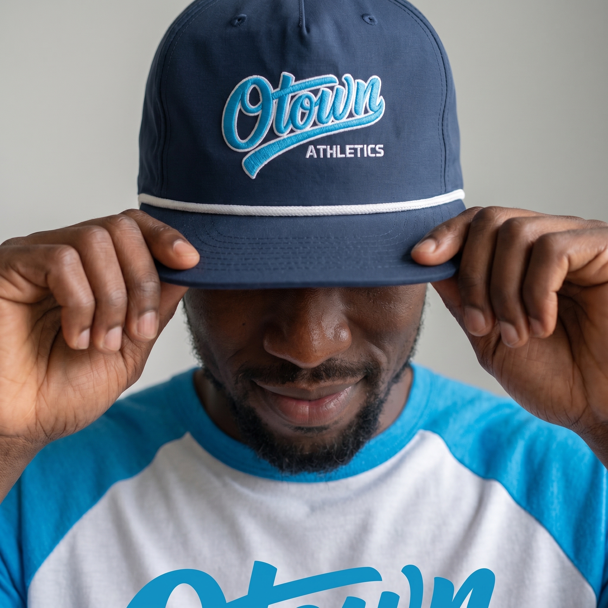
O Town Rope Cap
The navy rope cap gives the collection its most retail-ready piece, using raised script embroidery to make the local nickname feel polished and wearable.
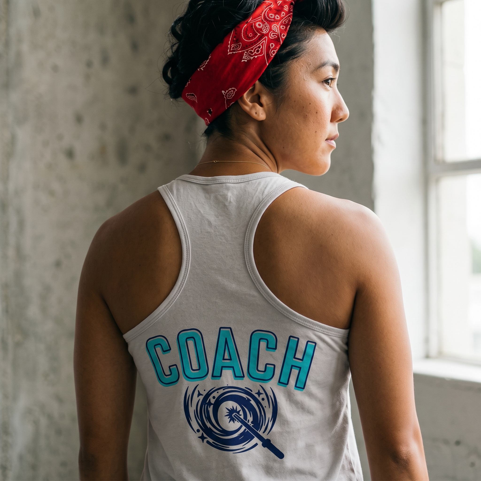
Orbit Coach Racerback
The coach tank keeps the role clear with large back lettering, then uses the orbit-and-wand mark underneath to connect staff apparel back to the full Orlando system.
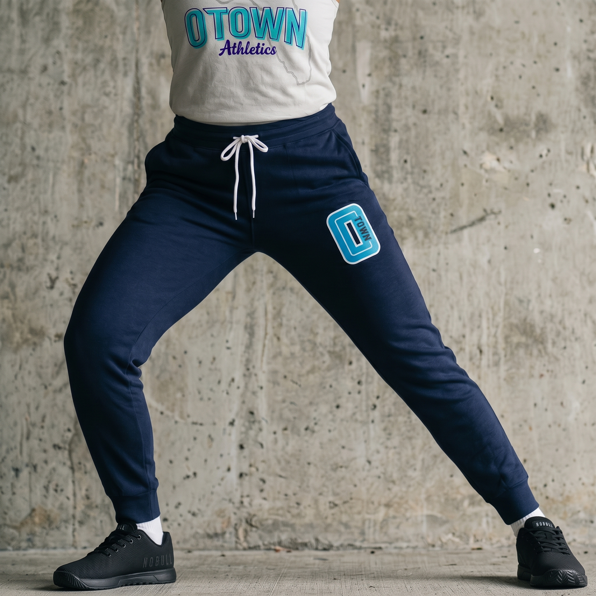
Navy O Town Training Jogger
The jogger uses a compact patch-style mark so the lower-body piece feels branded without competing with the larger tee and tank graphics.
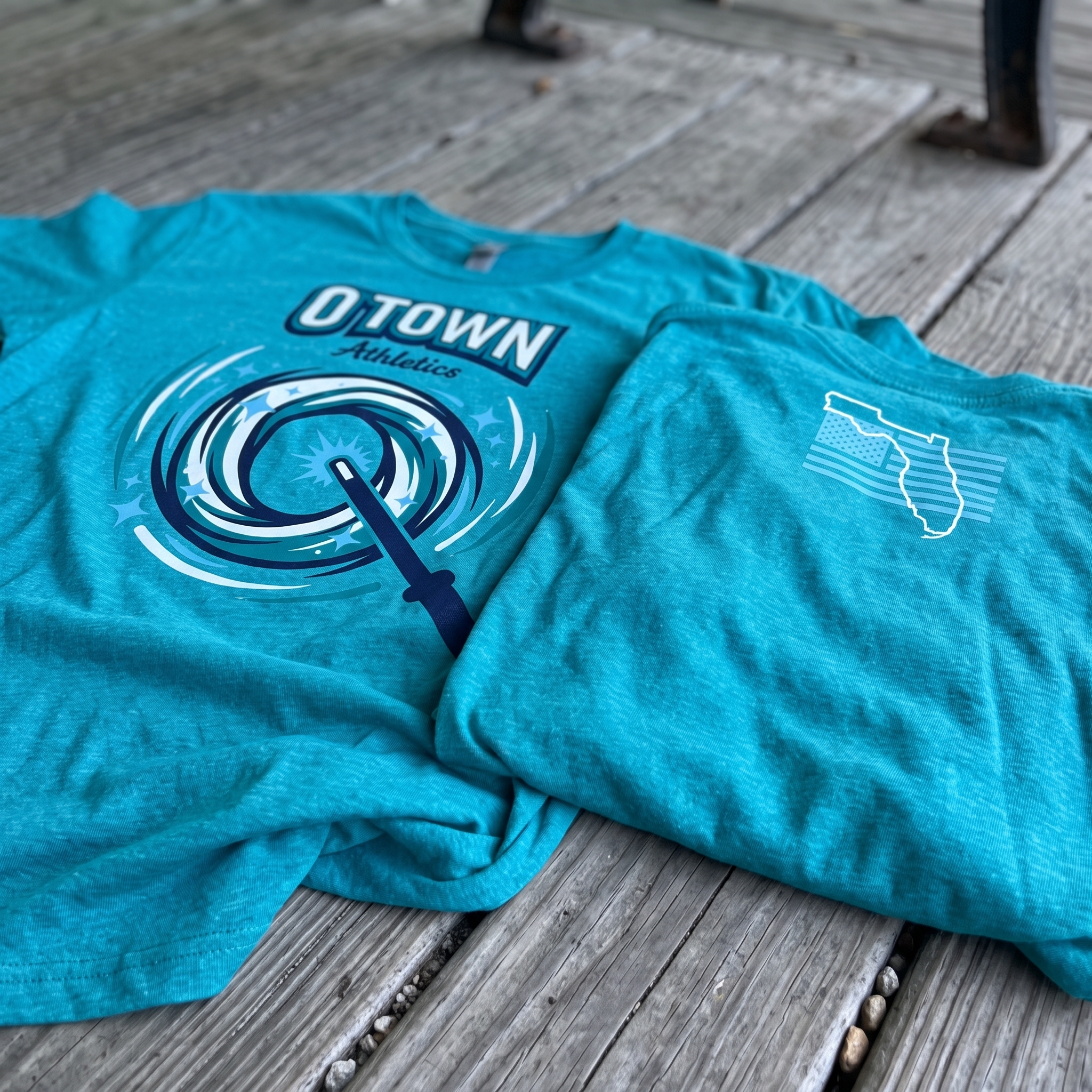
Florida Wand Tank Set
The tank set brings in the Florida outline and coach-specific artwork, giving the collection a local state marker while keeping the front and back graphics clean.
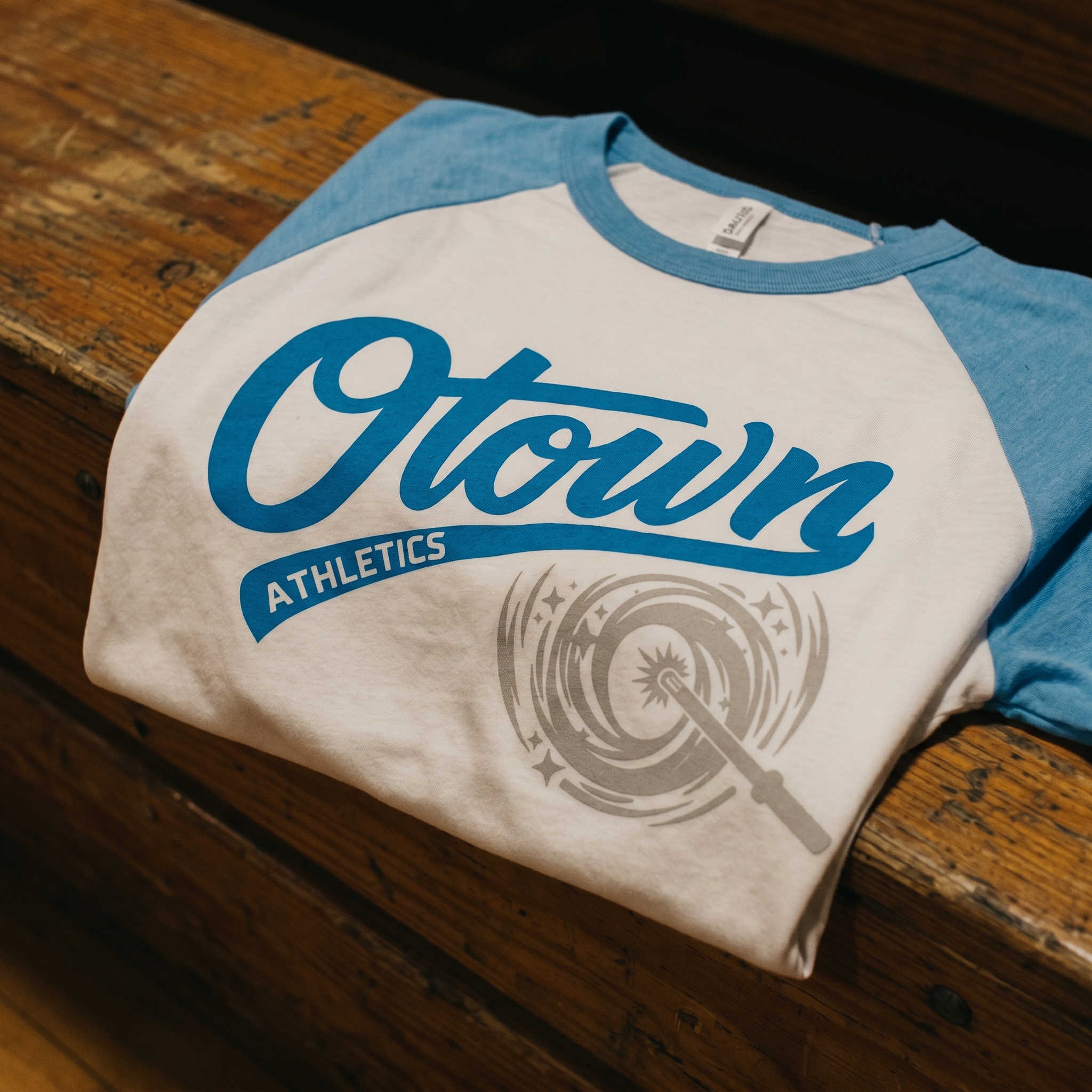
O Town Script Raglan
The raglan gives the drop a throwback athletic lane, using big script type and a muted swirl mark to make the piece feel classic instead of overly themed.
UNITEE Design Lab
Concept cars for custom gym apparel.
The UNITEE Design Lab works like concept cars for gym apparel. We start with an idea, then turn it into a real concept people can see: a shirt, hat, hoodie, uniform set, or full merch drop. Then we explain the thinking behind it. Why this garment? Why this graphic? Why this placement? Why this kind of finish? The work is built to inspire, test new ideas, and give our clients better custom gym apparel before they ever place an order.
For larger fitness brands, multi-location gyms, event groups, and enterprise clients, the Design Lab is where brand kits and full merch programs take shape. We build the look, then we print the gear. That means the same team can help shape the brand story, plan the apparel, design the graphics, and produce the final pieces.
For an independent gym owner, the value is simple: you get the benefit of our research and development without needing to buy a full brand package. Your order may be a small run of tees, hats, hoodies, or event shirts, but the thinking behind it comes from a team that studies gym merch every day.
Need better gym merch?
Tell us what you are trying to make. We can help with one shirt, a full drop, or a larger apparel program.
Start a Design Lab Conversation