
UNITEE Design Lab / Phoenix, Arizona
The Valley Lift Co.
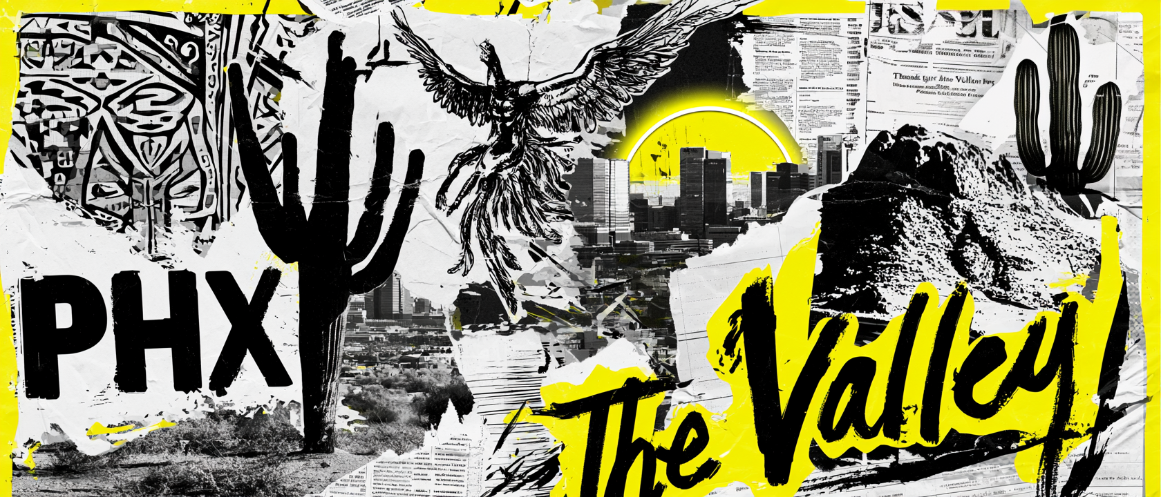
In Phoenix, “The Valley” is not just a nickname. It is how people talk about the whole place: the city, the desert floor, the mountains around it, the heat, the sunsets, the sports culture, and the long history of people building life in the Salt River Valley.
For The Valley Lift Co., the design system pulls from that full story: ancient canals, desert sun, saguaro silhouettes, citrus color, Phoenix sports energy, southwestern pattern, and a lizard-and-barbell mark that feels built for training in the heat.
Desert, Canals, Sun, And Sport
A city built from heat, water, and reinvention.
Phoenix sits in the Salt River Valley, which is why locals often call the metro area “The Valley.” The name feels casual, but it carries a lot of place. It points to the flat desert basin, the surrounding mountains, and the shared identity that reaches beyond one city line.
Long before modern Phoenix grew, the Hohokam built a large canal system through the valley. Later settlers reused and expanded those water routes, which helped make farming possible in the desert. That history matters because Phoenix is not just a hot city. It is a city built by directing water, work, and willpower into a difficult landscape.
Citrus became part of the region because irrigation, sun, and climate made desert farming possible. Orange, yellow, and warm cream tones in the collection are not random bright colors. They point to the citrus groves, sun glare, dry heat, and late-day desert light that define the Phoenix look.
The saguaro and cactus shapes matter because they are one of the clearest visual signs of the Sonoran Desert. They give the system a local silhouette that does not need a caption. The desert reptile mark works the same way. It feels native to the terrain, fast, heat-ready, and tough enough to become a gym mascot.
The Phoenix bird adds another layer. The city’s name itself suggests rising again, which fits a training brand well. A lift is also a repeat act of rebuilding. You fail, reset, stand up, and go again.
The sports influence is intentional too. Phoenix has a strong visual memory around orange, purple, black, and sunburst shapes. The collection uses that familiar local energy without turning into a copy of a team uniform. It feels like Phoenix. It feels like The Valley. Then the barbell makes it belong to the gym.
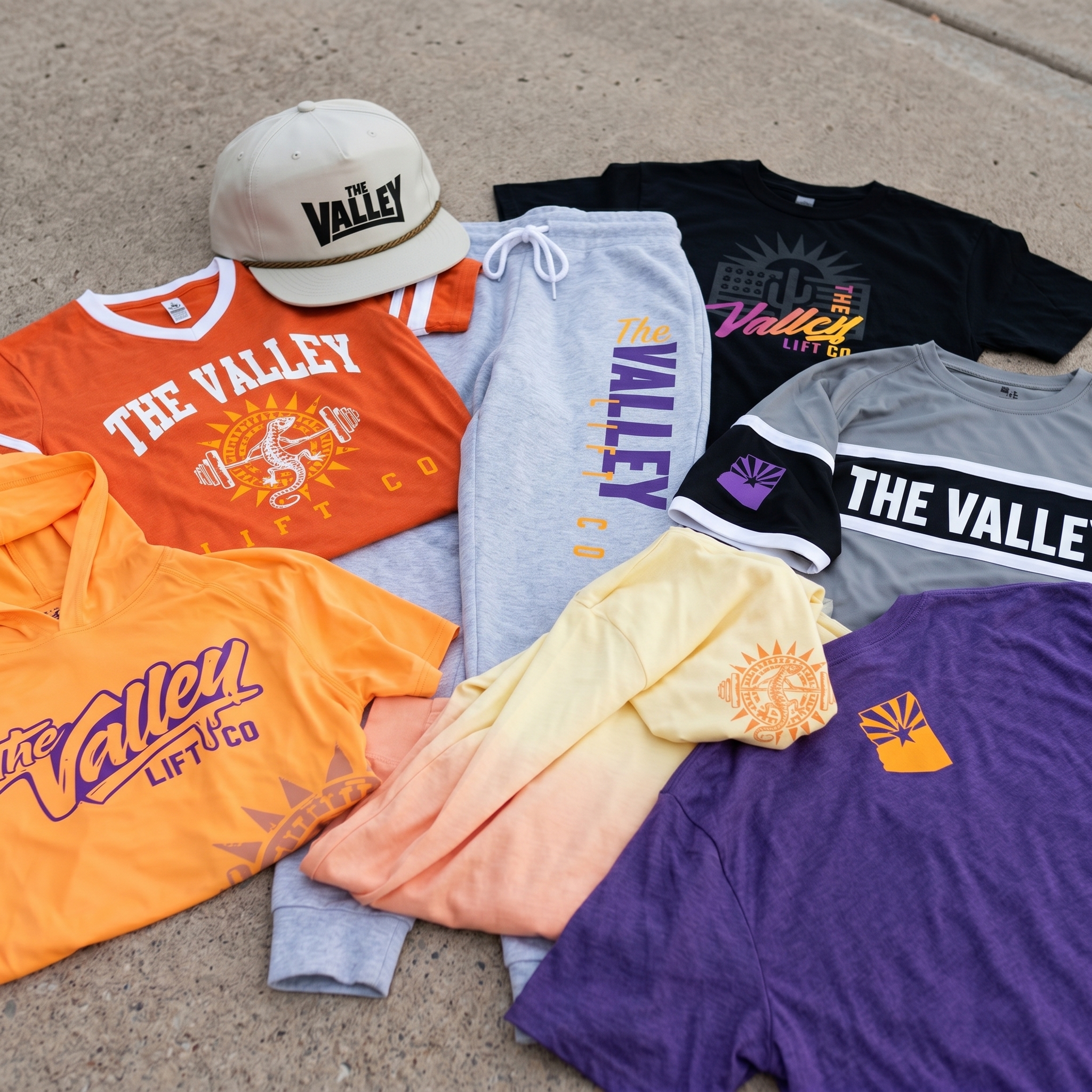
The Collection brings the Phoenix system together: orange and purple desert-sport color, grey training pieces, sunburst graphics, lizard-and-barbell marks, coach apparel, performance jerseys, rope cap embroidery, and casual pieces built around the local shorthand of “The Valley.”
Concept + Design Rationale
The name The Valley Lift Co. gave the system a strong base. It sounds local, but it also sounds like a real training brand. “The Valley” carries the Phoenix region. “Lift Co.” makes the purpose clear.
The main mark uses a desert lizard inside a sunburst, with a barbell running through the center. That gives the gym a symbol that is local, athletic, and easy to expand across shirts, hoodies, hats, joggers, and coach gear.
Typography was built in two lanes. The block and jersey-style type gives the collection a sport feel. The script mark adds motion, warmth, and a vintage gym-store quality. Together, they let the apparel move from training floor to streetwear without feeling like separate brands.
The palette leans into Phoenix without being one-note. Orange, yellow, purple, turquoise, grey, black, and cream each have a job. Some pieces feel hot and loud. Some feel cool and technical. The full system is meant to feel like a city that lives between desert heat, sports color, and modern training culture.
Color System
Desert Orange
Primary heat color pulled from Phoenix sun, citrus, and local sports energy
Valley Purple
Secondary color that gives the system a familiar Phoenix athletic edge
Sunburst Gold
Accent color for heat, speed, highlights, and desert-sun graphics
Poolside Teal
Cooling contrast inspired by water, shade, and desert-modern color
Concrete Grey
Training neutral used for jerseys, joggers, and performance pieces
Night Black
High-contrast base for lift graphics, coach apparel, and bold retail pieces
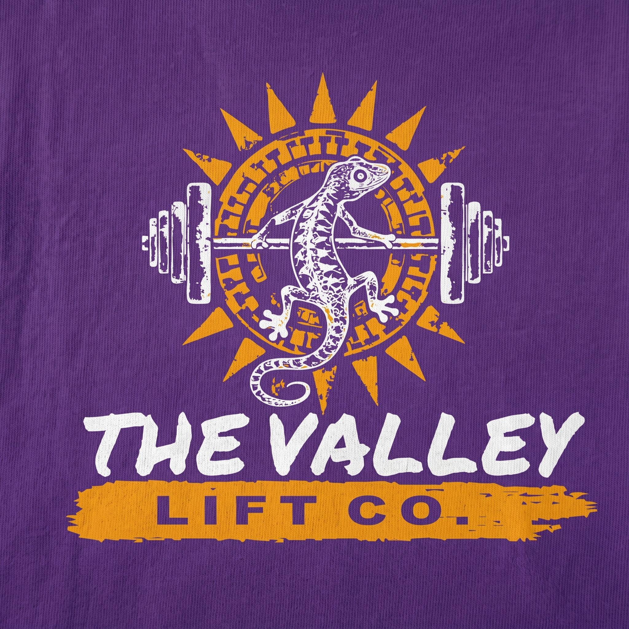
The screen-print mark combines the desert lizard, sunburst, and barbell into one central symbol. It gives the collection a mascot without losing the gym function.
The Valley Full Drop
The full drop shows how the system flexes: loud orange statement pieces, purple desert graphics, black training tees, grey joggers, performance tops, and a rope cap that makes the brand feel complete.
Desert Game Tee
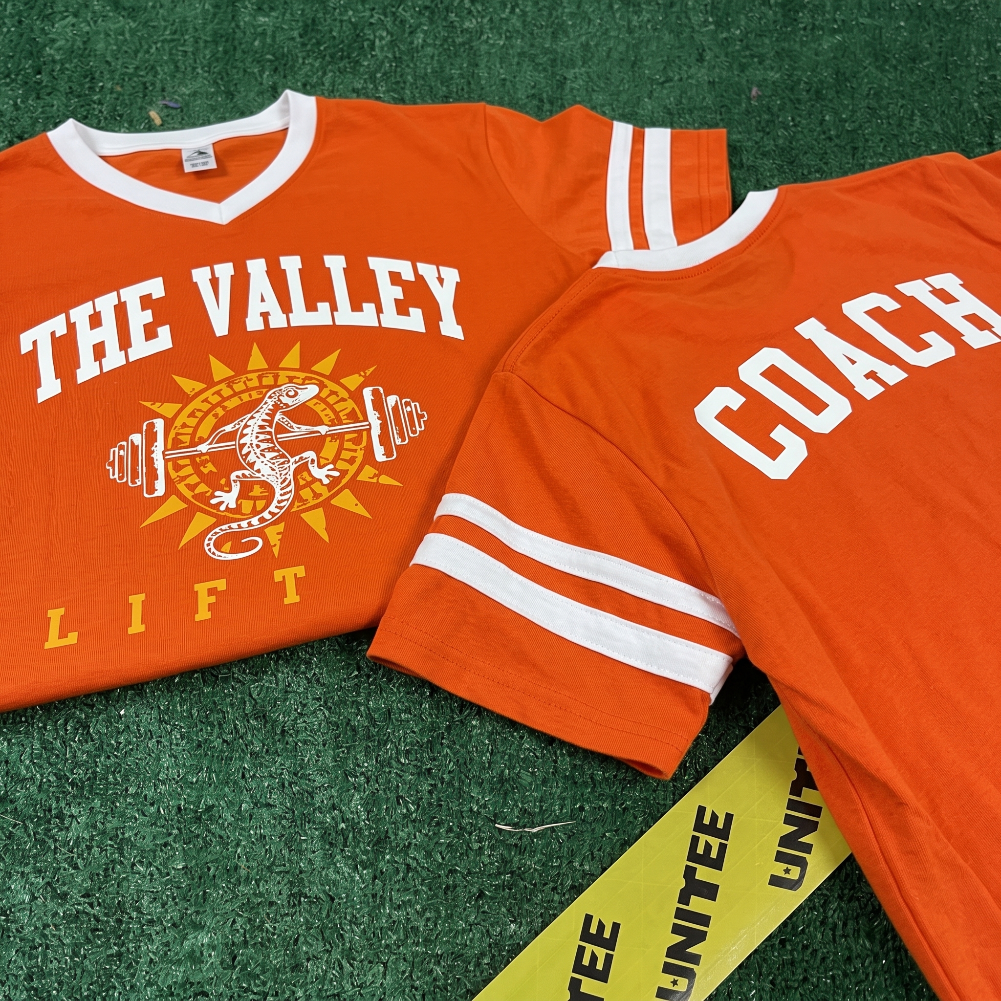
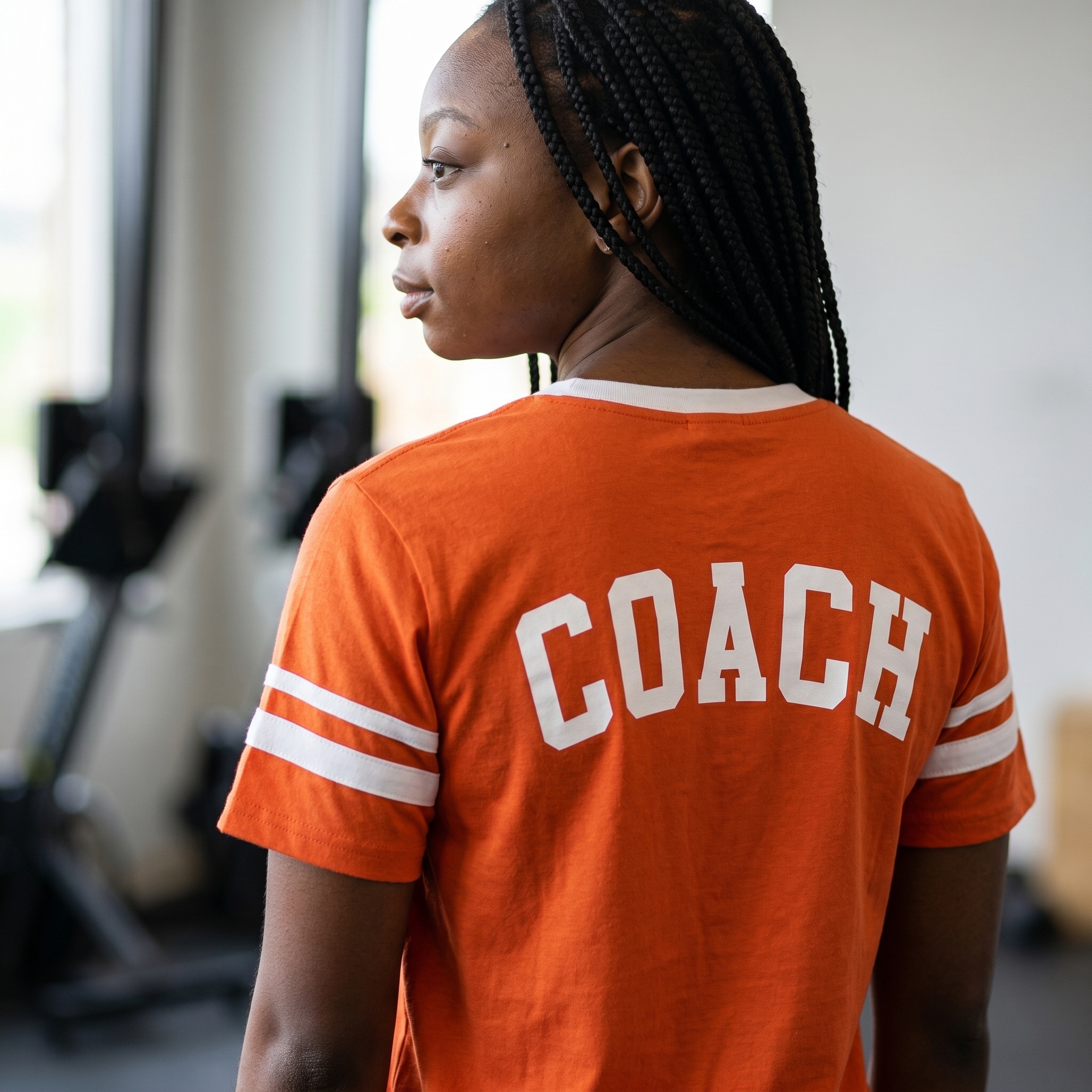
The orange jersey tee turns the collection into a team piece, using sleeve stripes, arched block type, and the lizard sunburst mark to create a Phoenix-ready coach and member shirt.
Sunset Baha style Hoodie
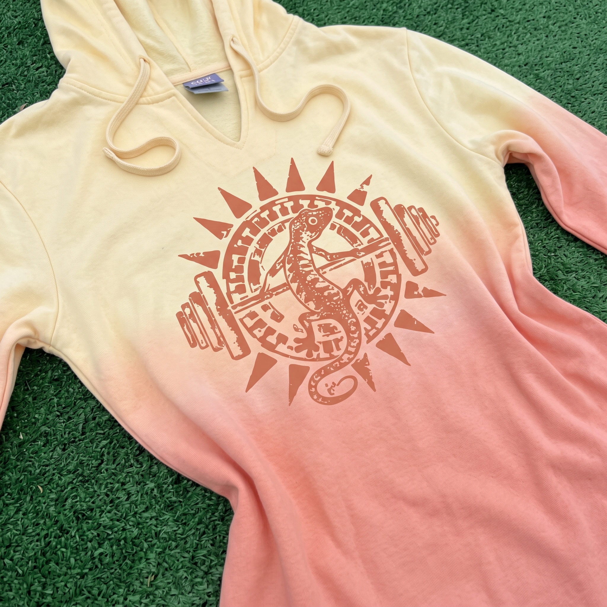
This baha style hoodie turns the lizard-and-barbell mark into a lighter layering piece, using a soft sunset fade that feels pulled straight from late-day Phoenix sky. The tonal print keeps the graphic relaxed and wearable while still tying the piece back to the desert heat and sunburst identity built into the collection.
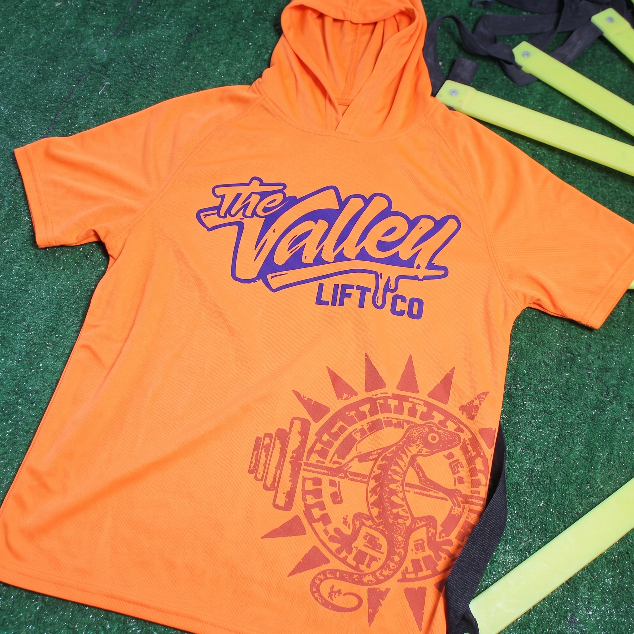
Heatwave Training Hoodie
The short sleeve hoodie pushes the loud side of the system, pairing the oversized Valley script with a large cropped lizard sunburst hit near the hem. The bright orange body makes the garment feel fast, hot, and unmistakably local, which gives it the same desert-sport energy that drives the rest of the Phoenix line.
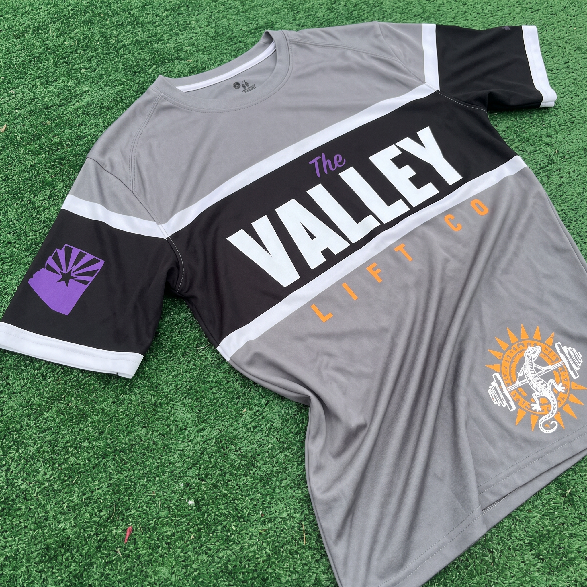
Valley Performance Jersey
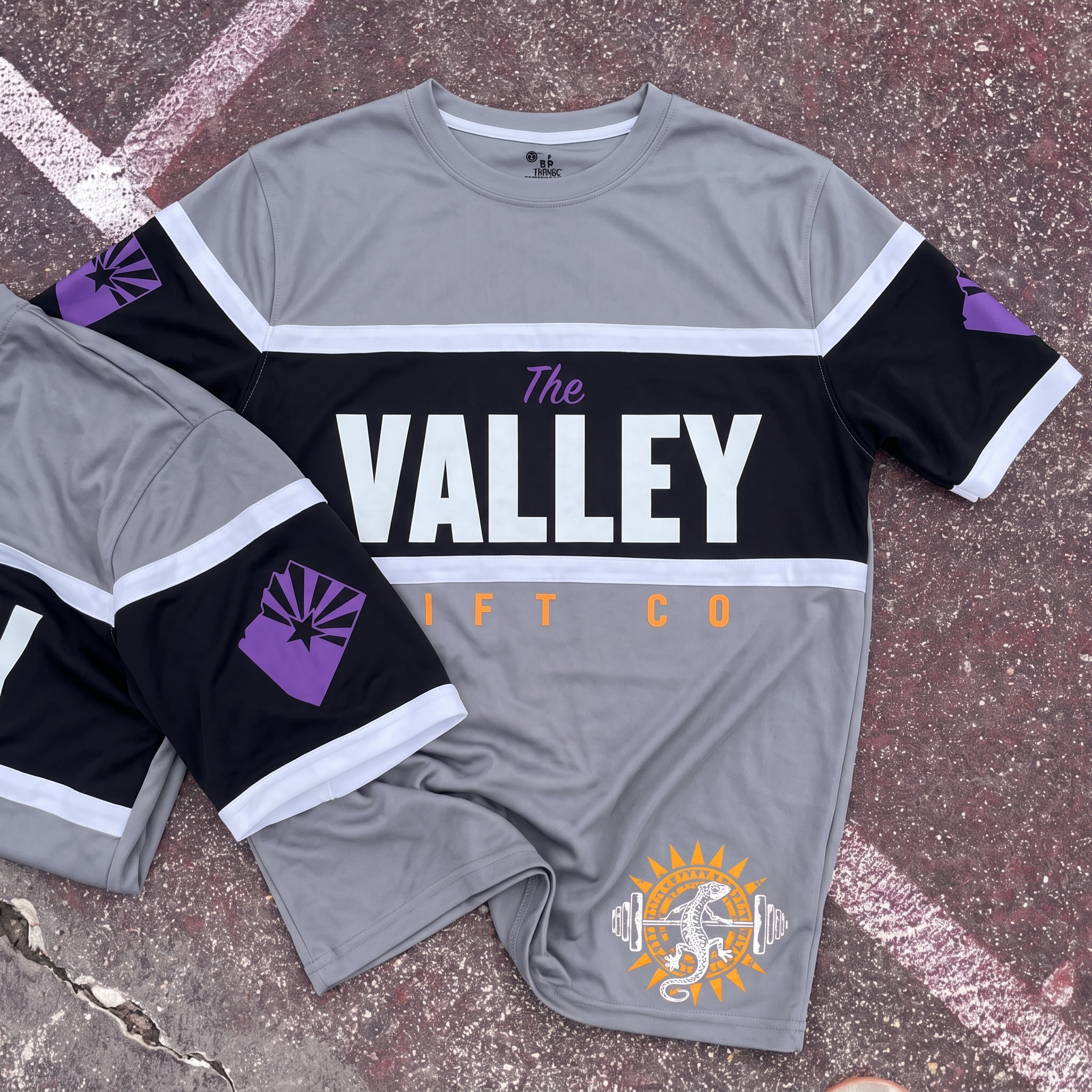
The performance jersey gives the collection a sharper athletic lane, using panel construction, bold front lettering, and a clean Arizona sleeve mark to make the piece feel team-ready. The lower sunburst lizard graphic keeps the jersey connected to the main Phoenix identity while the grey, black, purple, and orange palette brings in the city’s sport and desert contrast.
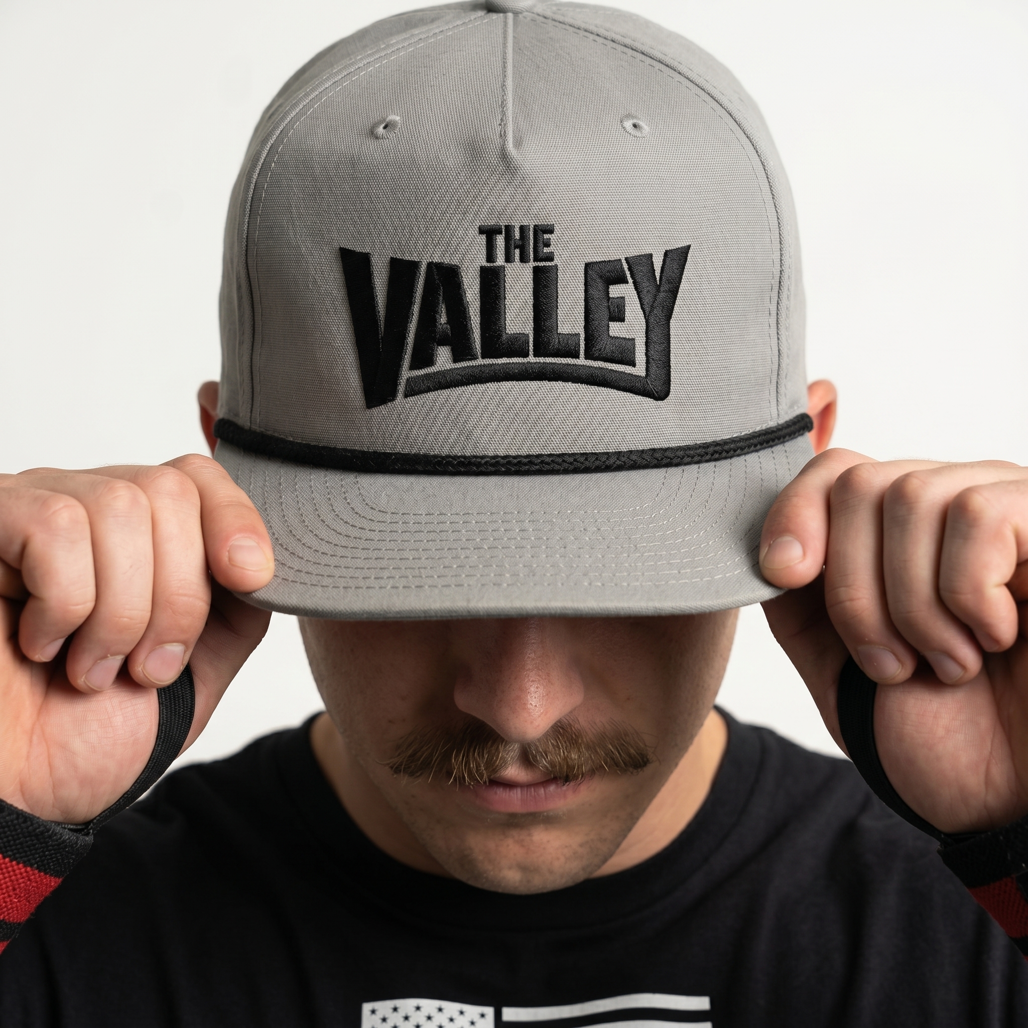
The Valley Rope Cap
The rope cap keeps the identity simple and retail-friendly, using a compact Valley wordmark that feels more like local sportswear than standard gym merch.
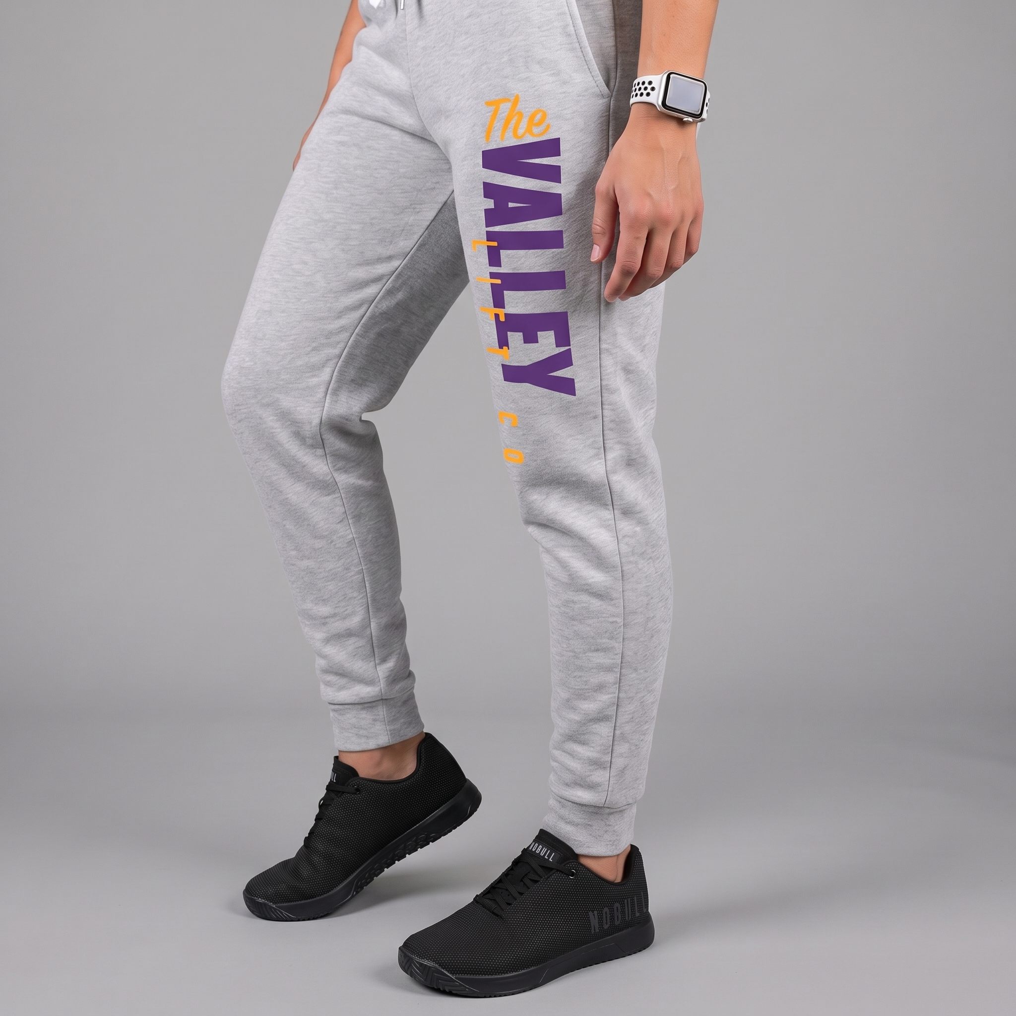
Valley Training Jogger
The jogger keeps the branding vertical, clean, and wearable, using purple and yellow on grey to bring the Phoenix palette into a daily training piece.
UNITEE Design Lab
Concept cars for custom gym apparel.
The UNITEE Design Lab works like concept cars for gym apparel. We start with an idea, then turn it into a real concept people can see: a shirt, hat, hoodie, uniform set, or full merch drop. Then we explain the thinking behind it. Why this garment? Why this graphic? Why this placement? Why this kind of finish? The work is built to inspire, test new ideas, and give our clients better custom gym apparel before they ever place an order.
For larger fitness brands, multi-location gyms, event groups, and enterprise clients, the Design Lab is where brand kits and full merch programs take shape. We build the look, then we print the gear. That means the same team can help shape the brand story, plan the apparel, design the graphics, and produce the final pieces.
For an independent gym owner, the value is simple: you get the benefit of our research and development without needing to buy a full brand package. Your order may be a small run of tees, hats, hoodies, or event shirts, but the thinking behind it comes from a team that studies gym merch every day.
Need better gym merch?
Tell us what you are trying to make. We can help with one shirt, a full drop, or a larger apparel program.
Start a Design Lab Conversation