
UNITEE Design Lab / Charlotte, North Carolina
Cotton State Fitness Co.
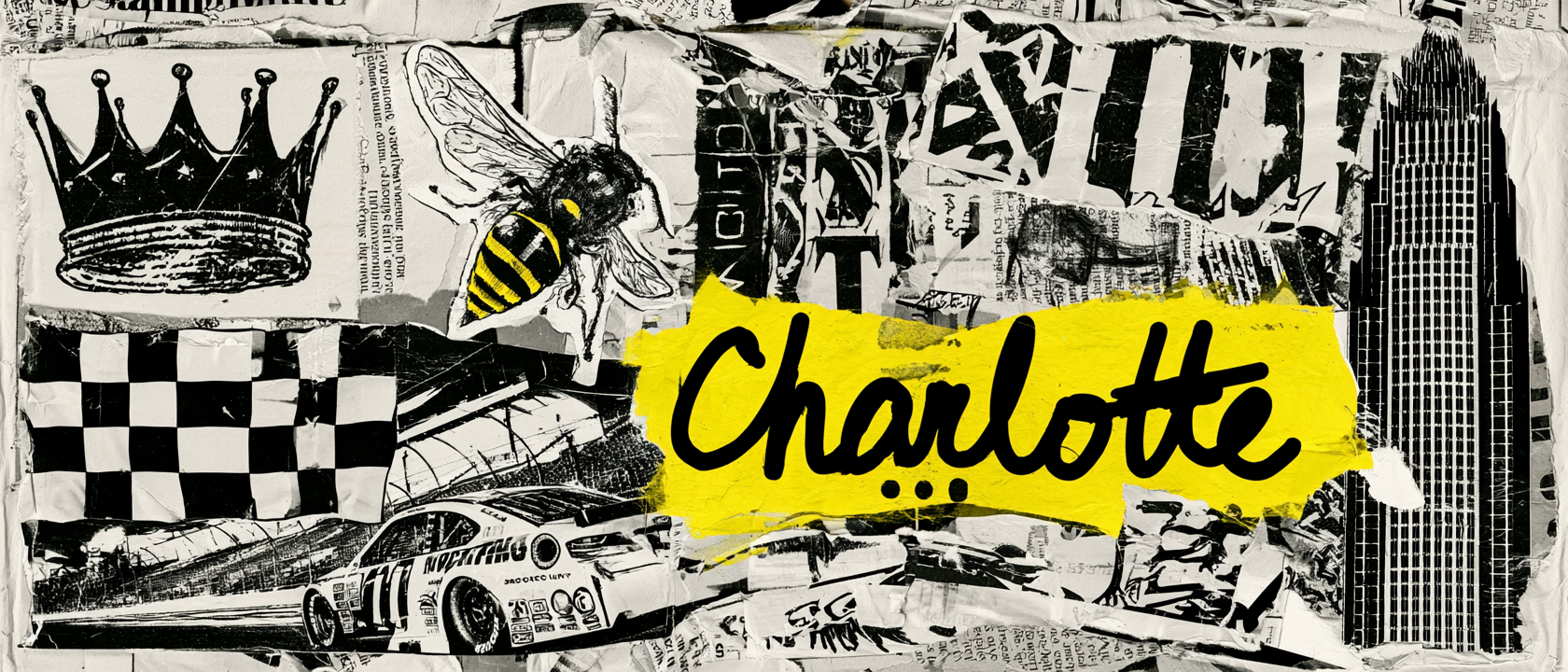
Charlotte has always known how to turn raw material into identity. Cotton became industry. Gold became ambition. Racing became speed. The crown became a city signal.
For Cotton State Fitness Co., we built the collection around that mix. The apparel pulls from Charlotte’s Queen City identity, cotton and textile history, teal-and-purple sports memory, race-day speed, and a cotton-boll kettlebell mark that turns a regional symbol into a gym system.
Queen City Material
Charlotte turns symbols into systems.
Charlotte is known as the Queen City, a name tied to Queen Charlotte. That gave the collection its first layer: a city with a crown built into its identity.
The second layer is cotton. Charlotte’s textile and mill history gave Cotton State Fitness Co. a strong source for the main mark. The cotton boll was not treated as decoration. It became part of the gym language.
That is why the icon combines cotton, a kettlebell handle, and a leaf form. It keeps the name local, but moves it into training. The result feels more like a fitness mark than a farm or state fair graphic.
Charlotte also has speed in its story. Racing culture is part of the region’s visual memory, and that gave the collection a reason to use bold contrast, athletic stripes, strong block type, and fast color.
The teal-and-purple palette adds another Charlotte cue. It feels tied to the city without copying one team directly. Teal gives the collection energy. Purple gives it the Queen City layer. Grey and white keep it grounded in training gear.
The final system is built from those pieces: crown, cotton, speed, city color, and gym utility. Each garment carries a different part of Charlotte instead of repeating one logo in the same way.
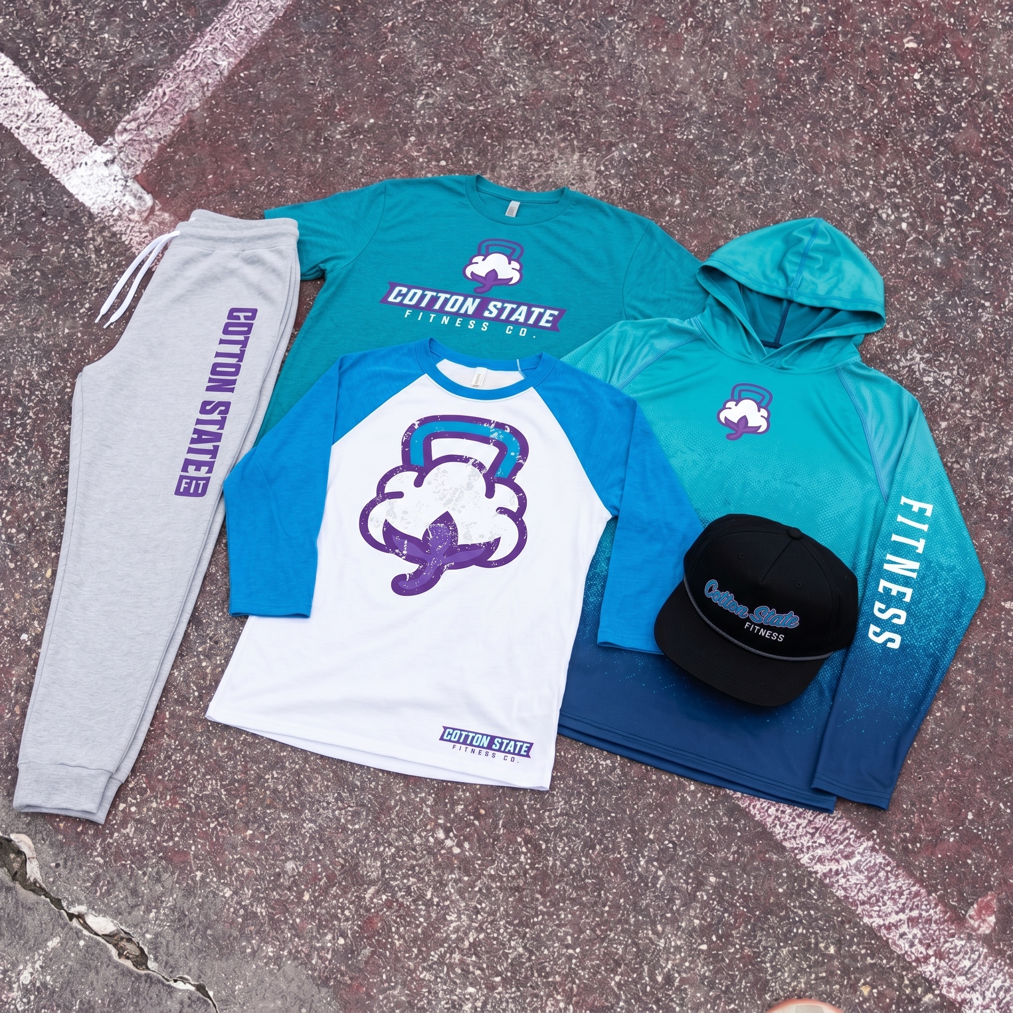
The Cotton State system uses a cotton-kettlebell icon, Queen City purple, Tryon teal, state-outline detail, coach pieces, joggers, headwear, and vintage athletic layouts to build a full Charlotte gym apparel story.
Concept + Design Rationale
Cotton State Fitness Co. works because the name gives us both material and place. Cotton gives the visual source. State gives the regional frame. Fitness gives the purpose.
The main mark turns a cotton boll into a kettlebell-shaped icon. That move matters because it keeps the design connected to Charlotte’s textile history while making the mark belong to a gym.
The typography leans athletic and bold, with banner shapes, block letters, and coach-style placements. It gives the collection a sports feel without making every piece look like a uniform.
The color system does a lot of the local work. Teal gives the collection a Charlotte sports memory. Purple brings in the Queen City layer. Grey keeps the coach and jogger pieces practical. White gives the mascot-style mark room to breathe.
The goal was to make Cotton State feel like a brand system, not one graphic. The tee, coach back, hat, jogger, raglan, and logo pieces each carry a different part of the story.
Color System
Tryon Teal
Charlotte energy and sport memory
Queen City Purple
Crown layer and identity punch
Cotton Boll White
Clean base and icon clarity
Mill Floor Grey
Training neutral and coach gear
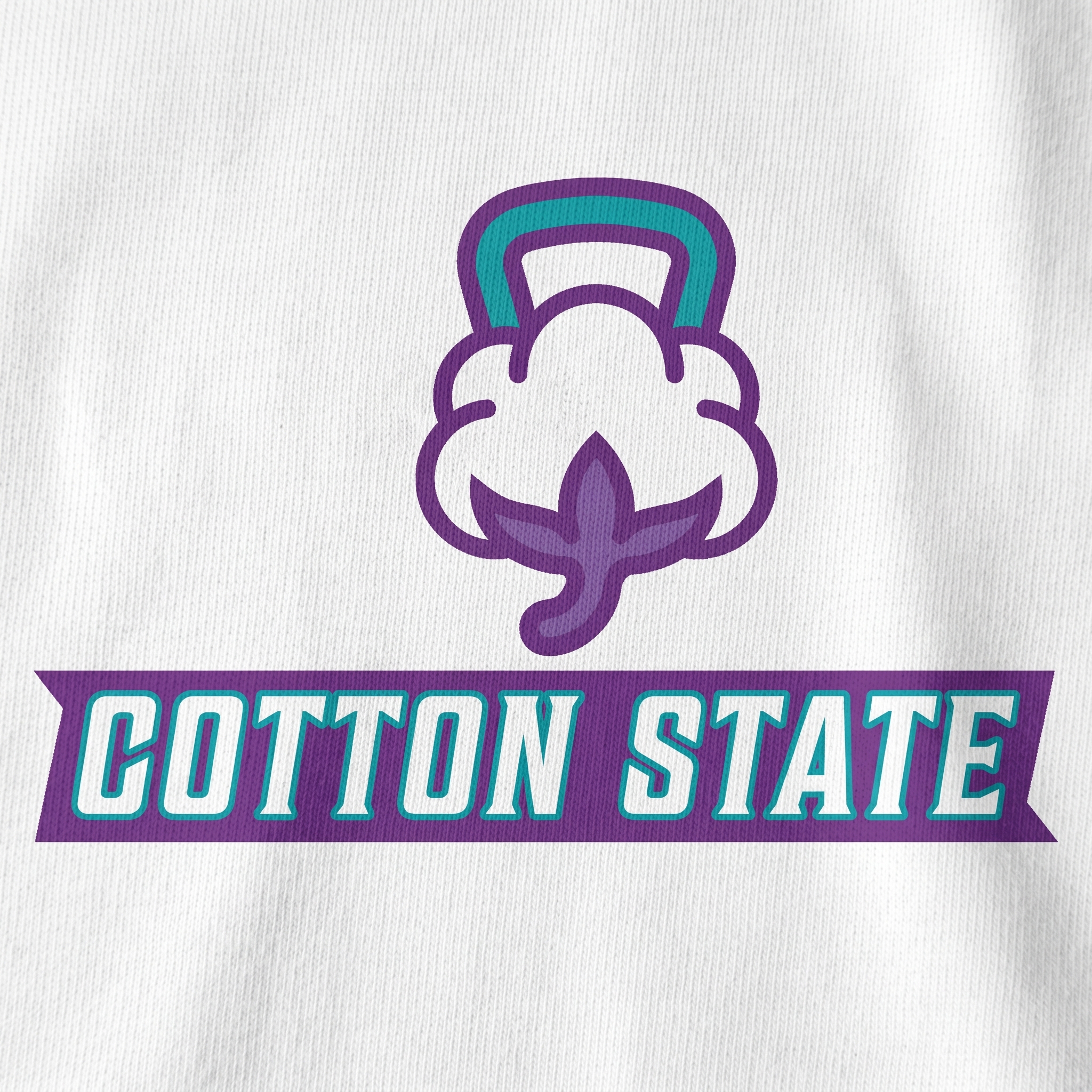
The Queen City Cotton Mark Tee
The main mark combines the cotton-boll icon, banner type, teal outline, and Queen City purple to make the gym identity feel local in one clear read.
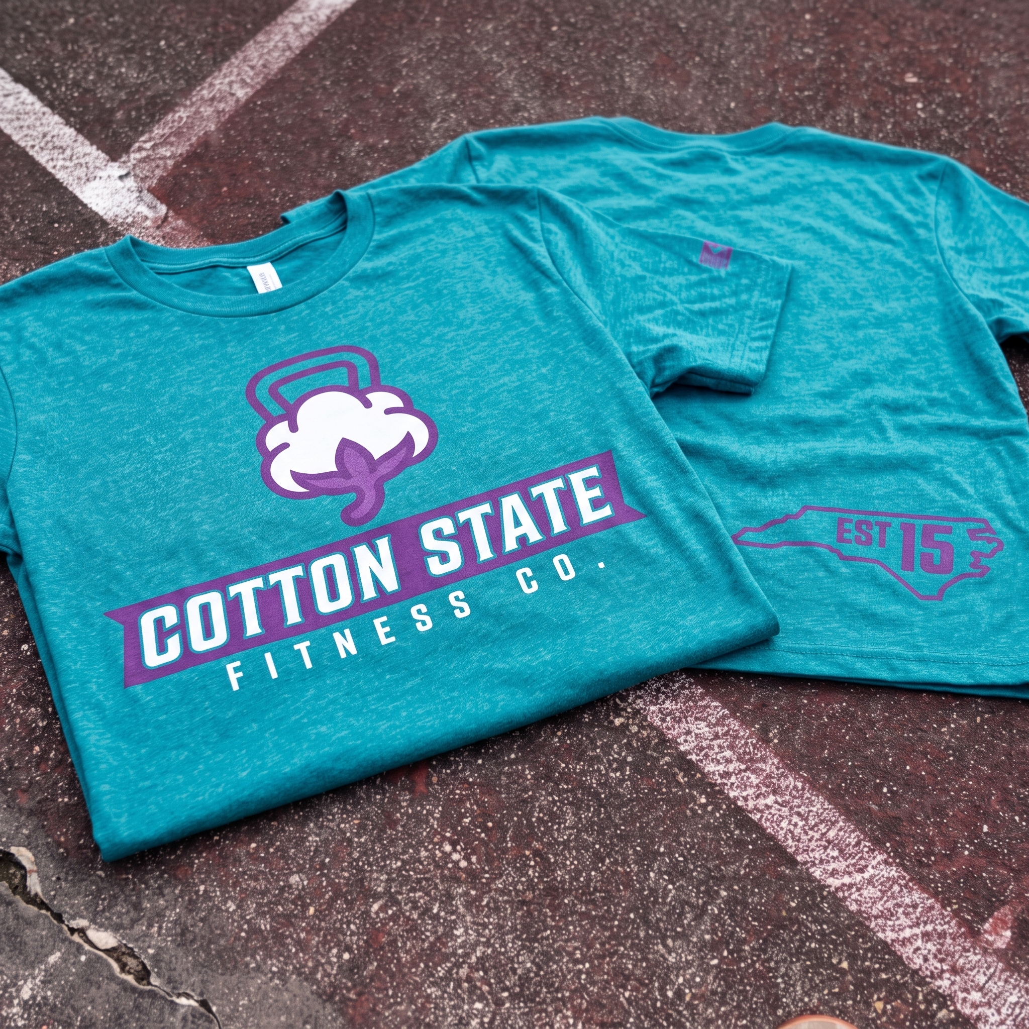
The Tryon Teal State Tee
The teal tee carries the full front identity and a North Carolina EST 15 back hit, giving the collection a strong local piece that still feels easy to wear.
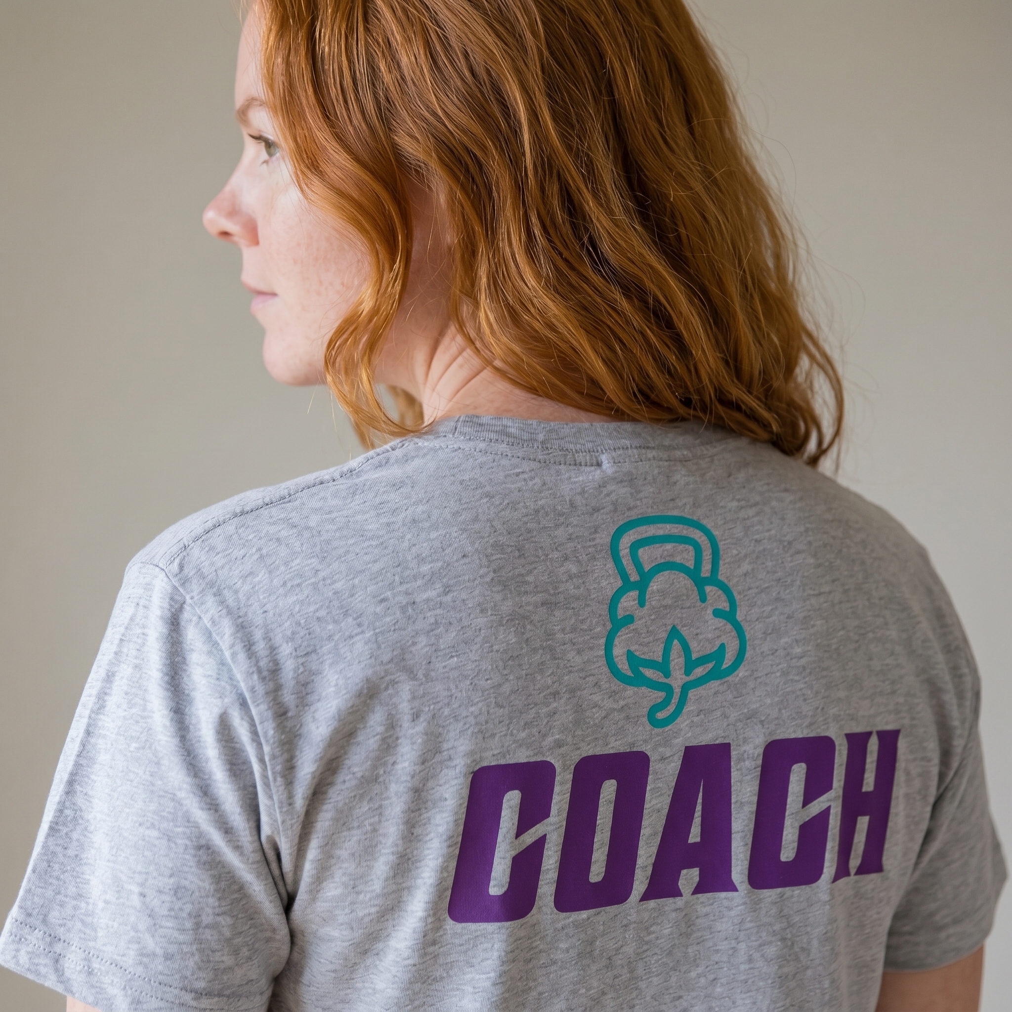
The Coach Boll Back Tee
The coach tee uses a large purple back print and small cotton icon to make the staff piece clear without turning it into a plain block-letter uniform.
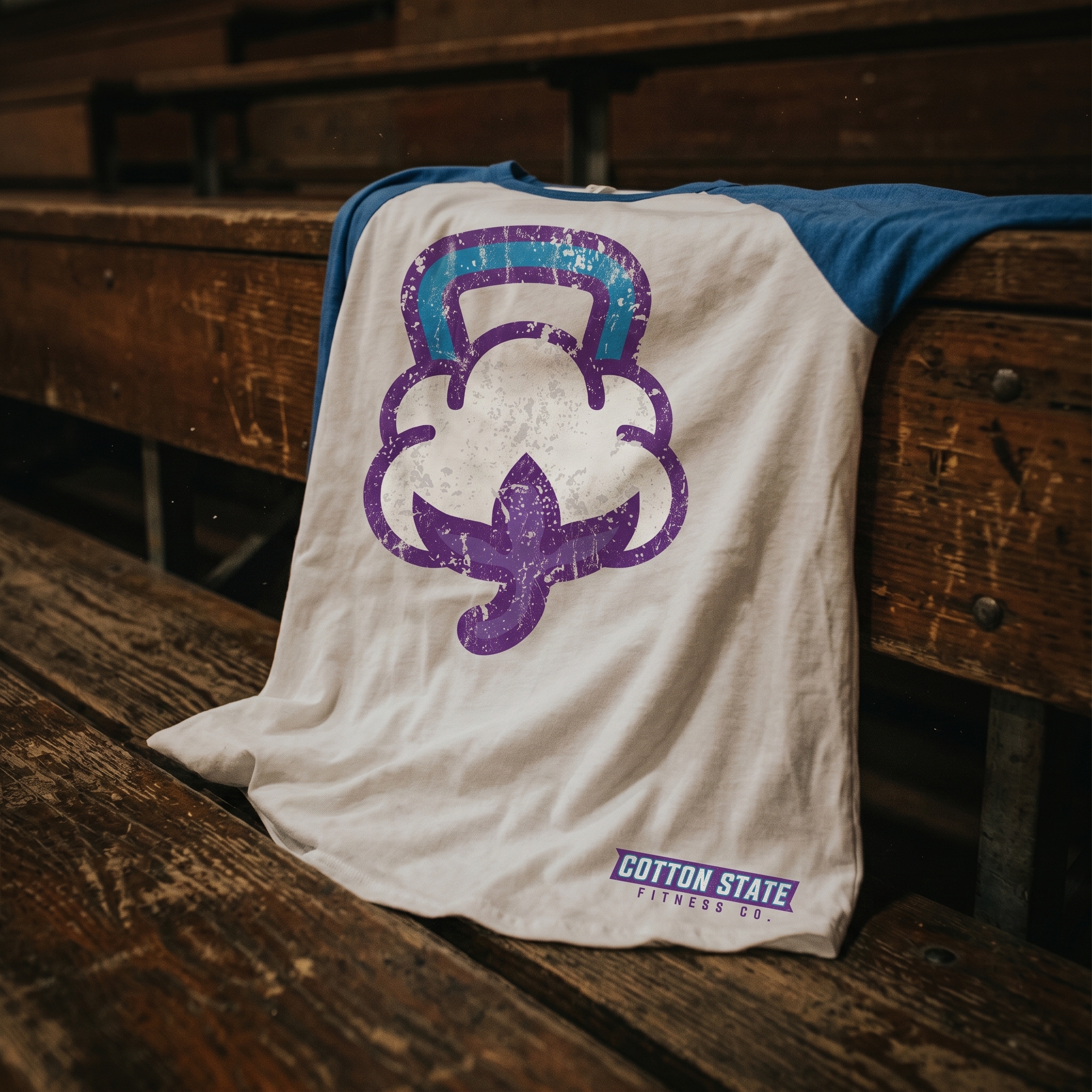
The Cotton Kettlebell Raglan
The raglan gives the cotton-kettlebell icon its biggest character moment, using a vintage athletic garment shape to keep the graphic playful but still gym-ready.
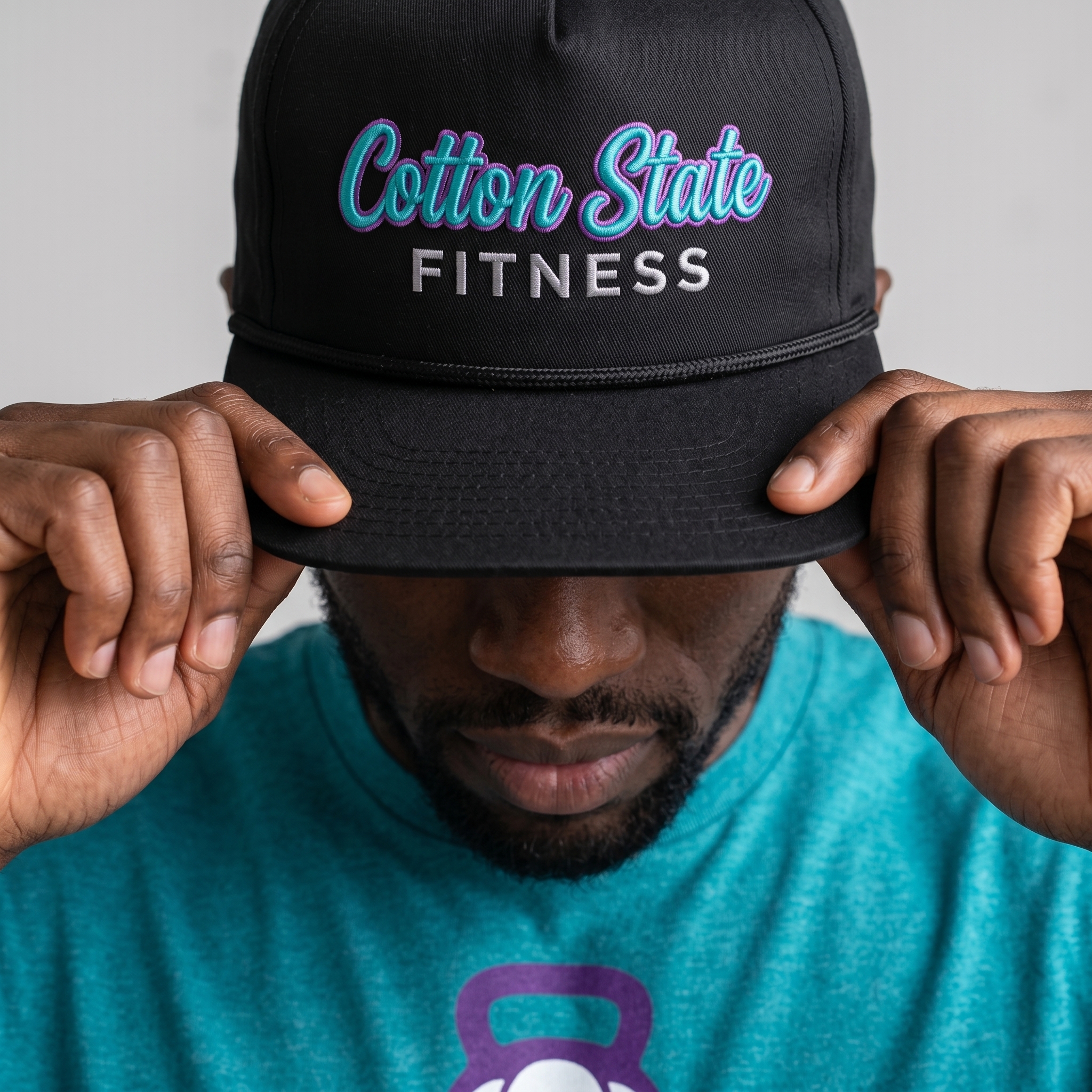
The Queen City Rope Cap
The black rope cap shifts the Cotton State script into embroidery, giving the drop a sharper headwear piece with teal and purple working at a smaller scale.
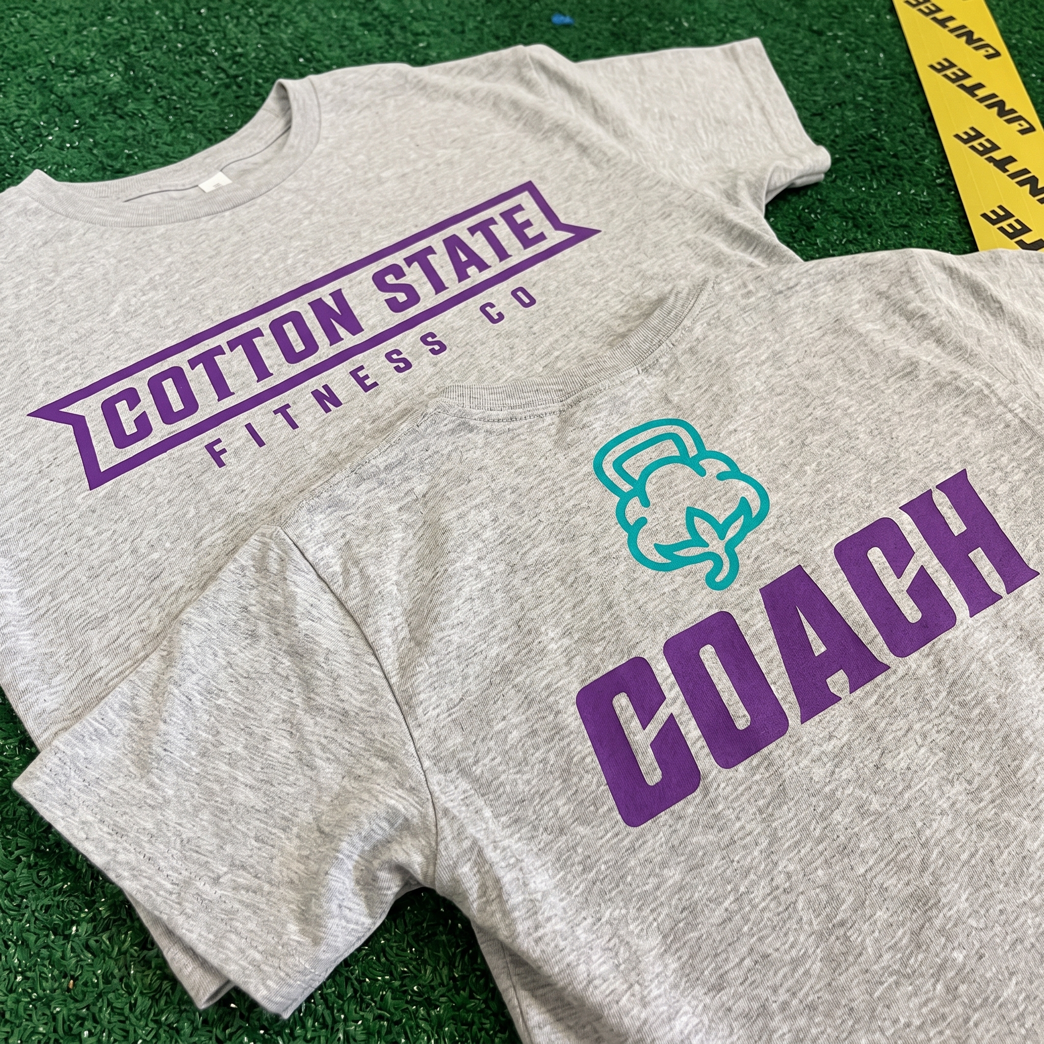
The Mill Floor Coach Set
The grey coach set keeps the palette grounded, pairing purple coach type with the teal cotton icon so the staff gear feels connected to the full system.
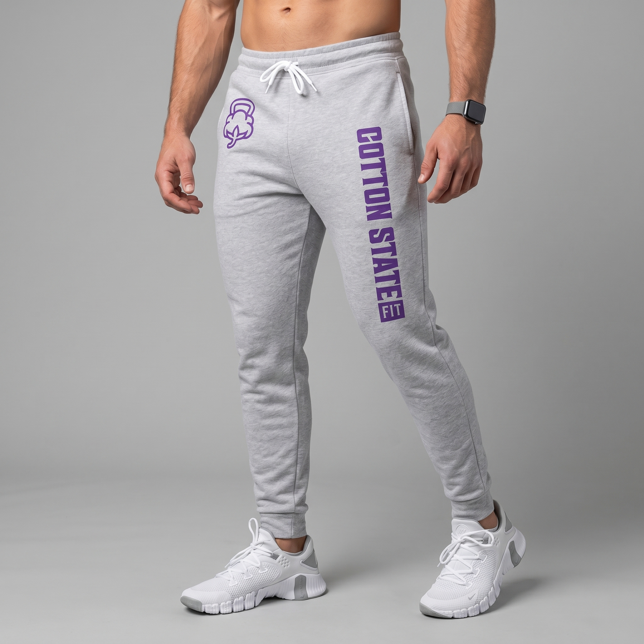
The Crown Line Jogger
The jogger uses a vertical Cotton State leg print and small cotton icon placement so the identity moves with the athlete instead of staying locked to the chest.
UNITEE Design Lab
Concept cars for custom gym apparel.
The UNITEE Design Lab works like concept cars for gym apparel. We start with an idea, then turn it into a real concept people can see: a shirt, hat, hoodie, uniform set, or full merch drop. Then we explain the thinking behind it. Why this garment? Why this graphic? Why this placement? Why this kind of finish? The work is built to inspire, test new ideas, and give our clients better custom gym apparel before they ever place an order.
For larger fitness brands, multi-location gyms, event groups, and enterprise clients, the Design Lab is where brand kits and full merch programs take shape. We build the look, then we print the gear. That means the same team can help shape the brand story, plan the apparel, design the graphics, and produce the final pieces.
For an independent gym owner, the value is simple: you get the benefit of our research and development without needing to buy a full brand package. Your order may be a small run of tees, hats, hoodies, or event shirts, but the thinking behind it comes from a team that studies gym merch every day.
Need better gym merch?
Tell us what you are trying to make. We can help with one shirt, a full drop, or a larger apparel program.
Start a Design Lab Conversation