
UNITEE Design Lab / Chicago, Illinois
3rd Coast Athletics
3rd Coast Athletics is built around one of Chicago’s strongest local truths: the city is not on an ocean, but it behaves like a coastal city. Lake Michigan gives Chicago beaches, harbors, running paths, skyline water views, brutal winter wind, and a shoreline identity that feels bigger than a lake.
The name avoids the obvious Chicago traps. No “Windy City.” No deep dish. No tourist-postcard skyline treatment. “3rd Coast” gives the brand an insider edge, while “Athletics” keeps it rooted in training. The result feels like a coastal-meets-Midwestern grit apparel label that locals would actually wear.
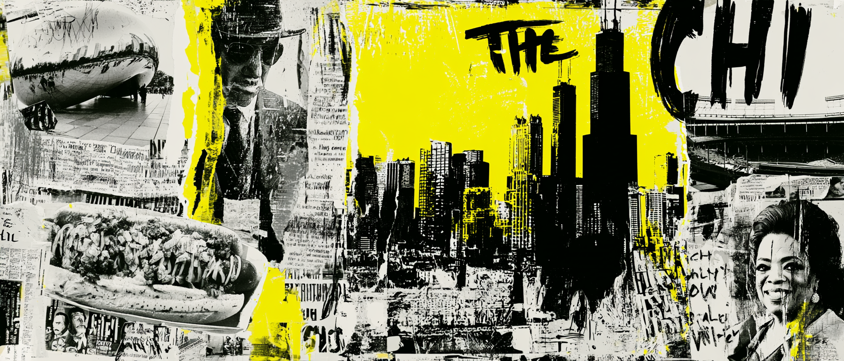
Lakefront, Fire, Flag, And Rebuild
America’s Inland Coast, Rebuilt With Grit.
Chicago’s story starts with geography. The city sits on the southwest shore of Lake Michigan, with a public lakefront that stretches for miles and functions like an inland coastline. That is the foundation of the name. “3rd Coast” reframes Chicago as a coastal city without borrowing from Los Angeles or New York. The bright lake blue sleeves, white raglan body, navy base pieces, and shoreline running photography all come from that idea: freshwater coast, hard-weather city, athletic pace.
Chicago also became powerful because it connected systems. The Illinois & Michigan Canal opened in 1848, linking the Chicago River near Bridgeport to the Illinois River and helping connect the Great Lakes with the Mississippi River trade network. Later, Chicago’s railroads, stockyards, factories, and lake shipping turned the city into a national movement machine. That history pushed the graphic system toward bold athletic blocks, badge structures, vertical type, and strong utility placements. The apparel needed to feel like motion, logistics, and work, not a soft lifestyle souvenir.
The city’s fire-and-rebuild story is just as important. The Great Chicago Fire began in 1871 and destroyed huge sections of the city, but Chicago rebuilt fast and became a proving ground for modern architecture, steel-frame construction, and civic ambition. By 1893, the World’s Columbian Exposition showed the world that Chicago had risen again. That is why the system uses crisp outlines, layered strokes, and varsity shapes. The graphics feel rebuilt, stacked, and engineered, with the red and blue palette adding civic heat instead of vintage softness.
The Chicago flag became the final design anchor. Its blue bars reference water, while its red stars mark major moments in city history, including Fort Dearborn, the Great Fire, the World’s Columbian Exposition, and the Century of Progress. We pulled from that civic language without copying it outright: four-star hits, red accents, blue outlines, white fields, and rectangular flag patches appear across tees, joggers, and the baseball jersey. The result is local but not lazy. It feels like Chicago through lakefront movement, civic code, sports nostalgia, and rebuilt-city toughness.
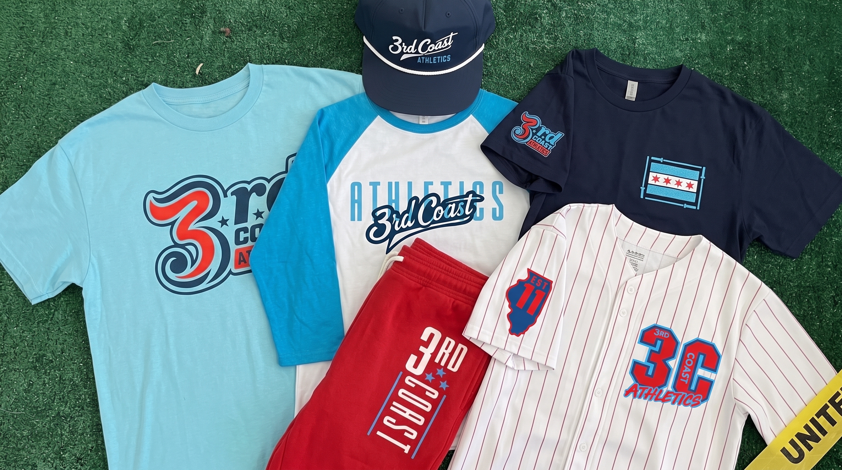
The full 3rd Coast Athletics collection uses lake blue, navy, red, white, baseball pinstripes, city-flag references, rope-cap embroidery, and streetwear-style sleeve hits to build a Chicago system that feels athletic, local, and wearable.
Concept + Design Rationale
3rd Coast Athletics works because it gives Chicago a cooler frame than the obvious city nicknames. The phrase points to Lake Michigan and the Great Lakes shoreline, while “Athletics” makes the name feel like a serious training facility and a premium apparel label.
The design system leans into Chicago’s lakefront, civic flag, sports culture, and rebuilt-city energy. We used red, white, navy, and lake blue because those colors can reference the city without feeling like a direct flag copy. The palette also feels clean enough for performance gear and bold enough for streetwear.
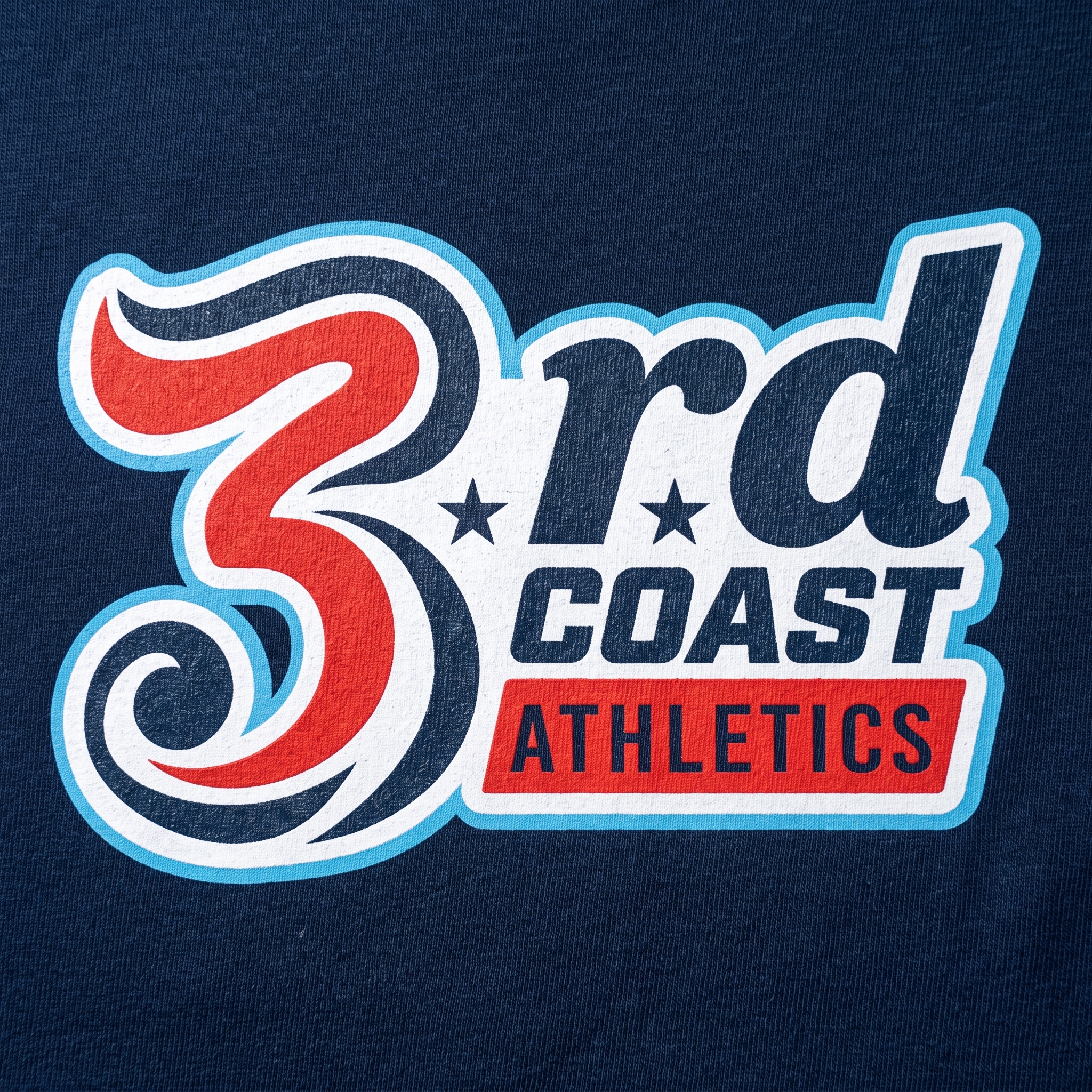
Typography was split into two worlds. The script mark gives the brand a coastal, baseball-inspired movement. The tall athletic block type brings structure, grit, and gym-floor clarity. That contrast lets the brand feel both relaxed and serious.
The collection was built to move across multiple product types: raglan, tee, jogger, rope cap, jersey, and coach apparel. Each piece carries a different piece of the Chicago story while staying inside one strong system.
Color System
Lake Blue
Primary coastal color tied to Lake Michigan, shoreline training, and the “3rd Coast” name
Deep Navy
Grounds the system in Chicago sportswear, lakefront evenings, and premium athletic apparel
Civic Red
Used for flag-star energy, baseball jersey accents, and high-contrast athletic hits
Clean White
Creates separation, gives the raglan and jersey a classic athletic base, and keeps layered marks readable
Concrete Grey
Neutral support tone tied to sidewalks, river walls, training floors, and rebuilt-city material
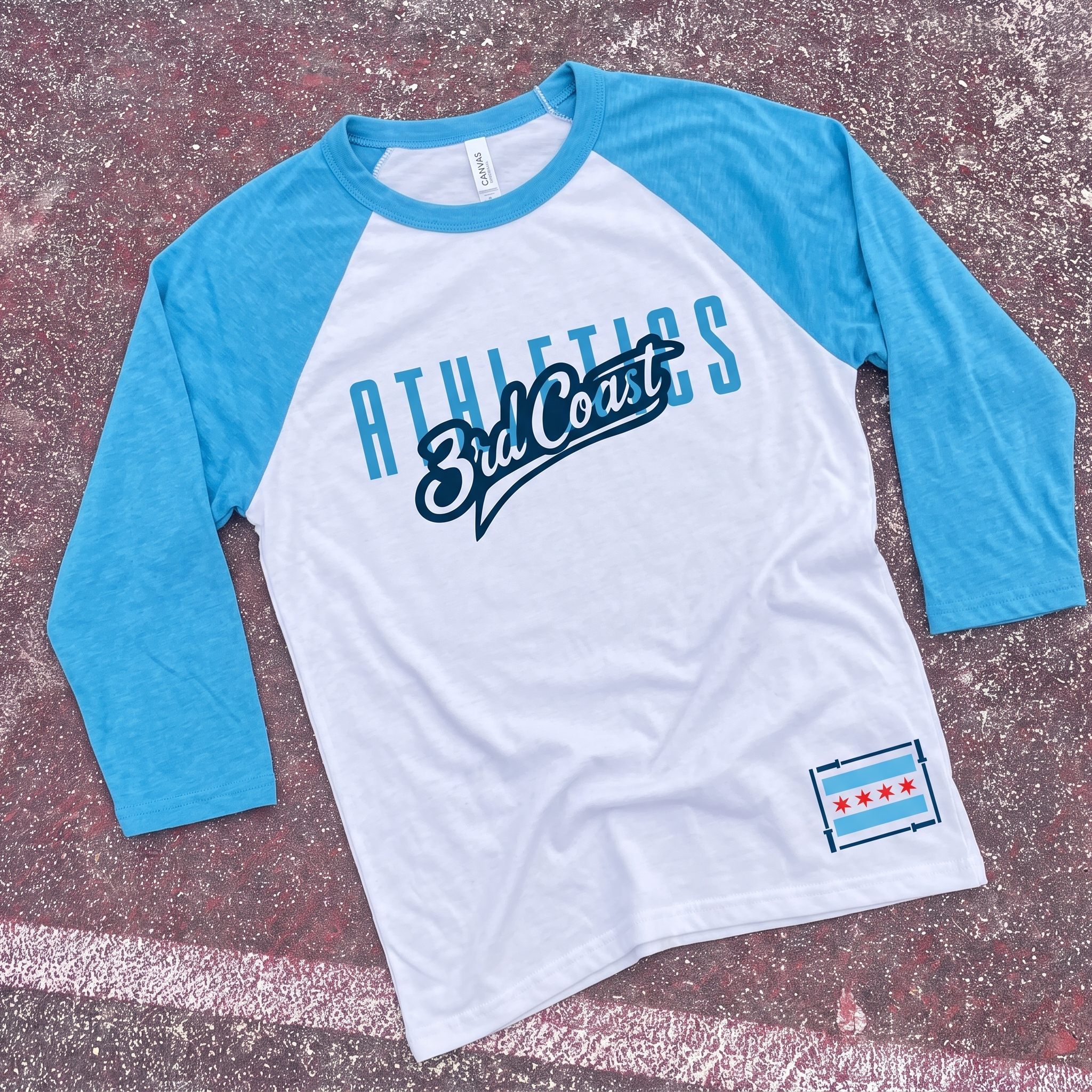
Lakefront Raglan
The raglan uses lake blue sleeves, a clean white body, and layered 3rd Coast script to make the brand feel fast, light, and shoreline-driven. The small Chicago flag hit at the hem was added as a local marker, giving the shirt civic identity without turning the whole piece into a flag graphic.
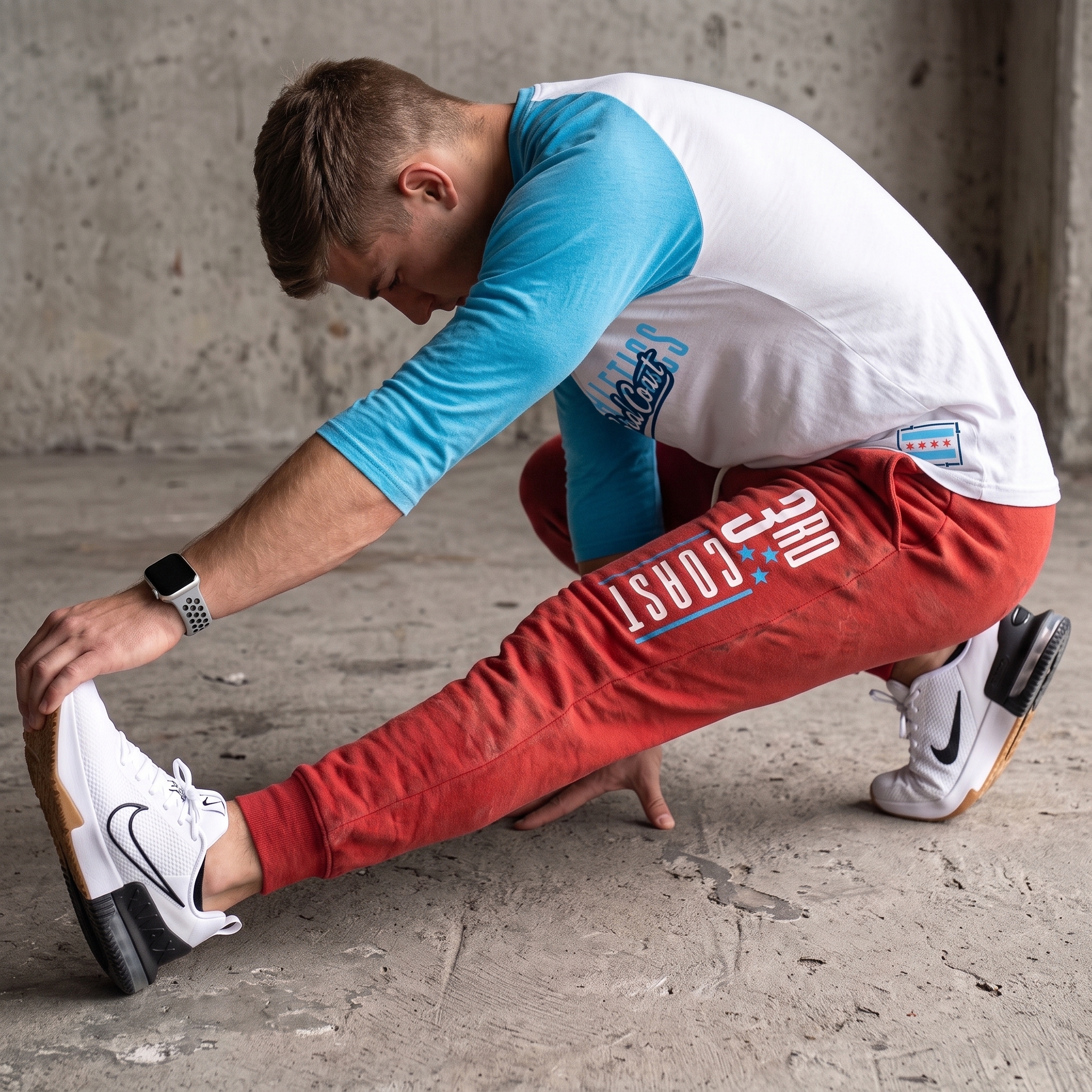
Redline Jogger
The jogger carries a vertical 3rd Coast mark down the leg, using red as the boldest civic accent in the collection. The stacked placement was chosen to create movement on-body and give the lower piece enough graphic weight to stand on its own.
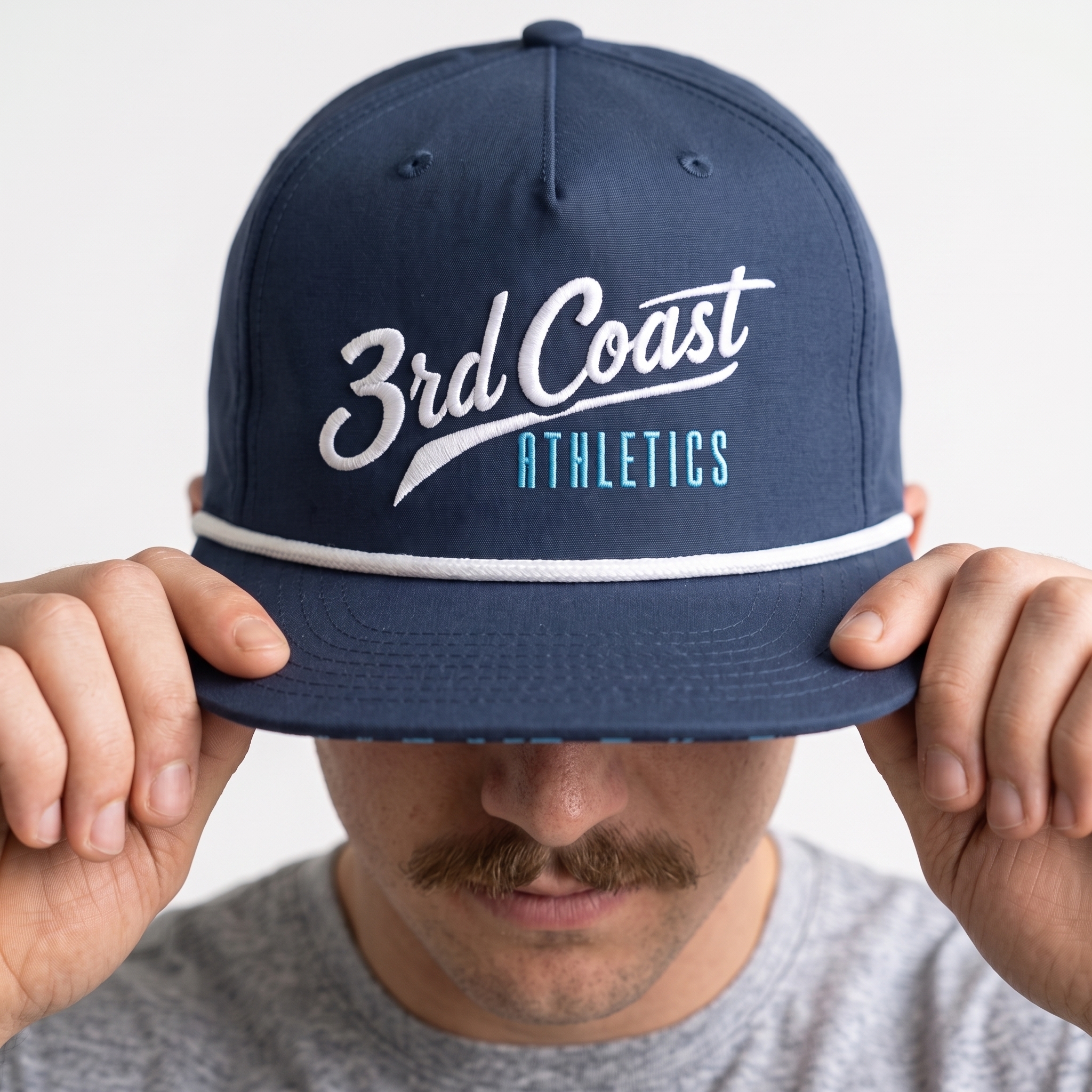
Lake Rope Cap
The rope cap reduces the system to its cleanest accessory mark, using white script, lake blue support type, and a navy field. The white rope detail was kept to reinforce the coastal idea while giving the front embroidery a crisp visual break.
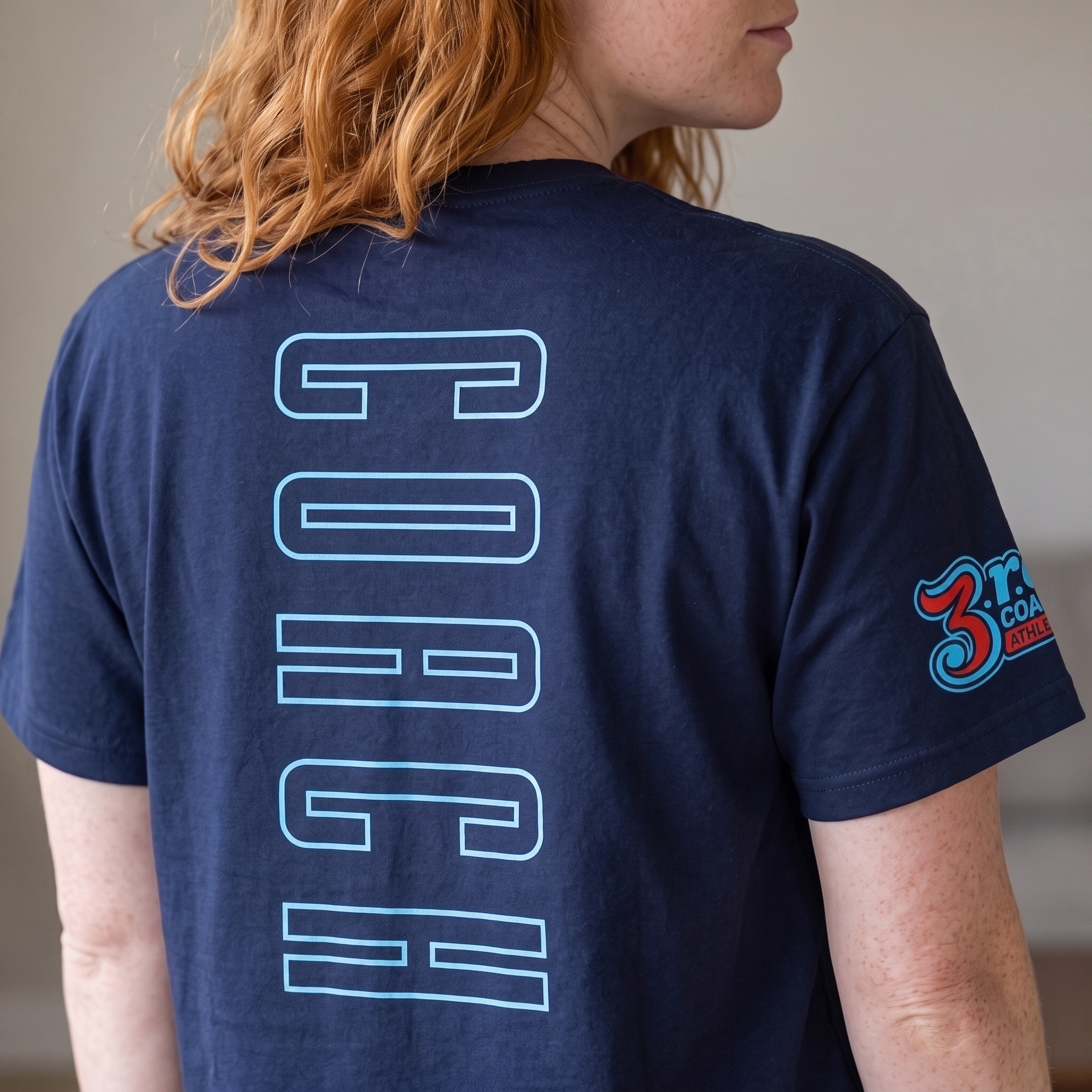
Coach Back Tee
The coach tee uses oversized outlined back type with a smaller sleeve logo to separate staff identity from the main retail graphics. The outline treatment was chosen to keep the mark large and visible while avoiding a heavy block of ink across the back.
Pinstripe Jersey
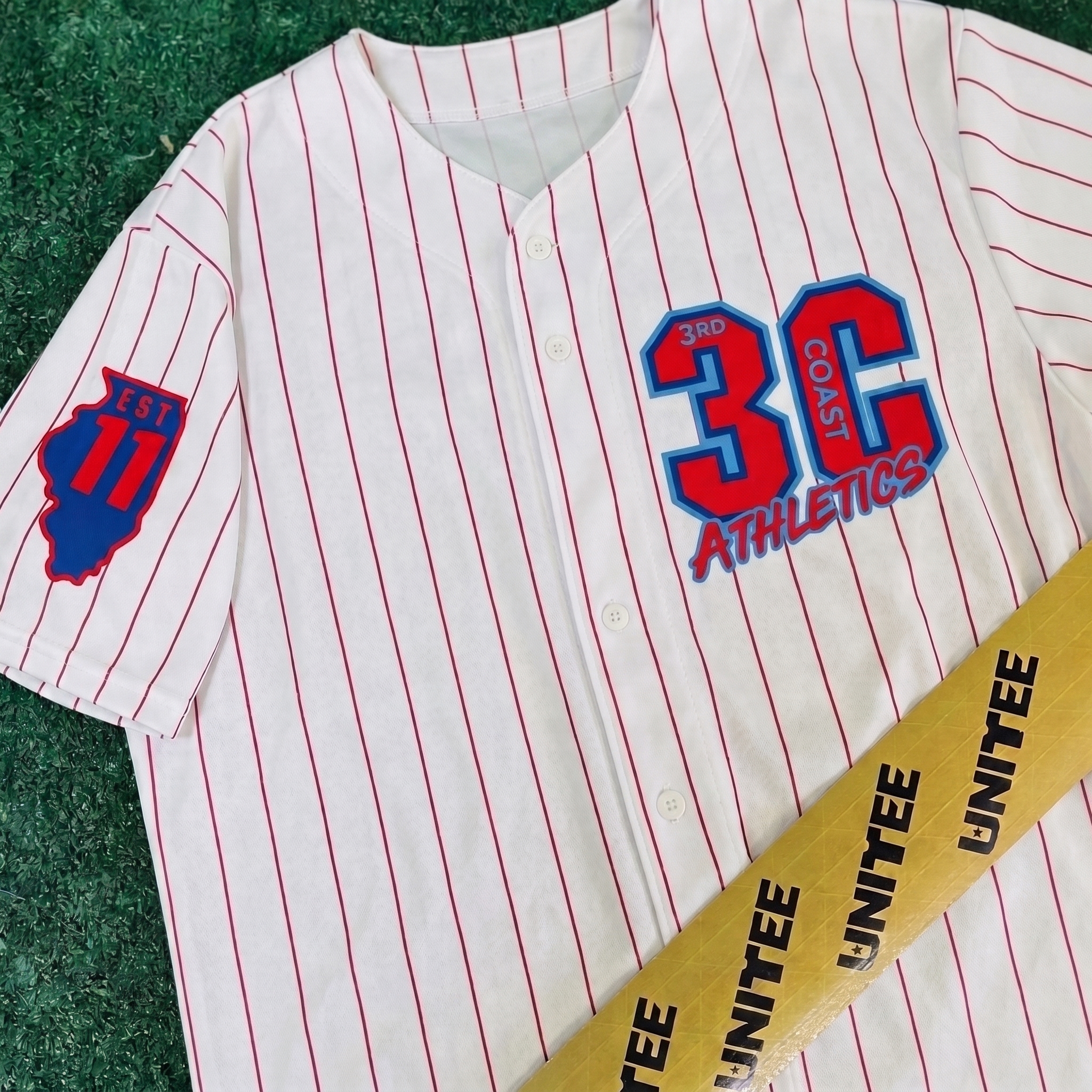
The baseball jersey brings Chicago’s sports language into the collection through red pinstripes, oversized chest lettering, and an Illinois sleeve badge. The jersey format was used because it feels instantly local and athletic without needing a literal skyline graphic.
UNITEE Design Lab
Concept cars for custom gym apparel.
The UNITEE Design Lab works like concept cars for gym apparel. We start with an idea, then turn it into a real concept people can see: a shirt, hat, hoodie, uniform set, or full merch drop. Then we explain the thinking behind it. Why this garment? Why this graphic? Why this placement? Why this kind of finish? The work is built to inspire, test new ideas, and give our clients better custom gym apparel before they ever place an order.
For larger fitness brands, multi-location gyms, event groups, and enterprise clients, the Design Lab is where brand kits and full merch programs take shape. We build the look, then we print the gear. That means the same team can help shape the brand story, plan the apparel, design the graphics, and produce the final pieces.
For an independent gym owner, the value is simple: you get the benefit of our research and development without needing to buy a full brand package. Your order may be a small run of tees, hats, hoodies, or event shirts, but the thinking behind it comes from a team that studies gym merch every day.
Need better gym merch?
Tell us what you are trying to make. We can help with one shirt, a full drop, or a larger apparel program.
Start a Design Lab Conversation